Samsung Galaxy S20 Ultra hands-on review
Samsung Galaxy S20 Ultra design
Just like its two siblings, the S20 Ultra is very familiar, yet distinctly different. Before we get to the elephant in the room - that huge, protruding camera hump, we need to try and consider where the Ultra fits in size and weight-wise, just like we did with the S20 and S20+. To put it as brief as possible - you better be prepared for a huge, two-handed phone. Measuring a whopping 166.9 x 76.0 x 8.8mm and tipping the scale at 220 grams, the S20 Ultra is nothing short of beefy.
Examining its heritage and genealogy takes us way beyond the S10+. It's 157.6 x 74.1 x 7.8 mm, 175 g footprint just seems measly in comparison. If you are looking to upgrade from one of these, then we definitely encourage you to go to a store for some hands-on experience with the Ultra first. The current generation Note10+ definitely comes a bit closer to the S20 Ultra size-wise, but even it falls a bit short. Literally. The 6.9-inch display on the Ultra has no shortage of vertical screen real estate.
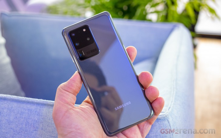
Now that we've hopefully gotten the point across on size well enough, we should talk about the S20 Ultra's redeeming factors in that regard. There is, of course, the massive 5,000 mAh battery. Most other points have to do with design and especially its continuity. Its overall shapes and curves both look and feel very familiar. Samsung has keenly leaned into what is now its very well-refined "glass sandwich" formula yet again. Thanks to that, the S20 Ultra provides a very snug and confident in-hand feel, despite its proportions. Weight distribution could use some work but is far from horrible. Especially considering all the new camera hardware the Ultra is lugging around in one of its top corners.
One potentially important note on the curvy design, though, is the fact that it mostly borrows the newer, noticeably narrower metal middle frame approach from the Note10 series. The best way to appreciate it is to look at a side shot of the Ultra or any of the S20 trio, since these all share the trait, particularly around the power and volume keys. Out of necessity, that part of the metal frame has some extra surface area allocated. This might be particularly important for any current S10 of older generation Galaxy S users, looking for an upgrade.
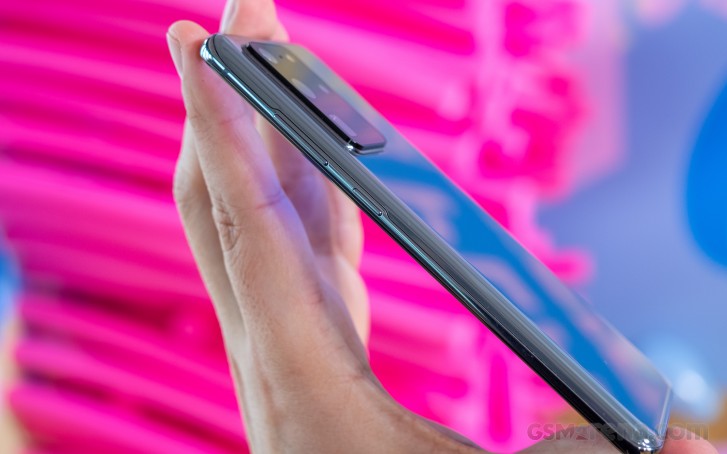
In place of the wider metal frame they might be used to, the S20 family, similar to the Note10 one, has more sloping glass. Particularly the back panel has been elongated and slopes further. If you haven't had the chance to experience this relatively newer design yet and us pointing it out raises some concerns, we can offer a few words of encouragement. After a brief period of actual daily use on a Note10 unit, we quickly got used to the thinner metal slivers. Those also provide just as good and confident of a grip. Quite important, since the rest of the curved glass surface on the S20 Ultra is just as slippery as you would expect.


Samsung Galaxy S20 Ultra hardware tour
In terms of controls and placement, we are happy to report that the S20 trio consistently offers a familiar, sensible and experiment-free setup. Power and volume keys on the right - surprisingly well vertically positioned on all three S20 models, obviously accounting properly for the difference in height. On the left side - a gorgeous, minimalistic, undisturbed bezel. No Bixby key, or arguably misplaced power button. Although both of these were pretty clearly dead and buried, going by some of Samsung's other recent phone releases, we are still relieved to officially confirm their absence.
On the top side - a hybrid dual SIM, plus microSD card slot, alongside a secondary microphone. And on the bottom - Type-C, speaker and the main mic. That's one of a pair of speakers since the entire S20 line has a stereo speaker setup. Clean, simple, familiar, predictable - we like it and the same will probably be true about the millions of Galaxy S fans and existing users. At the end of the day, you don't want to experiment too much with the formula of your top-selling flagship line.
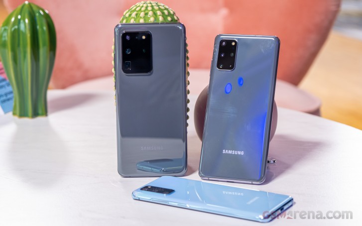
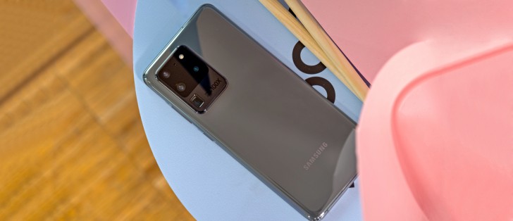
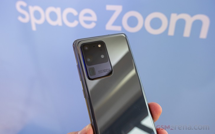
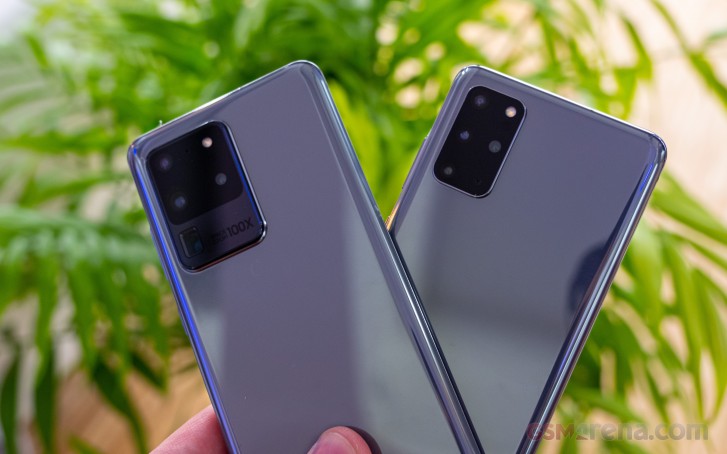
Hot on the heels of that bold statement, we just have to discuss the huge black slab that is the S20 Ultra's new camera module. Getting some obvious points out of the way first - yes, it is unusually large in person and yes, it does look a bit weird. Also, in case you can't quite make its height out from the photos - it protrudes a lot. More than the respective humps on the S20 and the S20+. As far as wobble on a flat surface is concerned, the extra width of the camera assembly on the Ultra does help a bit, compared to the S20. Not all that much, though. We would still, very much, recommend a nice thick case to flatten that out.
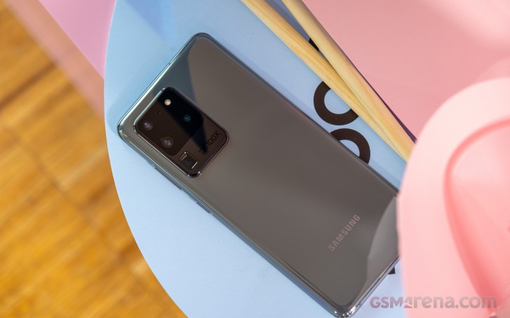
Before we get into the camera modules themselves, we do have a few more comments on the design of this area on the S20 Ultra. First a couple of positive ones - Samsung did a fairly good job with the black glass finish, hiding the different hole and lens sizes relatively well. Everything is nice and as symmetrical as possible too. However, we can't help but wonder why the entire surface isn't one uniform color. Instead, the area housing the four traditional cameras is one shade and the extra space for the horizontally mounted periscope - a distinctly different one. It kind of draws unnecessary attention to what is already a very distracting and arguably overbearing design element.
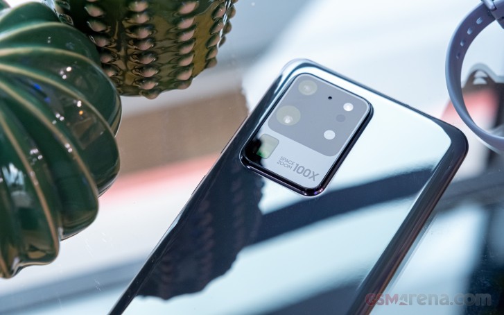
Also, the "SPACE ZOOM 100X" actual text, next to he periscope just seems tacky and unnecessary. We really thought we had left the years of camera specs, stamped on top of the actual camera behind us at this point. We get that it kind of fills in what would otherwise be empty space, but did it really have to be exactly that.
Camera
Now we are getting into the real meat of the S20 Ultra. Arguably, the main reason to consider shelling out for the top-tier Ultra, instead of one of its siblings. The quad arrangement on this one shares its core functionality and intent with the S20+, but almost every camera module has been upgraded to a fancier and more potent one.
The 12MP, 1.4µm, f/2.2 ultrawide snapper is a notable exception. It is the same across the entire S20 range. In fact, on the surface, at least, the Galaxy S10 Lite, Note10 Lite, as well as the A71 and A51 seem to all feature a very similar module. Whether or not it is exactly identical, though, remains to be seen under closer investigation.
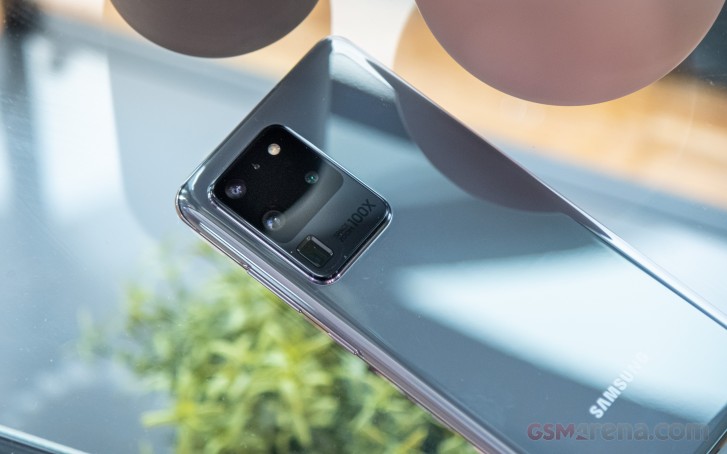
Traditionally, Samsung has the habit of leveraging its ultrawide for video capture. However, as the keen-eyed among you will definitely notice, 12MP is not enough to do 8K - a feature definitely on the S20 Ultra's PR shortlist. That task falls upon the shoulders of the new 108MP main camera. Since that is the case, we will look into exactly how this relates to other S20 Ultra video features, like Super Steady. Where and how it works and just how well. That would be in our full review, of course.
Speaking of the 108MP camera, we do already have a few early observations to share. Beyond the fact that it produces incredibly sharp images, both in its binned 12MP default mode and in full native resolution. It uses a Bayer pixel arrangement, but not of the quad variety, which has become so common lately, with an influx of 48MP and 64MP sensors. Instead, Samsung has a Nonacell setup - 9 pixel squares get their light and color data bundled-up digitally into a single "virtual" pixel. One that, using straight math alone, Samsung calculates at 2.4µm in size (0.8µm for a single actual pixel on that sensor). Of course, that's not really how the technology works, but the Bayer approach still has undeniable benefits when it comes to capturing more precise color data. Paired with a pretty bright f/1.8 lens and OIS, we expect big things out of Samsung's new snapper.
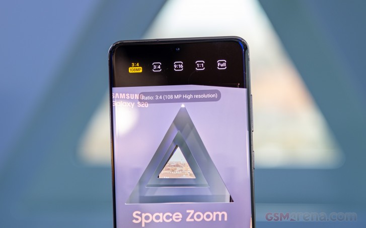
Naturally, you can expect plenty of parallels and comparisons to be drawn between this Samsung Nonacell camera and the one found inside phones like the Xiaomi Mi Note 10 and Mi Note 10 Pro. While somewhat justified, we don't necessarily feel like that comparison is appropriate on all levels. We still need to dig-up the entire story when it comes to the inner-working and "tricks" Samsung uses to leverage the main S20 Ultra snapper. There are definitely differences worth investigating and considering.
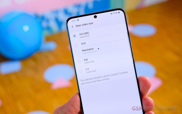
For the time being and for the relatively brief time we had to spend with the S20 Ultra's 108MP cam, we can still, at least, offer some detail on how 8K capture works. It is captured using a very tight crop from the full 108MP sensor. And, from what we managed to gather, at least, Samsung seems to be cropping straight from the full 108MP, without binning the individual Bayer pixels. Of course, we understand that there would be no way to bit these by a factor of nine like the sensor is designed to do since the resulting resolution is far from enough for 8K. We did consider the possibility of some sort of "half-way" binning in groups of three pixels, but we really can't find anything to back that speculation up at this point. We'll look into it once we get our hands on an S20 Ultra unit, though.
What we can say with certainty already, is that 8K looks amazing on the QHD+ panel of the Ultra itself. Plus, thanks to the extra power of the Snapdragon 865 and Exynos 990 and their respective ISPs, the S20 Ultra can do 8K at 24fps - an important jump up from the 15fps implementations we have seen on phones in the past. You can also snap individual stills while recording 8K, just like you would with any other resolution and end up with a massive and impressive 33MP photo.
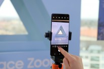
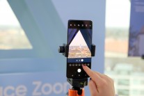
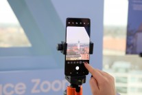
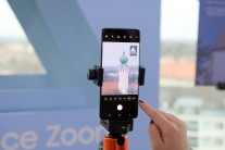
When it comes to zooming, Space Zoom is going to be the main focus of pretty much every S20 ad campaign out there. Samsung breaks it down into two different, market-friendly segments, shared among the entire S20 line - Hybrid Optic Zoom and Super Resolution Zoom. Where the S20 and S20+ use more conventional zoom cameras to pull of 3x and 30x zoom, of the two respective types, the S20 Ultra can do 10x and 100x.
The Ultra has its new 48MP, 0.8µm, f/3.5, OIS-enabled periscope camera to handle that. A module that got just as much attention and hype in the rumor mill, leading up to the S20 Ultra launch, as the 108MP one. We can understand why, since results look really impressive. Well, we wouldn't quite rely on Space Zoom on its highest 100x setting since quality definitely ends up on the diminishing return end of the scale, but 30x on the S20 Ultra looks awesome. A 4x zoom level looks sharper still and we do have a hunch as to why.
Looking at the zoom scale presets themselves, plus asking around some officials at the event as to what the "Hybrid" part in "Hybrid Optic Zoom" actually stands for, we think we mostly figured out the inner-workings. Apparently, the periscope camera natively offers a 4x optical zoom, which is then getting an AI-assisted digital bump up to 10x. The latter just sounds more pleasing from a market standpoint. The same logic likely applies to the 100x mode. Which, to reiterate seems to be pushing the digital zooming algorithms a bit too far. Even if you are not likely to start posting 100x photos regularly to your social accounts, though, the results Samsung is achieving at this zoom level, including detail, OIS and AI-aided anti-shake stability are nothing short of impressive.
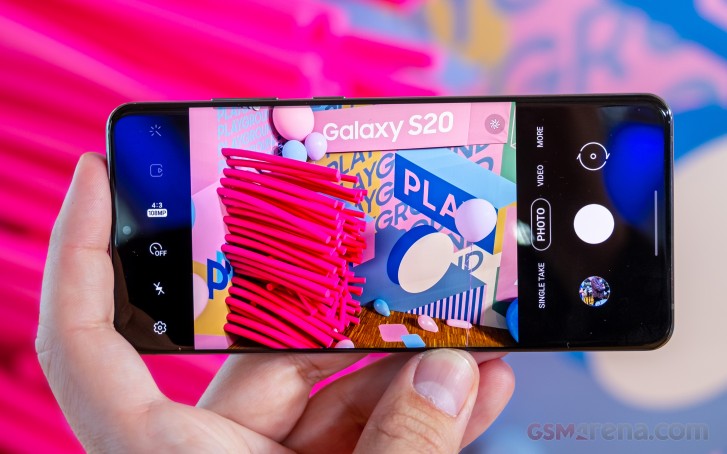
Last and probably least, just like its S20+ sibling, the S20 Ultra has a DepthVision sensor. Its purpose is pretty clear - to make for a symmetrical layout with no nasty holes, like on the vanilla S20. Joking aside, it is there for extra depth info for portraits and bokeh effects.
On the software side of things, the S20 Ultra ha s few new features and improvements to flaunt as well. Super Steady video mode, for one, should be improved. Then there is Night Hyperlapse - a new video mode that, as the name suggests, can produce clips with awesome light trails. AI Best Moment also sounds nice on paper. It is also pretty aptly named and is an algorithm that tries its best to snap and sort out the best moments it can, complete with as many smiles and non-blurry faces. It also takes into account things like colors and contrast in photos. It can even auto-apply filters for the best possible look. It mostly worked during our brief hands-on test.
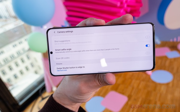
The selfie camera has a nifty new trick that should combat most of the backlash Samsung initially received from some of its more perceptive users when it decided to disable the ultrawide mode on its selfies by default. Now, if the phone detects more people outside of its default cropped frame, it will automatically toggle wide mode, thanks to Smart selfie angle.
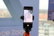
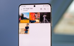
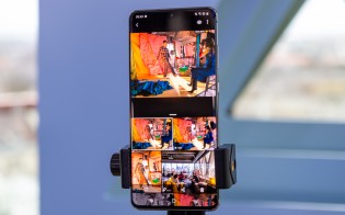
Single Take, however, sounds like the single most interesting (see what we did there) new camera software trick. Not unlike a certain app that has been gaining popularity on Apple's latest iPhones, Single Take captures videos and photos from all back cameras simultaneously. It works with 2 videos as a minimum and a maximum of 10 photos and 4 videos. Capture time is capped at 10s for a single take. The idea here, beyond simply showing off phone hardware prowess, is to then offer all of the angles and media to the user in a convenient interface for a more "interactive" picture of the moment.
Reader comments
- Anonymous
- 26 Oct 2020
- ptP
Cortex- A77 samsung galaxy S21. Cortex A78 ?
- Anonymous
- 04 May 2020
- vGN
From next year the exynos chips will be more powerfull than snapdragon chips because of AMD gpu in their flagship chipsets, it will compete with more powerfull apple a14 chipsets
- Kendra Shields
- 26 Feb 2020
- pc7
I don't understand - why do they do this? Why not put SD chips in all the phones? I hate these Exonus chips.

