Samsung Galaxy S22 Ultra review
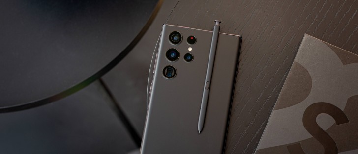
Design, build quality, handling
You're thinking it, and you may have read it on this very website several times already, in this article and also in previous ones, but we'll go ahead and say it once more - this looks and feels like a Note, even though Samsung chose to name it otherwise. Calling it the S22 Note wouldn't have hurt, would it?
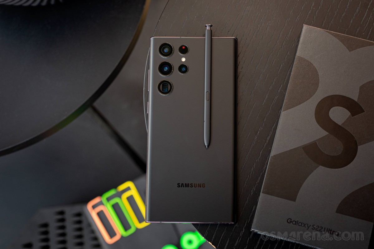
Indeed, the S22 Ultra has a very similar shape to the last Galaxy with a Note in its name, the Note20 Ultra, itself an evolution of previous designs in that lineage. Perhaps most characteristic of the Notes, the sharp corners are now found on this S handset, where more fluid curves are usually the norm.
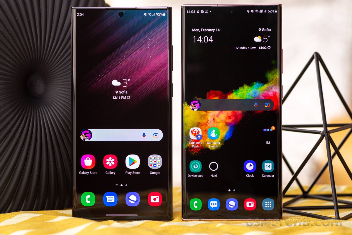 Galaxy S22 Ultra non-Note (left) next to the last Note, the Note20 Ultra
That said, the vanilla S22 and the S22+ have taken their own different path towards sharper edges and flat surfaces, reaching an almost iPhone-like state this year. But that's them.
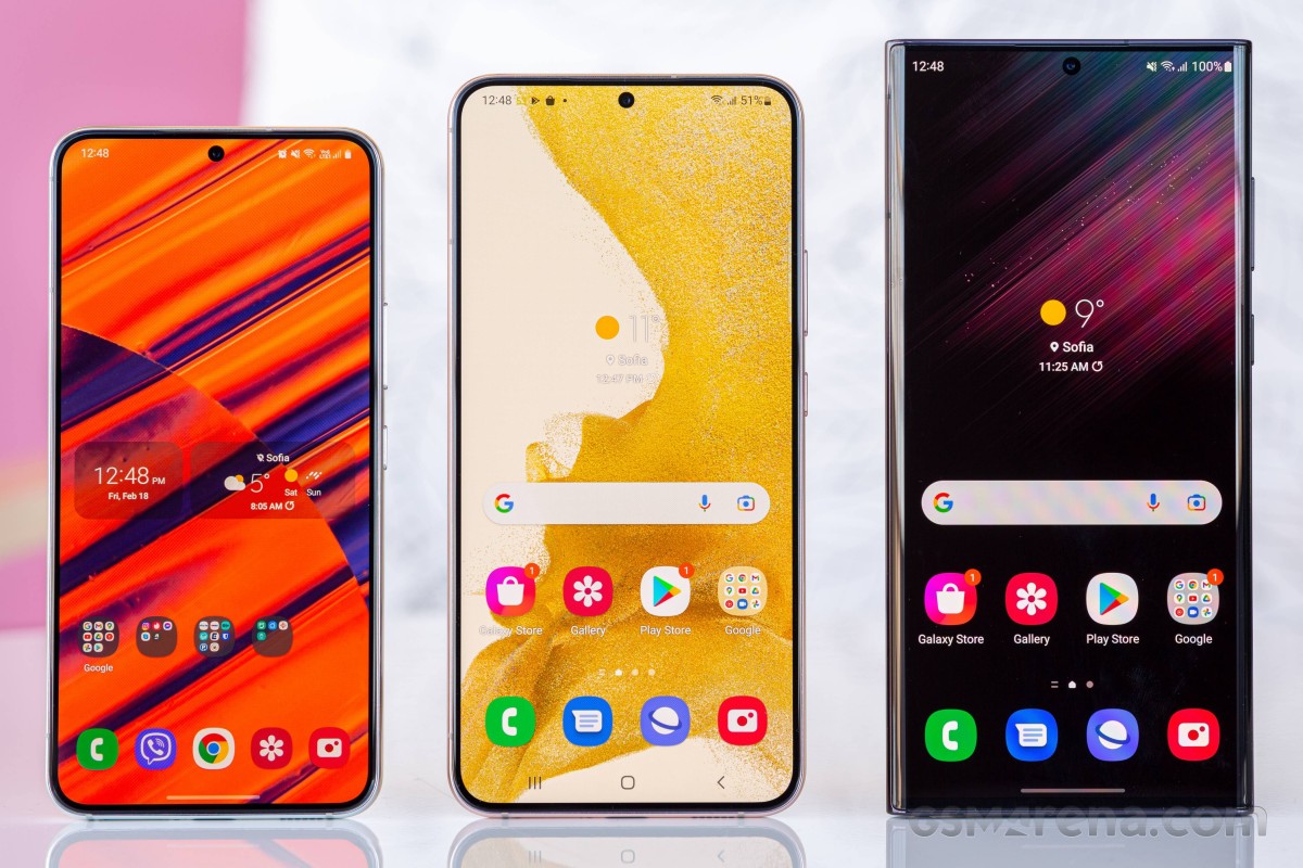
The Ultra maintains a distinct high-end Samsung look with unapologetically rounded side edges to that 6.8-inch OLED display - it's nothing like the S21 Ultra, which opted for more restrained curvatures. In a way, this here is the more logical approach, we believe, since the ultimate Galaxy should look like it. Not that last year's model didn't look premium; it just didn't flaunt it.
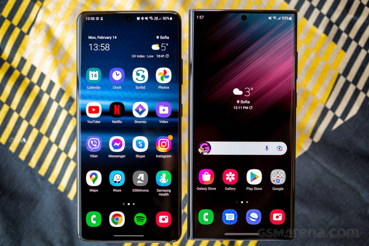
Protected by Gorilla Glass Victus+, the screen is slightly smaller than the one on the Note20 Ultra, but the difference is so minuscule as to be irrelevant. Comparing to the S21 Ultra, the S22 Ultra actually offers a smidge more viewable area despite the identical diagonal, thanks to the new phone's more squarish, Note-like aspect ratio.
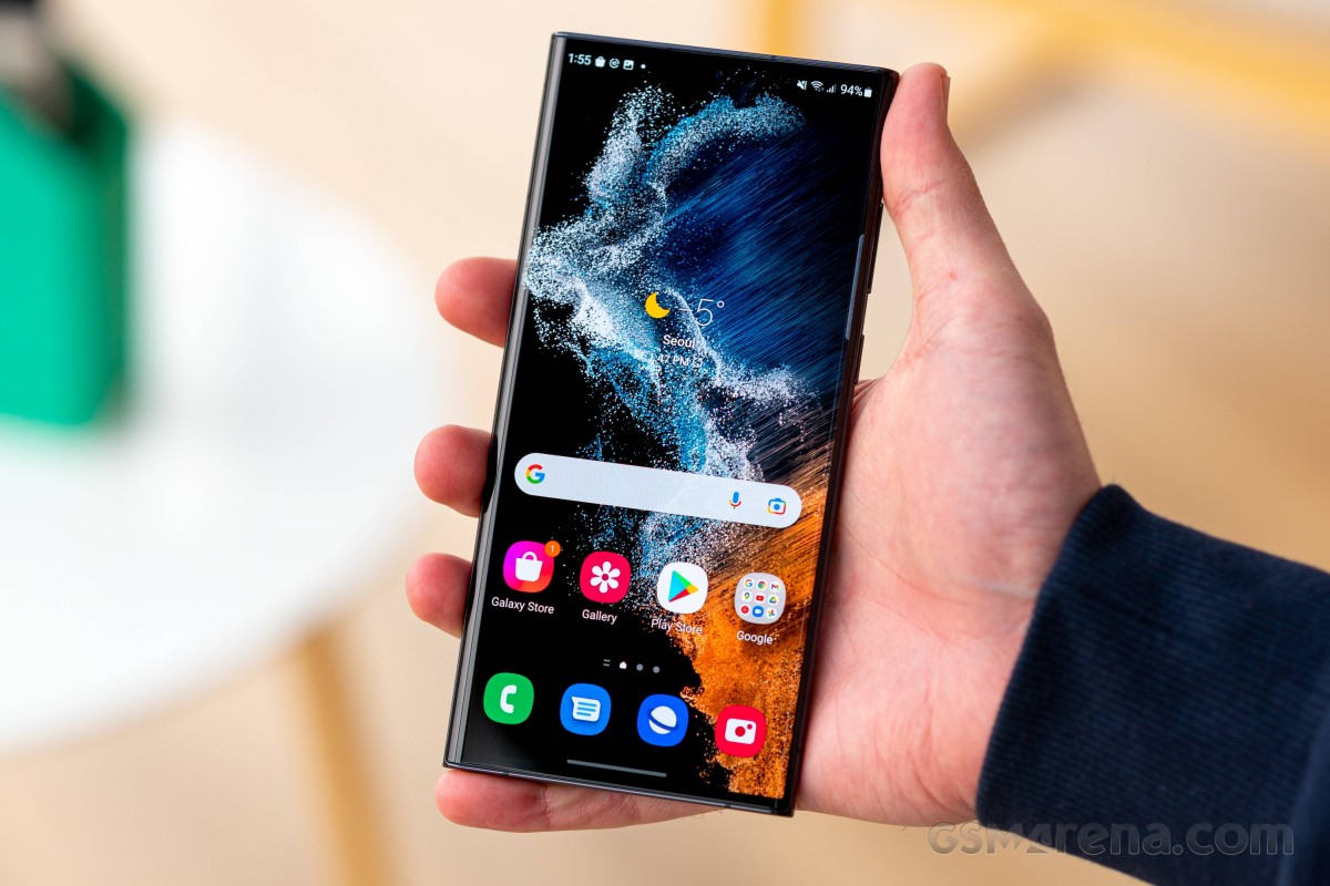
The S22 Ultra weighs as much as the previous generation, give or take a gram, and the 228g number marks an increase over the Note20 Ultra by some 20g. A long-time user of the last Note at the office says the new Ultra is tangibly heavier, so we'll go with his assessment. However, that doesn't make it an outlier in the large-size flagship segment - the iPhone 13 Pro Max (240g) and the Mi 11 Ultra (234g) are even heavier still.
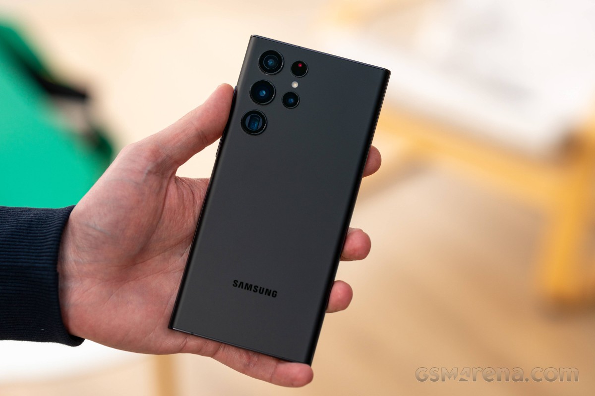
Despite the S22 Ultra's overall Note-ness, there is still a hint of continuity coming from the S21 Ultra, and we find it in the finish of the back panel. Now upgraded to Gorilla Glass Victus+ (from the Victus non-plus of yesteryear), the back maintains the same frosted matte surface, particularly appealing on this black version here.
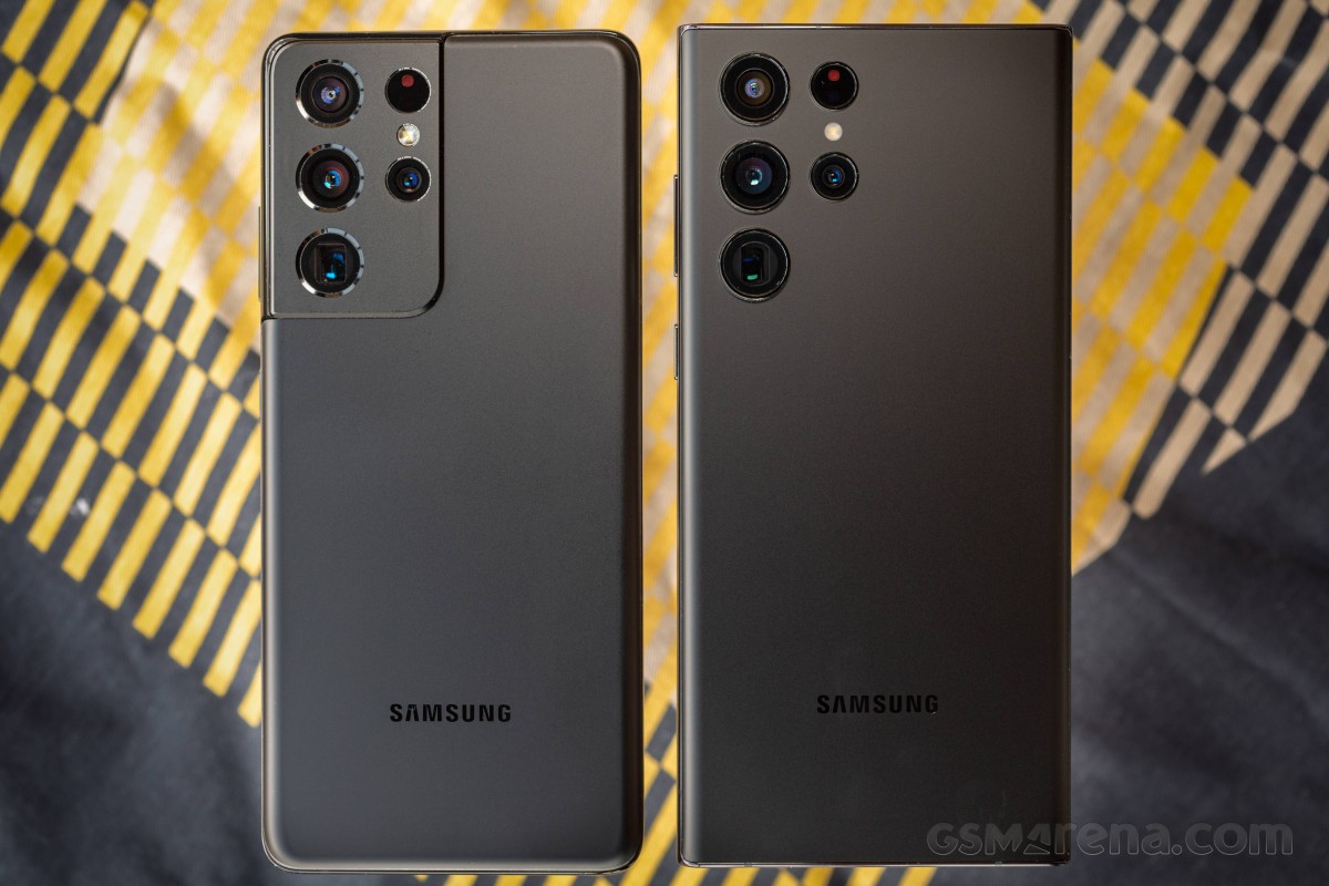 The back panel finish has been carrier over from the Galaxy S21 Ultra (left)
There's a total of seven color options, four of which are available from carriers and retail outlets while the other three are exclusive to Samsung's official online store, for countries where that's a thing. The mainstream variants include our Phantom Black, the Phantom White that some say is the best looking one (this reviewer), and Green and Burgundy (which is similar, yet different than the Note20 Ultra's hero Mystic Bronze).
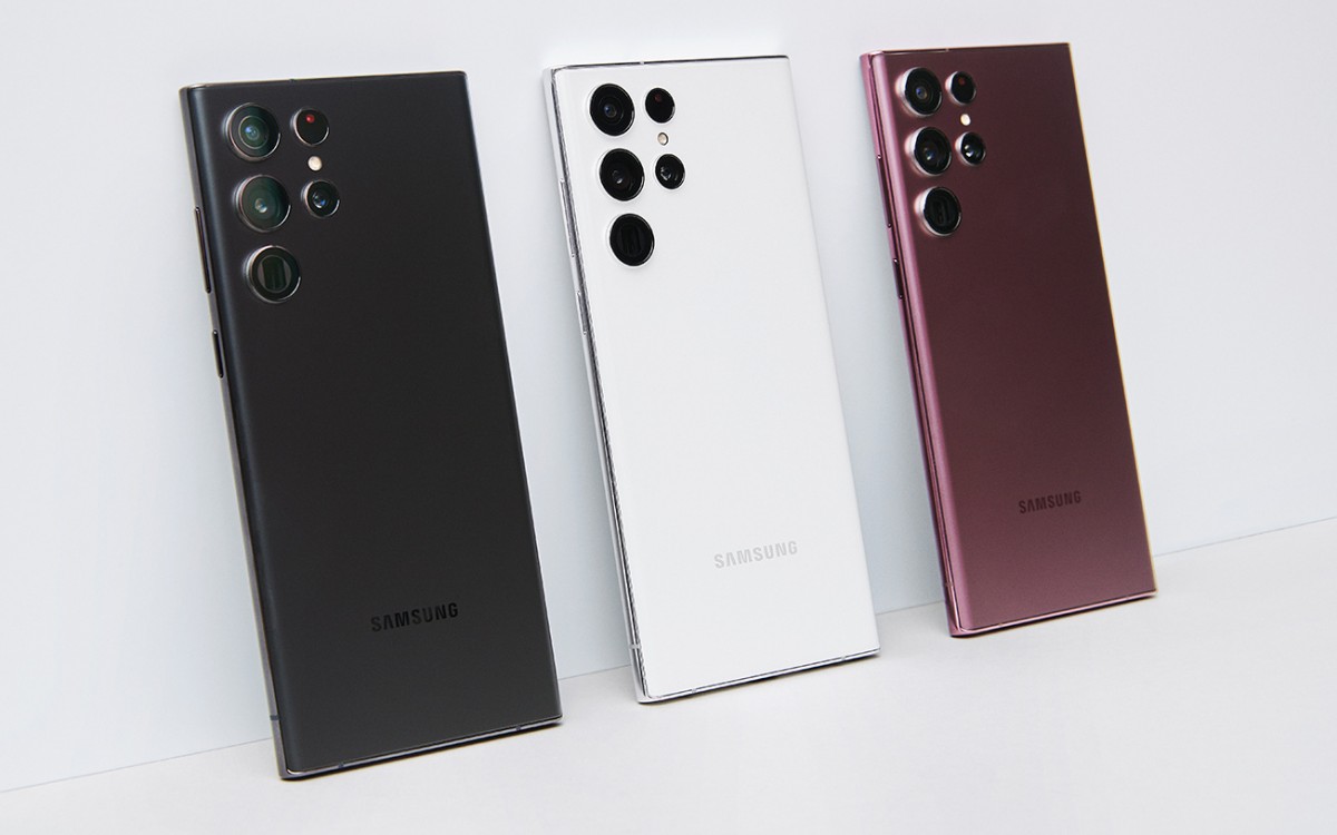
The online exclusives go by Graphite, Red, and Sky Blue, all of which have their exposed Armor Aluminum in black, a rather appealing combination.
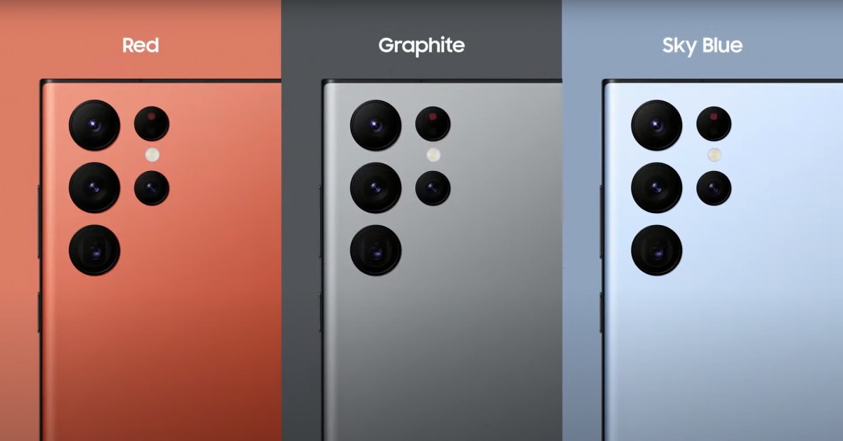
While we're loving the looks, we're less enthused about the panel's grippiness, of which it has very little. If you're the case type of person, that'll be a non-issue, but then you won't be getting that matte (black) goodness.
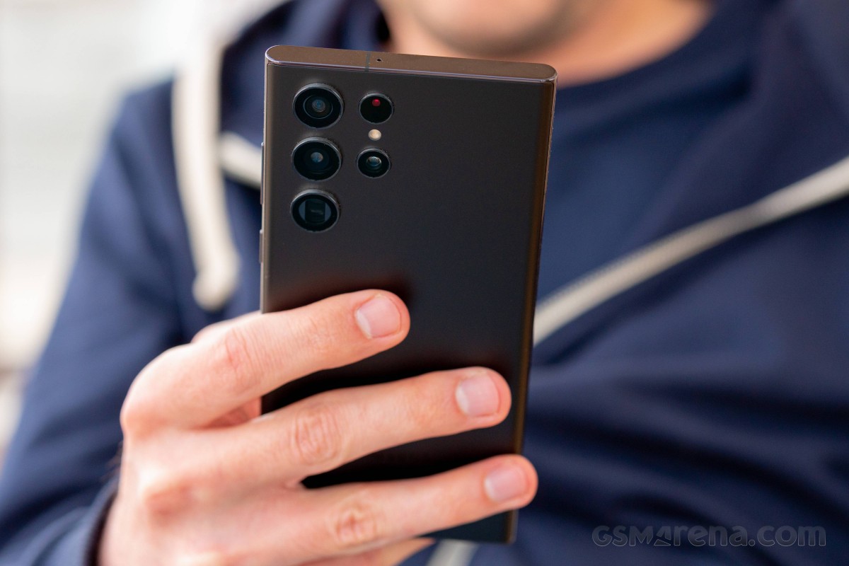
For all the traits inherited from this phone or another, the S22 Ultra has a camera setup that's styled like no other Samsung's. You get five separate raised rings - three large ones (primary, ultrawide, and long tele) and two smaller ones (short tele and the laser AF bits), and while the arrangement is all its own, the Ultra does resemble a major competitor in the design of its camera lenses. And, dare we say, it's even worse than those iPhones at harboring lint in between the rings. Urgh.
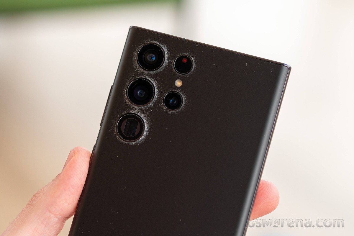 Shown here is a rather extreme case which we deliberately worked to produce for dramatic effect
The separated cameras also make designing a case for the S22 Ultra a tall order, and we're yet to see one that we love. You can say we're not fully on board with Samsung for the new camera cluster styling, and even if last year's Ultra wasn't universally liked in that area, we're now inclined to say it's less of an eyesore.
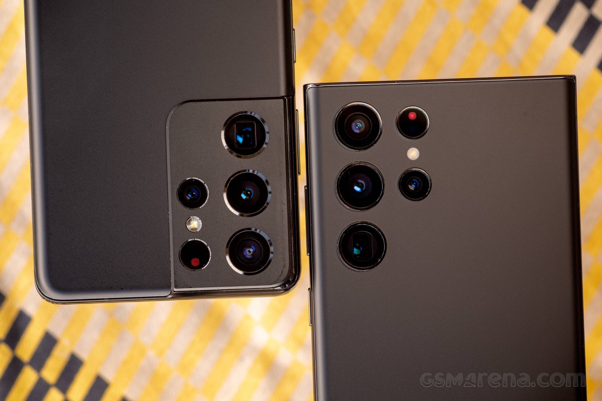 S21 Ultra (left) looks better, doesn't it?
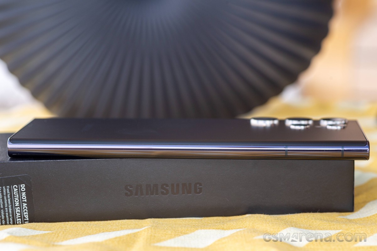
Another change this year, one specific to this Phantom Black colorway we have for review, is the tint of the frame. Properly black on the S21 Ultra, the rails on the S22 Ultra have a splash of dark purple mixed in. While some may appreciate having some color to go with the black everything, we tend to prefer the no-nonsense approach of last year's model.
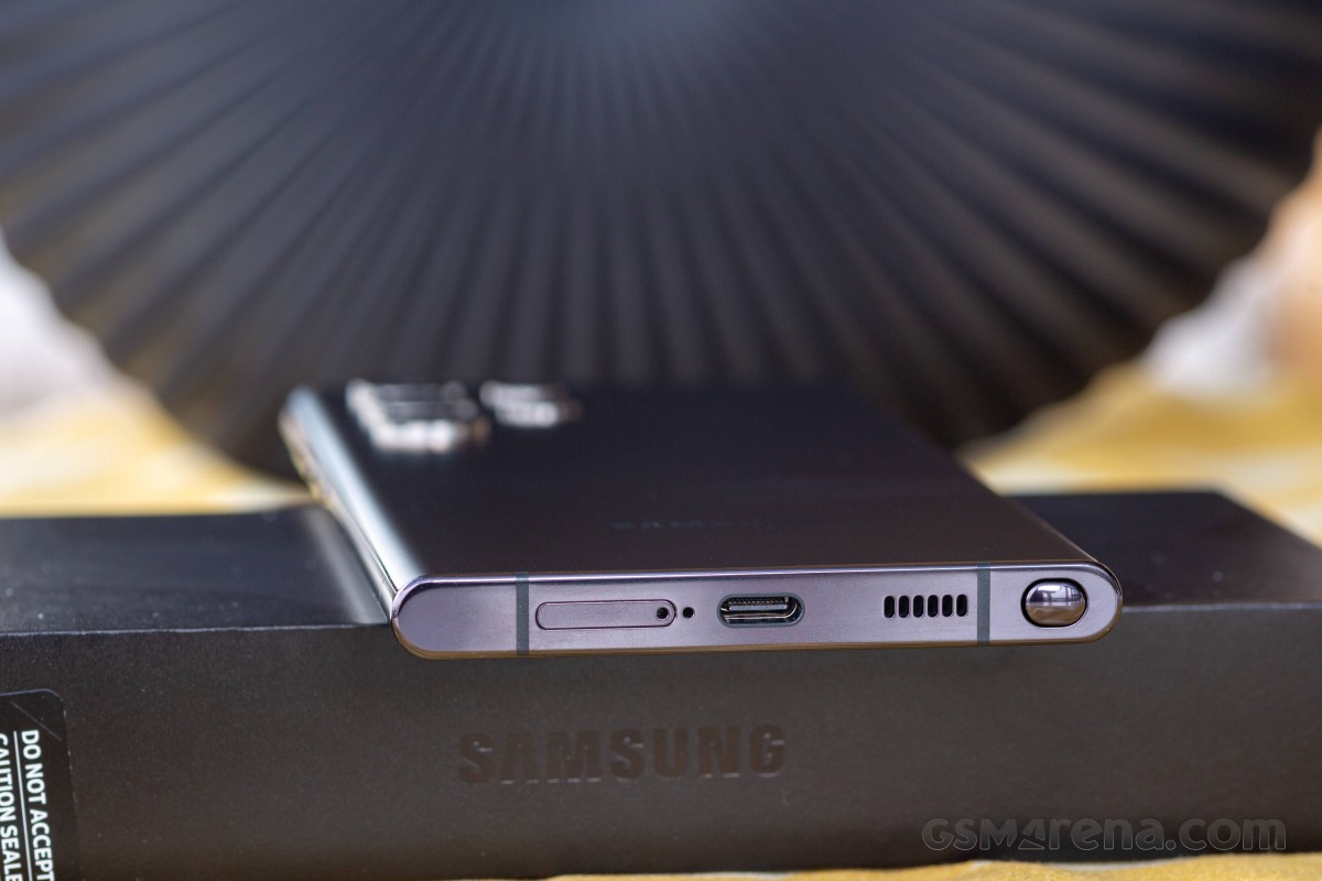
That frame is now made of what Samsung calls Armor Aluminum, an in-house developed aluminum alloy the company introduced with the latest generation of foldables. At that point, it was touted as the strongest aluminum used in smartphones, which it may very well still be, but it's no steel.
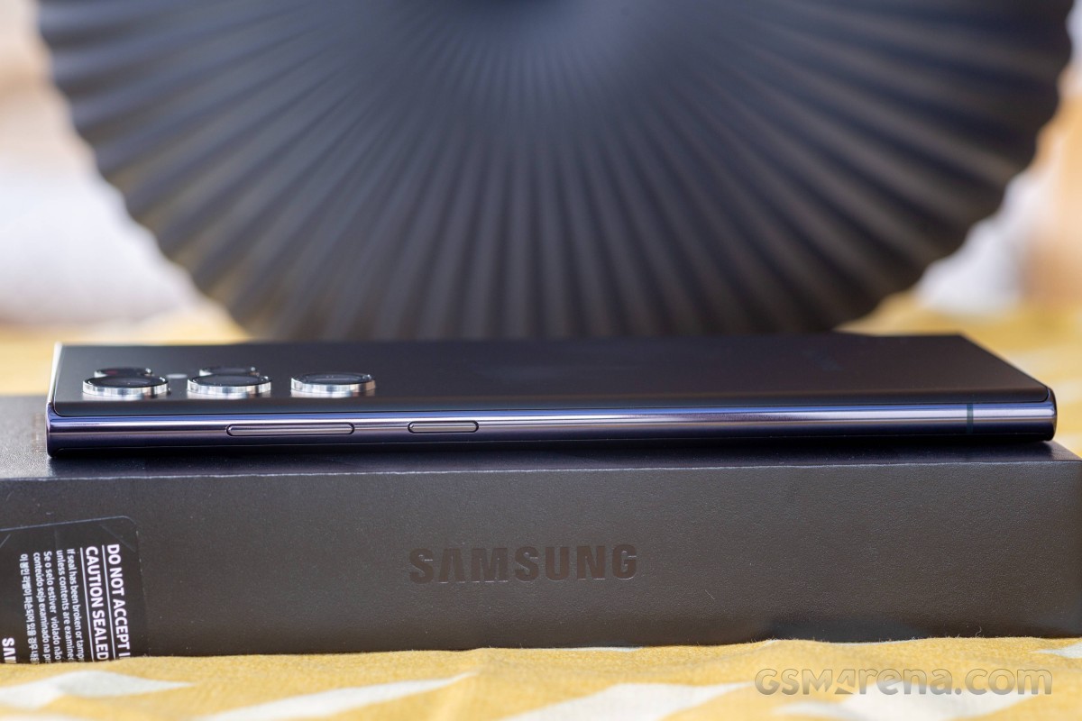
The overall control scheme is like on any other recent Samsung and includes a power button and a volume rocker on the right (both made from recycled recovered fishing nets, yay for the environment).
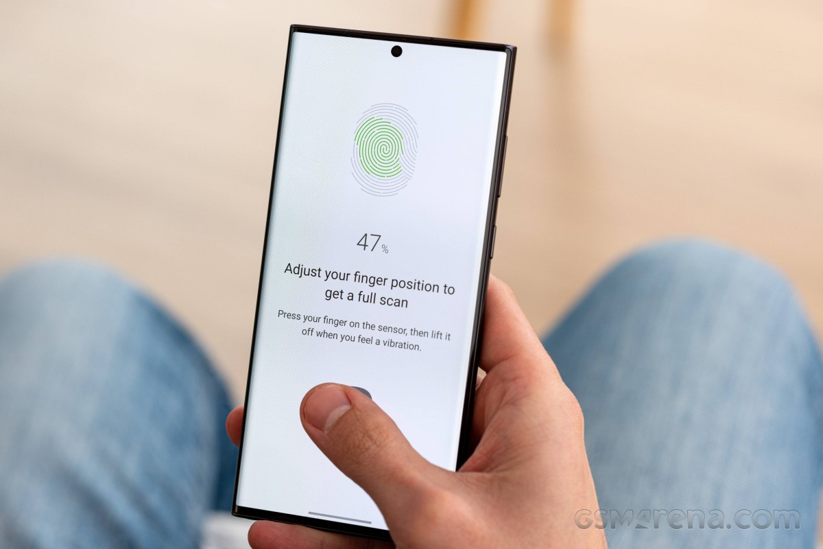
There's a fingerprint reader embedded underneath the screen, and, as is the norm with Galaxy flagships, it's of the ultrasonic variety. While initial efforts were somewhat hit or miss, things got notably better last year with the newer, larger sensors, and we're quite happy with the implementation on the S22 Ultra in terms of speed and reliability (and not blinding you at night).
The usual bits are in the usual spots too - card tray, mic and primary loudspeaker are flanking the USB-C port on the bottom, the secondary mic is up top, the earpiece is behind a front-firing slit where the top of the display glass meets the frame above the selfie camera.
Speaking of the card tray, we aren't one bit surprised that the S22 Ultra offers no option for storage expansion - that's become the norm. But it's here that we'll mention that the 128GB base storage on a phone of this caliber feels a bit cheap on Samsung's part - it should have been 256GB.
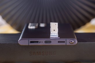
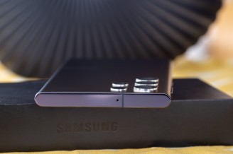
Card tray does not take microSDs • Mic up top
You'll note the gray seal that helps the card slot remain dust- and water-tight - the Galaxy S22 Ultra carries an IP68 rating, so it should survive under water down to 1.5m for 30 minutes. Apple, for one, goes above and beyond this minimum required by the standard and offers claimed protection down to 6m under water for its current generation phones.
Then again, the S22 Ultra does have an S Pen going 10.5cm deep into a silo inside the phone and is still rated for to be protected against submersion. That can't be an easy feat, even if it's not the first time they've done it.
S Pen
The S Pen - for the first time in a Galaxy S series smartphone. It's perhaps this one single sentence in the promo materials that is the reason why the phone isn't called a 'Note', a moniker it rightfully deserves (in case you've missed our bitterness on the matter).
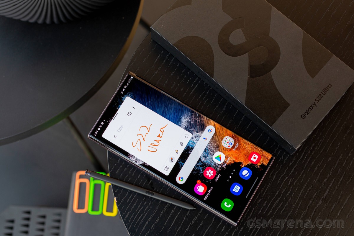
The stylus is otherwise the exact same unit you'd find inside the Note20 and Note20 Ultra - the SKU is probably different because of the new color, but the dimensions are identical. We say new color, singular, because all the mainstream colors of S22 Ultra get the same black S Pen with only the clicky cap on top matching the respective colorway of the phone. The online exclusives do have S Pens housings to match the body color though, with black caps to go with their black frames.
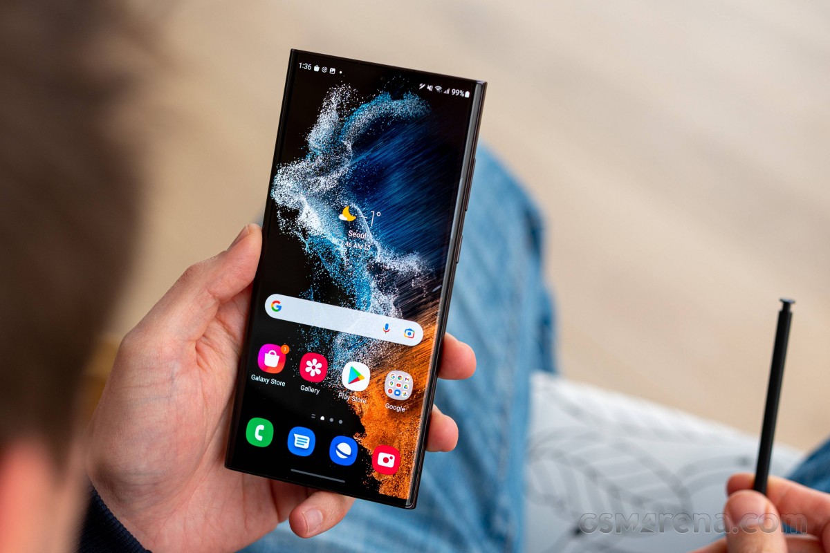
The internals of the S Pen are very likely identical too, and it's still an 'active' stylus in that it can do gestures and button actions without being in immediate proximity to the phone. The one on the Note20 Ultra was powered by a lithium titanate battery, and so is this one (probably, Samsung doesn't specify it). It communicates with the phone over Bluetooth Low-Energy, the stylus can be used for more than just writing, which is not really news - the functionality debuted on the Note9. But now is the first time it's available on a Galaxy S smartphone, mhm.
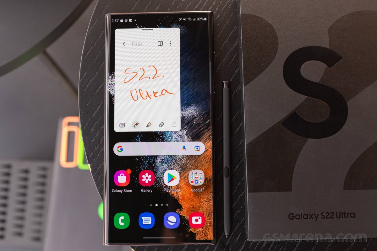
We should probably point out that if you've missed the last Note generation, you might be surprised to find the S Pen on the 'wrong' side of the S22 Ultra - it's on the left when the handset is facing you. We weren't entirely sure what brought about that change with the Note20 generation, and speculation pointed to button placement clashing with S Pen placement, and buttons had to go on the right, so the S Pen had to go in the left. That's how things are on the S22 Ultra as well.
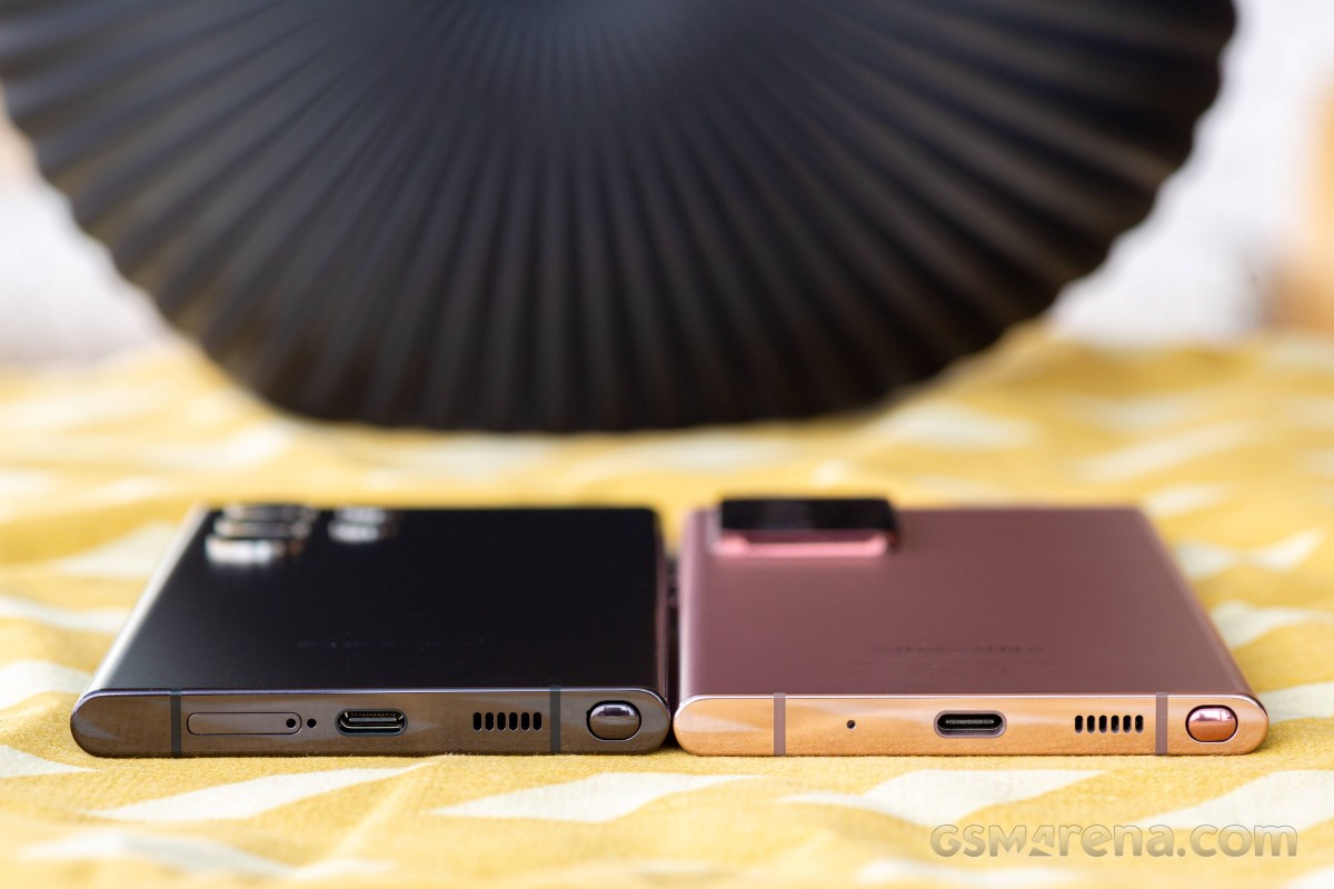 Two Notes with the S Pen on the wrong side - S22 Ultra (left) and Note20 Ultra
Reader comments
- jpn4
- 09 Apr 2025
- yJt
No issues, S22 Ultra is a great phone.
- Xeno-xt
- 07 Apr 2025
- MeP
I am gonna buy phone in a week so does s22 ultra get issues after some use like dots or shades appearing in screen and battery is it true or just rumors should i go s21 ultra than s22 ultra
- Anonymous
- 05 Apr 2025
- XND
S22