Samsung Galaxy S23 long-term review
Updates
The Galaxy S23 received the update to One UI 6 based on Android 14 while we were using it for the purposes of this review. Samsung has once again been on a roll with delivering this major update to dozens of devices within weeks, and there's no other Android device maker coming even close to it in this regard. Sure, Google's updates go out sooner, but Google only supports a few devices. At the scale Samsung operates, its rollouts are still impressive, even if this isn't the first time we've seen such a quick turnaround.
That brings us to the general update talk. Samsung promises four major updates for its S-series phones, which means the Galaxy S23 will get Android 17 in late 2026. Only Google's recent seven-year update promise for its latest flagships surpasses Samsung's currently, and Samsung is still the best third party Android device maker when it comes to updates.


Current software at the time of writing
We're not just talking about major ones either. Samsung constantly sends out monthly security updates the way they're meant to be sent out - monthly. A lot of its competitors aren't. You also get the current month's update within that specific month 99% of the time, again, unlike what happens with some other Android device makers which are happy to give you, say, the November update in late December. Samsung isn't perfect, and it does stray from this general rule sometimes, but overall, if timely updates are important to you and you want an Android phone, get a Pixel or a Samsung.
One UI 6
One UI 6 introduces a new font, which we do like more than the previous default, but is otherwise still easily identifiable as One UI. It comes with a slightly modernized look which is welcome, but no one will confuse this for any other Android skin - or iOS. Samsung has recently been slowly iterating in terms of design both on the hardware front as well as in software, we assume in order to create very recognizable looks for both.
And it's succeeded in that realm for sure, but whenever strategies like this are employed there's always going to be talk about what is sacrificed to accomplish such goals. And in this case, it's definitely 'freshness' of design. One UI 6 doesn't look 'stale', but it's definitely not wow-inducing either - to anyone. This is definitely a deliberate choice on Samsung's part, so we hope the company has carefully weighed the pros and cons.
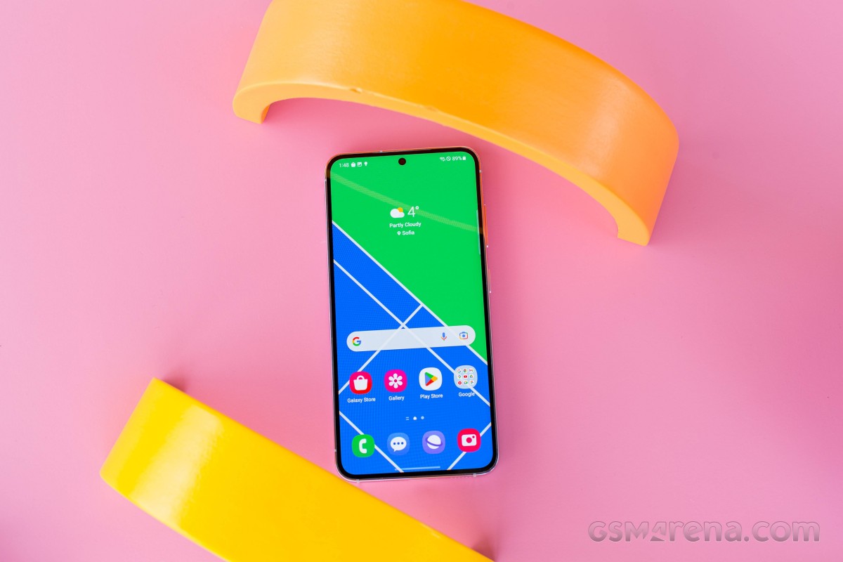
While we might complain about this, let's never forget that Apple gets away with exactly the same thing year after year, especially when it comes to iOS, which pretty much still looks as it did years ago, give or take a few small touches here and there. So it's rather clear who Samsung is trying to emulate here, and the huge upside to this strategy when it comes to software is that someone jumping from a Samsung phone running One UI 5 to one with One UI 6 will still feel right at home.
Settings, duplicates
Another thing that seems heavily influenced by Apple (or, perhaps, more generally, just the way of the mobile world these days) is Samsung's ecosystem play. But there is a huge difference in how these two companies go about achieving that. Unlike Apple, Samsung has to rely on Android, which means it has to have Google's Play Store on its devices, along with all the other apps Google mandates should be preinstalled on any handset that has that.
But leaving things there would only help Google's ecosystem play, so Samsung, as you probably know by now, also bundles its own app store and a bunch of built-in apps that are alternatives to Google's. This is not a new situation by any stretch of the imagination, it's been going on for years, so if you've ever used a Samsung smartphone before you're probably content with it.
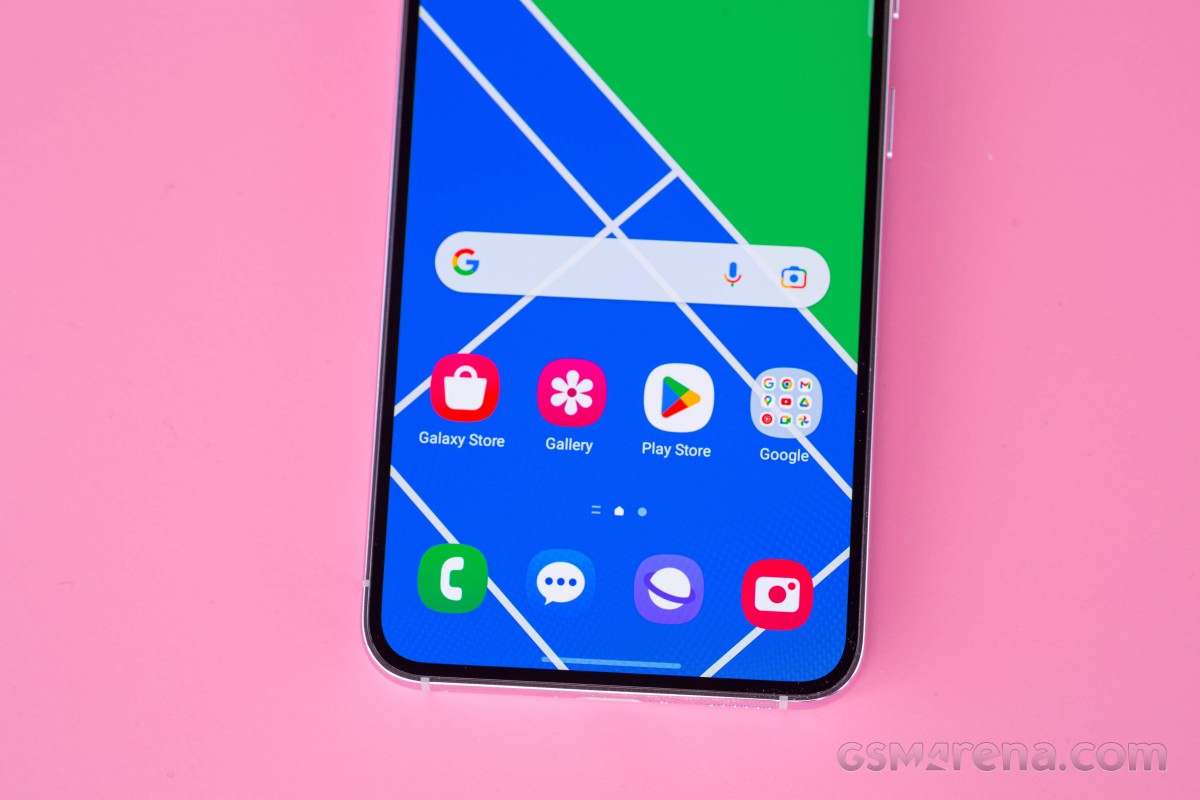
That, however, doesn't make things less confusing for first-time Samsung buyers. Samsung's apps all update through Samsung's app store, while Google's go through - you guessed it - the Play Store. Samsung's store has a lot of the same apps as Google's, and sometimes even updates them before the Play Store has had a chance to. It's pretty messy, and the fact that we're all used to this by now doesn't make it less so.
We have ranted a lot about needless duplication in the past, so we won't dwell on this for too long here, just know and keep in mind that nothing's changed on this front, aside from Samsung's texting app now using Google's RCS and overall being a weird hybrid of the old Samsung texting app and Google's own Messages.
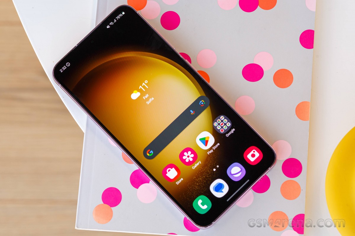
It works, and we're thankful for the lack of duplication on offer in this one case, but it only shows how great it would be to not have duplicates for others. Additionally, some Google apps that usually come preinstalled on other Android phones, like Google Calendar, aren't built-in on Samsung devices, so you'll have to go get it from the Play Store. Obviously, that's not a huge issue in and of itself, it just could be jarring for someone who's used other Android handsets and then switches to a Samsung like this one.
The Settings menu in One UI 6 is just as extensive and packed as always, but it looks 10% prettier now (in this reviewer's opinion, at least). There are still more options for more things in there than you may have ever imagined, so a lot of small things that could irk you can be tweaked to your liking. That's a huge plus for anyone who's into tinkering with various settings, although it could take even those people a good amount of time to go through everything.
At the other end of the scale, if you don't care about any of that and simply want things to 'just work', as Apple fans would say, you're mostly going to be fine. There could be a small thing here and there that isn't quite how you imagined it would be (or how it is on other skins), but, as we've already said, that's a small tweak of a setting away from pleasing you, regardless of your taste. So the S23 isn't fully in the 'just works' realm for everyone, but it's close enough that it's unlikely to annoy anyone.
Launcher
The launcher could take some getting used to, if you're not coming to the S23 straight from another Samsung. It still insists on scrolling horizontally in the app drawer, unlike literally every other Android skin out there, and sure - this makes sense in a way since it's exactly the manner in which the home screens scroll. We get that logic, but entering the app drawer requires a swipe up (unless you're one of those people who still use an icon for it). As such, it feels more natural to then keep swiping up to scroll vertically, the way everyone else does it.
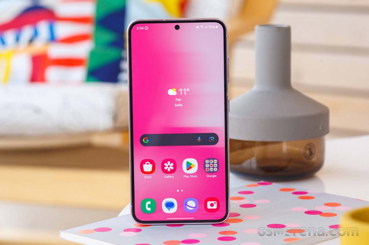
As is probably obvious from how we started the last paragraph, we're in the latter camp and would either like an option for how it scrolls, or an outright change. Alas, Samsung doesn't seem to want to - and since it's been like this for so long, we get that it doesn't want to confuse long-time Samsung users. But that's at the expense of new ones.
The usual final note about One UI's app drawer still applies - it has folders in it for some reason and, by default, it's not sorted alphabetically, again, unlike every other skin out there. The sorting issue is easily fixable with a setting that's readily available in the three-dots menu at the top right, but there's nothing you can do about Samsung's love of folders inside the app drawer.
These may or may not be niggles for you personally, however we always point them out because they are pretty important points of differentiation compared to the competition. Otherwise, Samsung's launcher is very good and does the job well, although it's weirdly not as customizable as almost everything else about One UI is. It hasn't received a new feature in probably years, so maybe it's time? Regardless, the very good news is that it's been fully devoid of any bugs throughout our use of the S23. Most launchers these days are, but it's still good to see and we thought we'd acknowledge that.
To the left of your leftmost home screen you can find the Google Discover feed, which is now the only option. You used to be able to pick Samsung Free, which was One UI's alternative, but not anymore. We can't say we're sad to see it go, not at all, but if you used it then you should know it's gone. The menu for selecting which "media page" to add is thus now pointless, since it was clearly built to show you more than one option, and yet now it only has one. Maybe someone at Samsung HQ should look into cleaning it up a bit.
Recents, Dark mode, Wallpapers
The Recent apps display is horizontally scrolling like most are these days (Samsung seems to only do things differently sometimes, other times it sticks with where the market as a whole is at, like in this case). A great feature that's been in One UI for a while but still wows us every day is the row of four suggested app icons at the bottom. It's a great use of what would otherwise be empty space (or, even worse, space wasted by pointless 'clear all' buttons and the likes).
These are suggested based on your usage, and depending on which Samsung phone we're talking about, we found that, for us, they are accurate at least 85% of the time - it was more like 90% on the S23 specifically. What we mean by that is that when we enter Recent apps, 90% of the time the app we were going to switch to was to be found within those 'suggested apps' icons. That greatly improves the speed of multitasking in this way and we still highly appreciate it. It's a small but useful thing we've used dozens of times each day.
The Dark mode in One UI 6 isn't changed from 5.x, it's still basic but gets the job done. You don't get any darkness settings, you can just turn it on and off and schedule it to either come on at sunset and turn off at sunrise, or based on custom hours. Additionally, there's a "Dim wallpaper when Dark mode is on" toggle that's in the Wallpaper and style section of settings. That's it.
Speaking of wallpapers, Samsung took Google's automatic theming based on wallpaper colors and Samsung-ified it with plenty of "Color palette" options. For each wallpaper, you get a few different palettes to choose that are based on its colors, but if you don't like any of them, you can always opt for the "Basic colors" and go with that. On top of all this Samsung still has a theme store as part of its app store, so the options for customizing the UI's looks are pretty much endless.
Gestures, Bixby
Gesture navigation works perfectly on the S23, we didn't encounter any issues with the Home gesture triggering a scroll inside the app we're in before finally taking us to the home screen, as we did on the Galaxy A54 that we reviewed long-term recently. As we said in that review, we assume this means Samsung's interpretation of gesture navigation needs a lot more resources than any other Android skin and so it works well on high-end devices like the S23 but is stifled by lower-end chipsets like the one in the A54. That's a shame and a weird idiosyncrasy of One UI since we've never had a similar issue on any other skin.
You can get rid of the white pill bar at the bottom if you use gestures to navigate the UI, and even when you do that, you can still quickly switch between apps by swiping across the bottom of the screen. That's the best of all worlds in this reviewer's personal opinion, and not an option you have anymore in MIUI, for example. As we already mentioned, the navigation gestures work great, but if for some reason you have some issues with them while using a case, there's a sensitivity slider that you can play with. For the S23, we liked this in the second highest position, but of course you may have a different preference.
Speaking of gestures, there are more that you can use in One UI, and they get an entire Settings submenu for themselves: Motions and gestures. This is where you have some options that you could find quite useful, like walking the screen when you pick up the phone (though this reviewer finds that rather annoying so kept it off), double tapping to wake and turn off the screen, muting incoming calls and alarms by turning your phone face down or putting your hand over the screen, swiping the edge of your hand across the screen to take a screenshot, and, in our opinion, the most useful of all - "Alert when phone picked up".
This will gently vibrate when you pick up the phone if you have a missed call or message. Thus, if you don't use the Always On Display, you will instantly know you have a missed call or message even before the screen turns on (unless you have "Lift to wake" also on, but you get the point).
Another gesture that you might enjoy, and one that's not specific to One UI, is swiping diagonally from the bottom left or right of the screen to access Google Assistant - this seems to be imposed by Google since it's now in practically all skins. If you don't like using "Hey Google" to activate the Assistant, this is, in our view, the second best option. It doesn't interfere with any other gesture and gets you there quickly.
Speaking of assistants, Bixby is still present but you can thankfully 100% ignore it, that is, if you go into Side key settings and switch up the default for long pressing the power button, which still takes you to Bixby. If you change this to the power menu showing up instead, you can use your S23 forever without ever encountering Bixby, and that might be a huge plus in your book. On the other hand, if you want a lot of Bixby in your life, that's also an option, in true Samsung style.
Reader comments
- Karl
- 01 Sep 2024
- E4q
Where is it?
- Lt
- 27 Aug 2024
- pdX
Everyone complaining about fingerprint reader. I am using cheap protective glass, and have registered both my thumbs two times each. And it is ok. Sometimes it gets unrecognised, but it is same with all the phones i had.
- Vardy
- 28 Jun 2024
- anJ
It's already there!


