Samsung Galaxy S4 preview: Take two
Take two
This article is outdated. We have already published a full review.
Design and handling
The Samsung Galaxy S4 design is the part that has changed the least compared to the Galaxy S III. The smartphone uses the same Hyperglazed finish, on account of which the predecessor was bashed for feeling like a plastic toy rather than a flagship proper. And the Galaxy S4 will most likely receive the same criticism. After all, it doesn't come anywhere near the premium feel of a Sony Xperia Z, let alone the HTC One.
This is not to say though, the Samsung Galaxy S4 looks worse than its predecessor. The new texture gives it a more serious and stylish look, while the improvements to the design also contribute to the overall appeal. The slimmer bezels leave more space for the brilliant screen (more on it later), while the slimmer body has a more high-end vibe. We are positive too that many will appreciate a black paintjob.
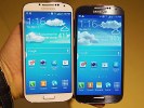
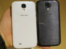
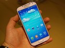
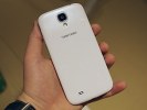
The new pattern and the thinner bezel make the Galaxy S4 prettier than its predecessor
The size of the Galaxy S4 is a marvelous achievement, which should not be overlooked. The smartphone is the exact same height as its predecessor, but is 0.8mm narrower, 0.7mm slimmer and 3g lighter, while featuring a 0.2" larger screen, a higher-capacity battery that's still removable, and a host of new sensors and radios.
We guess Samsung has to share some of the credit with Corning and its new Gorilla Glass 3 that the Galaxy S4 employs. Based on a completely new glass composition, the third generation of the popular screen coating offers increased impact and scratch resistance, so Samsung could probably get away with using a slimmer shield, while maintaining the same level of protection. In fact the early tests are showing that the Galaxy S4 is actually harder to scratch than its predecessor.
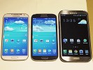
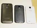
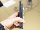
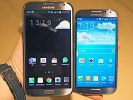
The Samsung Galaxy S4 sized up against the Note II
At any rate, despite all the new features it introduces, the Samsung Galaxy S4 is easier to handle than the S III. It also feels more comfortable in the hand than the HTC One and that one only has a 4.7" display. Samsung has shown to competitors that a 5" screen doesn't necessarily make for an unwieldy handset.
1080p Super AMOLED display is what geeks' dreams are made of
One of the most important updates that the Samsung Galaxy S4 brings is the new 5" Super AMOLED screen of 1080p resolution. While it does have a PenTile matrix, the 441 ppi pixel density makes sure you won't be able to spot the hated cross-hatch pattern.
The defect wasn't easily spotted on the Galaxy S III either unless you looked from a closer-than-comfortable distance, which is to say it was as good as invisible to the naked eye. The design of the PenTile matrix has been changed too, so now green sub-pixels are twice as many as blue and red sub-pixels and the arrangement is changed. This however matters little to anyone not armed with a microscope.
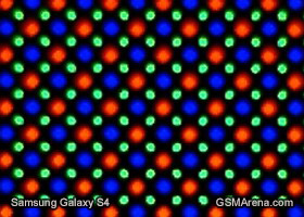
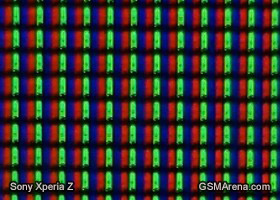
Samsung Galaxy S4 and Sony Xperia Z display matrices compared
What you should take away from all this is that the final weak point of the Super AMOLED screens has been taken care of and the Galaxy S4 offers image quality like no other smartphone on the market. Its impressive contrast and almost perfect viewing angles make everything on the screen pop-up regardless of your view point.
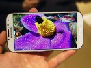
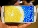
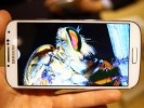
The 5" 1080p Super AMOLED display is gorgeous
The color saturation is beyond the reach of any LCD out there, which make even the dullest image appear remarkably vibrant. Still, if you are not a fan of the oversaturated look of the AMOLEDs Samsung gives you the option to tune down the saturation to more natural levels and enjoy the best of both worlds.
The brightness levels of the Samsung Galaxy S4 is slightly higher than the rest of the company's AMOLED displays, which is to say not very high. However, due to the low reflectivity this doesn't affect outdoor performance.
| Display test | 50% brightness | 100% brightness | ||||
| Black, cd/m2 | White, cd/m2 | Black, cd/m2 | White, cd/m2 | |||
| Samsung I9500 Galaxy S4 | 0 | 201 | ∞ | 0 | 404 | ∞ |
| Samsung I9300 Galaxy S III | 0 | 174 | ∞ | 0 | 330 | ∞ |
| HTC Butterfly | 0.14 | 173 | 1200 | 0.45 | 501 | 1104 |
| Sony Xperia Z | - | - | - | 0.70 | 492 | 705 |
| Oppo Find 5 | 0.17 | 176 | 1123 | 0.51 | 565 | 1107 |
| HTC One X | 0.15 | 200 | 1375 | 0.39 | 550 | 1410 |
| Nokia Lumia 920 | - | - | - | 0.48 | 513 | 1065 |
| Google Nexus 4 | 0.22 | 314 | 1447 | 0.45 | 608 | 1341 |
| LG Optimus G | 0.14 | 197 | 1445 | 0.33 | 417 | 1438 |
| Apple iPhone 5 | 0.13 | 200 | 1490 | 0.48 | 640 | 1320 |
Of course, Nokia showed that a brighter AMOLED can do even better in direct sunlight, but the gain isn't dramatic. We'll make sure to do a sunlight legibility test for the review and find out all about that.
Reader comments
- Naresh Rao
- 01 Mar 2016
- YQ{
its a awesome phone which han no lag and better camera
- Anonymous
- 01 Jul 2013
- 4QS
Wow....Now try to make a truthful logical statement.
- AnonD-139127
- 24 Apr 2013
- YQW
no good camera