Samsung Galaxy S4 preview: Take two
Take two
This article is outdated. We have already published a full review.
Updated user interface
The Samsung Galaxy S4 comes with Android 4.2.2 Jelly Bean - the latest release of the Google platform available at the moment - and a laundry list of new TouchWiz features. The Galaxy S4 combines the best of both worlds and while it seems familiar, there's plenty below the surface.
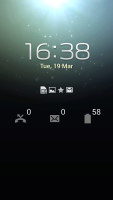
We start with the lockscreen, which features the new lockscreen widgets introduced with Android 4.2, though Samsung fiddled with them a bit. The default lockscreen shows the time along with a personal message overlaid on beautiful photos pulled from TripAdvisor (with text at the bottom about where the photo was taken).
The water ripples have been replaced by a lens flare effect though you can switch back to the old one or disable it all together.

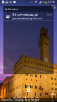
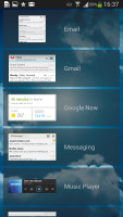
The lockscreen shows beautiful photos and cool widgets
The lockscreen has multiple panes, each containing one widget. The page to the right of the default one is special and can either be a list of favorite apps (the default TouchWiz setting) or a shortcut for the camera (as in pure Android).
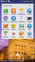
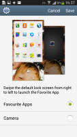
Favorite Apps are the default for the Galaxy S4 • the camera alternative
The pages to the left contain different widgets - email, Google Now, Messaging, music player, Yahoo! Finance and News and you can download apps from the Play Store that add new widgets.
There are no app shortcuts at the bottom of the screen by default - the Favorite Apps widget to the right has taken over that role, but you can enable them and have up to five easily accessible shortcuts.
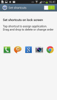
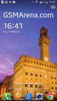
The lockscreen shortcuts are not enabled by default but are still here
One cool option for those who use more secure lockscreens (PIN, Pattern, etc.) is the Auto unlock zone feature. You can add several "home" Wi-Fi networks and the lockscreen will be disabled when the Galaxy S4 hooks up to one of them. This way you can have a secure PIN lockscreen outside and a quick unlock at home or the office.
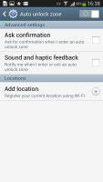
The lockscreen can automatically be disabled if the Galaxy S4 is connected to trusted networks
Another nice trick is the Quick glance option we first saw on the Galaxy Note II. It uses the proximity sensor to detect you reaching for the device and it lights up the screen that shows the time, missed call and message counters, battery charge and music track info.
The homescreen looks mostly the same, though there are a number of tweaks that make it easier to use, especially in the notification area.
At the top there are five (or eight in landscape mode) toggles that can quickly enable and disable features. There are more than five toggles, of course, you can swipe horizontally to get to the others. Or you can tap the new button that reveals a grid of all the shortcuts, 20 in total. You can rearrange this grid (the top row toggles are always visible). A two finger swipe directly opens the grid of toggles.
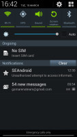
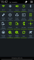
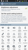
The new notification area is better than the one in stock Android 4.2
Below the toggles is the display brightness slider complete with an Auto toggle. You can disable this slider to get more room for notifications.
The notifications themselves have not changed - they can be expanded to reveal more info and collapsed to save space or dismissed with a sideways swipe. Sometimes they also have helpful buttons on them like "Call back" and "Send SMS" on a missed call notification.
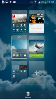
You can pinch zoom to get into the overview mode of all homescreen panes. There can be up to 7 and you can easily add, remove and rearrange panes from here. One pane is marked as "home", that's the one you go to when you press the Home button.
The app drawer hasn't changer really since the early days of Nature UX. The app shortcuts are presented as a customizable grid, alphabetized grid or list and you can hide shortcuts (good for bloatware you can't uninstall), view only downloaded apps, uninstall apps and add folders. Widgets are in a separate tab in the drawer.
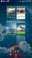
There's a useful but almost invisible change to the way you drag out shortcuts and widgets to the homescreen - there's a list of small thumbnails of all the homescreen panes with the silhouettes of the widgets there so you can judge how much space is available on each pane.
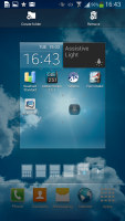
The small thumbnails of homescreen panes make finding room for a new widget a breeze
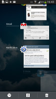
The App switcher interface is unchanged - there's a list of thumbnails of all the recent apps, apps can be swiped to dismiss and there are three buttons at the bottom, Task manager, Google Now and Kill all apps.
The Galaxy S4 comes with Multi-window. It runs two apps side by side on the screen. You can adjust the division line giving one app more space. Only compatible apps can be used with Multi-window, for now that means mostly the ones that come preinstalled on the phone.
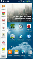

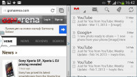
Multi-window mode on the Galaxy S4
Air and Motion gestures, Smart Screen
The Samsung Galaxy S4 comes with a number of advanced features enabled by the powerful hardware and dedicated sensors.
The first is Air View, which debuted on the Galaxy Note II and worked with the S Pen. There's no S Pen on the Galaxy S4, or a need for it - the phone can detect your finger hovering over the screen.
This enables information preview (e.g. SMS text, calendar entry text and so on), previewing videos just by pointing to a spot in the timeline, the next track in the music player by hovering over the next button (works with previous button too), previewing folders, speed dial contacts, and magnifying links in web pages. Air view detects fingers 1cm / 0.5" away from the screen, so there's no danger of accidentally tapping the screen when you wanted to use Air View instead.
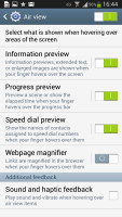

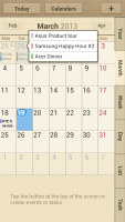
Air View turns your finger into an S Pen
Another set of "air" features are the Air Gestures. Quick Glance is one of them, but there's more. The rest of the air commands are triggered by waving your hand over the Galaxy S4.
You can use this to scroll web pages in the browser (vertical waves), switch between tabs (horizontal waves), move between tracks in the music player and photos in the gallery, accept a call and move app shortcuts and S Planner events.
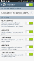
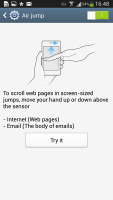
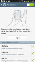
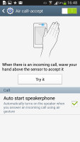
Air Gestures turns the S4 into a mini-Kinect
Air Gestures can detect your hand up to 7cm (just under 3") and might prove useful in some situations. Note that only the native apps support them, third party apps will not work with them (even Chrome that comes preinstalled on the phone).
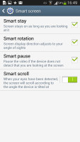
The familiar Smart Stay and Smart Rotate features are enabled too. Stay prevents the screen from locking as long as the front-facing camera can see your face (great for reading) and Rotate uses the orientation of your face rather than accelerometer info to decide how to rotate the screen.
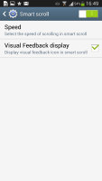
Smart Scroll is one of the two new features - it allows you to scroll up and down by tilting the phone as long as you're looking at the screen. In effect, it's an accelerometer based scroll that prevents accidental scrolling by making sure you're paying attention to the screen.
The second new feature is simpler and more useful - Smart Pause. While watching a video, it uses the front-facing camera to track your face and will automatically pause the video when you look away. Look back and the screen and the playback continues.
Then there are a number of motion gestures, which are not exactly new. There's direct call (dial the contact whose info you're currently viewing by lifting the phone up to your ear), smart alert (makes the phone vibrate when you pick it up if there are missed events), zooming and panning in the gallery, a shake of the phone to refresh the list of Bluetooth devices and muting alarms or pausing music playback by putting the phone face down.
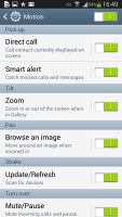
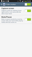
The gestures from S III and Note II are on board too
You can also pause the music player by putting your palm on the screen. A palm swipe takes a screenshot.
Reader comments
- Naresh Rao
- 01 Mar 2016
- YQ{
its a awesome phone which han no lag and better camera
- Anonymous
- 01 Jul 2013
- 4QS
Wow....Now try to make a truthful logical statement.
- AnonD-139127
- 24 Apr 2013
- YQW
no good camera
