Samsung Galaxy S4 vs Galaxy S III: Advanced fence-sitting
Advanced fence-sitting
Software and features
Both smartphones run Android Jelly Bean, but at least for now, different versions of it - the Galaxy S III is powered by Jelly Bean 4.1.2, while the Galaxy S4 will launch with version 4.2.2, which is the latest available to date. The Galaxy S4 rocks the later version of TouchWiz, too. It brings a plethora of new features, some of which will eventually hit the Galaxy S III, too, but for now are exclusive to the latest flagship.
Air gestures, Smart scroll and quick glance to name just a few, but before we start examining those, here are both the Galaxy S III and Galaxy S4 with their relative TouchWiz UI versions on video.
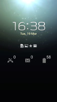
The differences between the two start right at the lockscreen, where the Galaxy S4 takes advantage of its Android 4.2.2 Jelly Bean build. Thanks to it, the new Samsung flagship offers the so-called lockscreen widgets. The lockscreen has multiple panes, each containing one widget. The page to the right of the default one is special and can either be a list of favorite apps (the default TouchWiz setting) or a shortcut for the camera (as in pure Android).
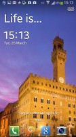

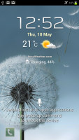
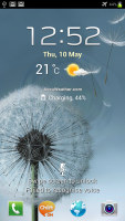
New and old lockscreens compared
The default lockscreen shows the time along with a personal message overlaid on beautiful photos pulled from TripAdvisor (with text at the bottom telling you where the photo was taken). Additionally, the water ripples seen on the Galaxy S III have been replaced by a lens flare effect though, if you prefer, you can switch back to the old one or disable it all together.
The latest TouchWiz version on the Galaxy S4 offers another cool options for the lockscreen dubbed Auto unlock zone. You can add several "home" Wi-Fi networks and the lockscreen passcode will be disabled when your Galaxy S4 hooks up to one of them. This way you can have a secure PIN lockscreen outside and a quick unlock at home or the office.
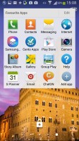
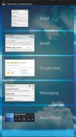
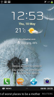

The lockscreen shows beautiful photos and cool widgets
There's also the Quick glance feature on the Galaxy S4. It's neat trick that the Galaxy S4 has learned from the Note II, which uses the proximity sensor to detect when you're reaching for the device and lights up a portion of the screen with cool glow effect. The lit area shows you the time, missed calls, message counters, battery charge and music track info.
You can still place app shortcuts at the bottom of the lockscreen on both phones. Notably, the Samsung Galaxy S4 supports up to five shortcuts, as opposed to four on the Galaxy S III, but other than that their functionality remains unchanged.
Going past the lockscreen feels similar on both devices with the homescreen mostly unchanged over the previous TouchWiz version. On the homescreen you can place maximum of five custom shortcuts or folders at the bottom of the screen. Widget editing works mostly the same, too, except this time you also get a tiny map at the bottom showing you which panes have available spaces. .
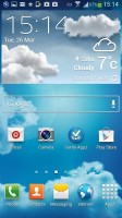
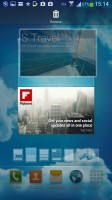

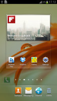
The Galaxy S4 and Galaxy S III homescreens
The settings menu has been redone in the latest TouchWiz version. Instead of a scrollable grid of icons and sections Samsung has went with a tabbed interface. On top you get four tabs - Connection, My device, Accounts and More and you can find the relative features in their corresponding place - display, for instance, is in the My device tab.
It makes navigating the settings menu much faster and more intuitive. In comparison, the single-list Settings menu of the Galaxy S III is much harder to navigate.
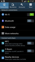
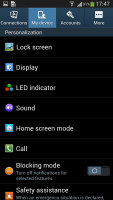

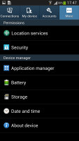
The revamped Settings menu of the Galaxy S4
Both the Galaxy S4 and Galaxy S III sport the Multi-Window feature. This lets you run two apps side by side on the screen. You can adjust the division line giving one app more space. Only compatible apps can be used with Multi-window, for now that means mostly the ones that come preinstalled on the phone.
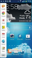

The Multi-Window feature is supported on both devices
Thanks to its dedicated sensors and more powerful hardware, the Galaxy S4 comes with a number of advanced features that will not make it to the Galaxy S III in its future updates.
The first is Air View, which debuted on the Galaxy Note II and worked with the S Pen. There's no S Pen on the Galaxy S4, or a need for it - the phone simply can detect your finger hovering over the screen.
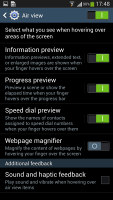

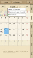
Air View turns your finger into an S Pen
This enables information preview (e.g. SMS text, calendar entry text and so on), previewing videos just by pointing to a spot in the timeline, the next track in the music player by hovering over the next button (works with previous button too), previewing folders, speed dial contacts, and magnifying links in web pages. Air view detects fingers 1cm / 0.5" away from the screen, so there's no danger of accidentally tapping the screen when you wanted to use Air View instead.
Another exclusive "air" feature on the Galaxy S4 is called Air Gestures. Those rely on the smartphone's built-in IR gesture sensor and mean that the phone can detect your palm waving over the screen.
You can use this to scroll web pages in the browser (vertical waves), switch between tabs (horizontal waves), move between tracks in the music player and photos in the gallery, accept a call and move app shortcuts and S Planner events.
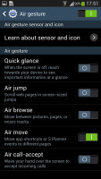
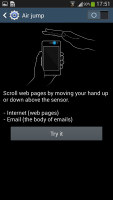
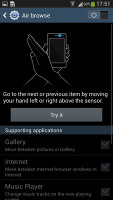
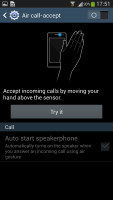
Air Gestures turns the S4 into a mini-Kinect
As we said, "Air" features rely on the Galaxy S4's infrared port, which the Galaxy S III lacks, so they won't be ported to the former flagship.
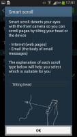
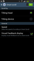
However, one of the new features that'd probably make its way to the Galaxy S III is Smart Scroll. It allows you to scroll up and down by tilting the phone or the tilting your head (you can pick between the two modes). It's a bit hard to get right at first but works well after that.
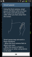
Smart Pause is the other new feature. While watching a video, it uses the front-facing camera to track your face and will automatically pause the video when you look away. Look back and the screen and the playback continues.
A number of features have made their way from the Galaxy S III to the new flagship. There's direct call (dial the contact whose info you're currently viewing by lifting the phone up to your ear), smart alert (makes the phone vibrate when you pick it up if there are missed events), zooming and panning in the gallery, a shake of the phone to refresh the list of Bluetooth devices and muting alarms or pausing music playback by putting the phone face down.
There are also a batch of new and updated apps that currently only the Galaxy S4 can boast with. Among them are the updated S Voice, S Health and the newly introduced S Translator. Their arrival on the Galaxy S III is only a matter of time, which is also the case with Group Play and Samsung Link.
Overall, the Galaxy S4 brings more than enough software goodies to be a worthy upgrade over its predecessor. However, many of them will be making their way to the Galaxy S III as a part of its upcoming update, so it's just the hardware-specific ones that might justify dropping the old flagship for the new ones. And while stuff like Air gestures and S Health are undeniably pretty cool, you probably won't miss them all that much.
Reader comments
- fakhre alam
- 17 Jan 2017
- PAm
My phone takinig time is 4to6 hours
- nathan
- 18 Aug 2016
- CCp
I have s4 performing very nice for 9 months but now have fallen down and loss the screen. The problem is that the price for repairing is very expensive so if you can try something...........
- Anonymous
- 28 Jun 2016
- Hkt
Local
