Samsung Galaxy S4 vs. Sony Xperia Z: When worlds collide
When worlds collide
Image galleries
Sony Xperia Z
It's usually the hardware that makes a proper flagship - be it the chipset, the camera sensor, the screen resolution or the amount of RAM. Yet, it's only half the work done. The other half gets delivered on the software end. And we don't just mean a custom launcher or skin.
Both Sony and Samsung have put a lot of effort in their own gallery, music and video player. There are connectivity apps too that boost your experience with connected devices such as TVs, PCs, etc.
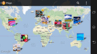
The gallery on the Xperia Z is called Album and it's among the most fluid and visually appealing apps you could find on any smartphone platform. Images are organized into stacks of thumbnails and sorted by date. You can opt to show all of your albums in one place, and there are three tabs above the stacks - Pictures, Map and Online.
Pictures is the main tab and one of its features managed to impress us: you can pinch to resize the image thumbnails. The whole thing is super responsive and hundreds of thumbs fall in and out of differently sized grids with cool animation.
The Album app supports highly customizable slideshow called SenseMe with several effects to choose from, and customizable music. Standard slideshow options is available too.
The Online tab displays pictures from Google Picasa and Facebook. You have options to tag, like and comment on Facebook photos.
Images can be cropped or rotated directly in the gallery. Quick sharing via Picasa, Email apps, Facebook, Bluetooth or MMS is also enabled.
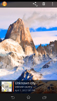
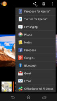
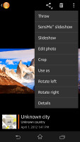
Viewing an image on the Xperia Z
The BRAVIA engine enhances contrast, colors and sharpness, while simultaneously reduces noise, but the truth is videos and images still look better on the Samsung Galaxy S4 Super AMOLED superior display.
Samsung Galaxy S4
The gallery on the Galaxy S4 has a new layout too. It can be sorted into albums, all photos and videos, time, location, etc. There's also a spiral option, which revamps the gallery into a Scalado-like spiral of images and video, which after a while gets really nauseating.
You can pinch to zoom in the gallery and thus manage the size of the thumbnails.
Upon choosing an album (for instance Camera) you're taken into that albums' stack of photos but a swipe to the right will reveal a bar that lets you switch albums without going back to the default screen.
Upon a press and hold on a picture the gallery gives you the option to select multiple images, which you can then mass delete, share, copy or move.
Viewing photos on the Galaxy S4 is a joy. The screen is ample and the Super AMOLED a treat when displaying colors. The gallery naturally supports full-res images. If you know what "color profile" is you can enable the Adobe RGB screen mode for accurate color rendering, if not you can just enjoy the vibrant colors of the default setting.
When viewing a single photo, you'll find several sharing shortcuts and a delete button above the photo, while below is a line of small thumbnails of all other photos in the album. You can tap those small thumbnails to move to other images or you can just swipe to the side.


Viewing image • Sharing options
You can easily retouch photos right in the Gallery itself. The photo editor gives you options like crop, rotate, color and effects. You can also make a memo on top of the picture.
The Gallery on the Galaxy S4 also supports highly customizable slideshows with several effects to choose from, customizable music and speed. You can also highlight specific images to be included in the slideshow. It is as cool as the SenseMe slideshow on the Xperia Z, but thanks to its advance settings and speed customization, it's actually better.
Air view gesture works in the gallery as well. You can hover your finger above and image and you'll get a bigger thumbnail overview of the image or you can use it to peek inside folders. That's definitely something the Xperia Z can't do.
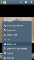
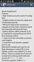
There's a nifty detect text option in the Gallery's context menu, which does as advertised - it detects text on an image and converts it into a text file, which you can share via mail, messages, etc. Keep in mind that it requires a data connection to work. This is another plus over the Xperia Z Album app.
Winner: Samsung Galaxy S4. The Samsung flagship's Gallery app offers more options and advance features and while it's not as much fun as the Xperia Z Album it does its job better.
Video players
Sony Xperia Z
Both smartphones boast 1080p screens with a massive 5" diagonal that's more than enough for watching movies on the go. As such they need proper video codec support to let you enjoy the full experience but the software that displays the content is equally important.
The Xperia Z and Galaxy S4 managed to play just about every video we threw at them. Xvid, DivX, MKV were all fine. The Galaxy S4 though handles AC3 codec well, while the Xperia Z doesn't support it and the movies with AC3 audio played without sound.
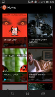
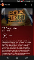
The video player of the Xperia Z is dubbed Movies and it has a new interface. It's connected to Gracenote, which helps you find additional information about the movies and TV shows you have preloaded.
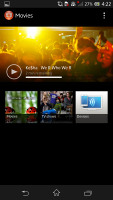
On top of the Xperia Z Movies app there is a huge animated thumbnail that shows the last few seconds of the last unfinished video playback. The video gallery sorts the videos by their type - Movies, TV shows, Nearby devices, Others. If you downloaded some TV shows episodes, they'll be sorted by seasons.
The video playing interface is nothing out of the ordinary. It has a slightly WP8-influenced interface with an overlay featuring play/pause and FF/rewind along with a timeline, which can be scrubbed to jump to specific scenes.
There's an option to "throw" the video to a connected BRAVIA TV set, as well as an ample sound settings menu. You can enable surround sound, clear stereo (which reduces channel crosstalk) and if you're watching a video with the built-in speaker instead of headphones you can enable xLOUD and Clear Phase (which automatically adjusts the quality). In truth we found only the clear stereo and surround sound options to really make a difference. Finally you can hop into the display settings straight from the video player.

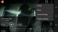
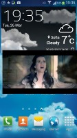
Watching a video on the Xperia Z
Sony Xperia Z Movies app doesn't support subtitles.
Samsung Galaxy S4
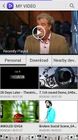
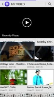
The new video player, found on the Galaxy S4 has the last watched video on top for quick access. Under it there are three tabs - personal (showing you the videos on your local storage), Download (which lets into the Videos store) and Nearby devices, which shows the PCs and players on your local Wi-Fi network.
The grid view is our favorite as it is a true quad-core tour de force - the visible video thumbnails are actually playing the videos instead of being static images. They play at a reduced framerate and generating those previews takes a couple of minutes the first time around, but it's an awesome preview and it shows what can be done when you have processing power to spare.
The video player lets you choose between three crop modes for how the video fits the screen. The same SoundAlive audio-enhancing technology is available here too. The video player lets you squeeze the best viewing experience out of the large, high-res screen. You can adjust video brightness, color tone and enable outdoor visibility too.
The chapter preview detects chapters in the video and shows a rectangular grid, with live thumbnails (just like the grid view above).
Hovering your finger over the timescroll lets you preview part of the video in a small thumbnail - just like YouTube videos do when you hover the mouse.
Pop up play is here too - it moves the video in a small floating window and you can use other apps on the phone while still watching the video. You can use pinch zoom to adjust the size of the video.
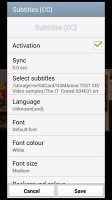
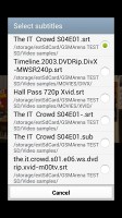
The Galaxy S4 offered a list of subtitles and let us pick. It scans for all subtitles, so the file doesn't have to have the same name as the video file.
Winner: Samsung Galaxy S4. The Video Player of the Galaxy S4 might not be as eye-candy as the Movies app on the Xperia Z, but it handles AC3 audio and comes with rich subtitle support. The cool pop-up play and live video preview give even wider advantage.
Music Players
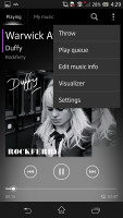
The Walkman music player we saw in Sony Xperia smartphones from the second half of 2012 is also on board. It offers the same cool interface as before, but this time it got even more sound enhancement options. It also offers rich audio codec support including FLAC and WAVE.
The Walkman is divided into Playing and My music panels. In the My music section, you can update your album art and music information like album, year released, and more. SenseMe is included, meaning you can filter your songs by mood - upbeat, energetic, mellow, dance, etc. Creating playlists is enabled and you can also view your Facebook friends' activity if they too use the Walkman player.
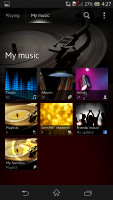
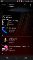
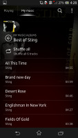

The Xperia Z Walkman player is decent looking and snappy
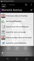
The Now Playing screen offers the standard music controls, shortcuts to the library, "Infinity" key and the song cover art. The Infinity key lets you quickly look up a song on YouTube or browse for the lyrics, among others.
Throw option is also available so you can easily output the sound to a connected wirelessly device (audio system, TV set, etc).
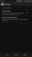
Sony has improved on the Walkman player's settings. There's a new ClearAudio+ option, which determines the best audio quality settings depending on the song you're listening to.
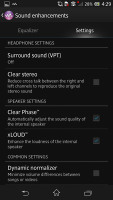
There's Surround sound mode, which imitates the Studio, Club or Concert Hall experience. The Clear stereo mode enhances the perceivable stereo channel separation.
Speaker settings include Clear Phase, which adjusts the quality, while xLOUD enhances the loudness of the internal speaker.
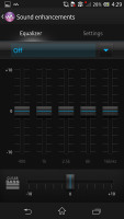
And audio fans will be pleased as there is a configurable 5-band equalizer with bass adjustment. However die-hard audiophiles might prefer additional players, which sport a 10-band or even 20-band equalizer.
There are music controls on the lockscreen. Swiping them to either side brings back the clock. The notification area also offers the now playing screen with music controls and the option to jump into the Walkman player.


Music player controls on the lockscreen and notification area
Samsung Galaxy S4
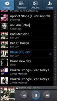
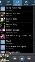
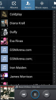
The TouchWiz music player on the Galaxy S4 is jam-packed with features and supports a wide variety of file formats, including FLAC, Wave, etc.
Music is sorted by the usual Artist, Album, Playlist, etc. but there's also Folder support (which is more often found on third party players) - it's quite handy as it saves you the need to sort songs into playlists like on so many other players.
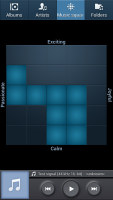
Then there's Music square - it's quite similar to the SensMe feature of Sony smartphones. It automatically rates a song as exciting or calm, passionate or joyful and plots those songs on a square (hence the name).
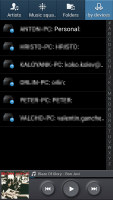
The Galaxy S4 can also search for content on third party players like PCs on the same network.
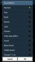
Samsung has enabled equalizer presets (including a custom one) along with the sound-enhancing SoundAlive technology, which features 7.1 channel virtualization. Samsung uses SoundAlive in some of their MP3 and Android-powered media players.
You can also customize your own 7-band equalizer too.
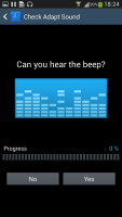
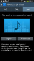
The S4 has a couple of features that will improve your listening experience further. One is Smart Sound, which equalizes the volume between tracks. The other is Adapt Sound - it plays a series of beeps (both high and low frequency) and asking if you can hear them. This way the phone can map the capacities of your specific headset and fine tune the sound.
The Now playing screen gives you the usual options - a timescroll of the song, play/pause and back/forth controls, repeat and shuffle, volume control, AllShare shortcut and a direct sound settings shortcut.
While listening to a song you can find music controls in the notification area and the lockscreen.
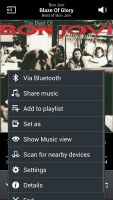
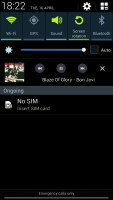
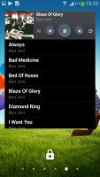
Music player options • controls in the notification area and lockscreen
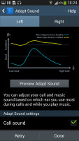
Samsung has enabled a great new feature called Adapt Sound. It determines the best possible sound setup for your choice of headphones by doing a frequency test and resolving which frequencies you can hear and which not.
It then shows you the sound gain you're receiving by turning Adapt Sound on. Turns out that some of us here have average hearing but we still did okay.
Winner: Tie. Both phones offer excellent music players with lots of advanced options and audio enchantments that will certainly keep the audiophiles happy.
MULTIMEDIA WINNER: Samsung Galaxy S4. Samsung has supplied the Galaxy S4 gallery and video apps with a host of cool features, which gave it an edge over its competitor today.
Reader comments
- Xperia galaxy s4
- 05 Feb 2019
- tEZ
Galaxy s4 awesome speaker quality, powerful sound ring. Xperia my favorit to with galaxy s4.
- Samsung galaxy s4
- 20 Oct 2018
- y0L
Samsung galaxy s4
- Vic
- 17 May 2016
- t7X
Your s4 will log and hang man compare to xperia z , your s4 wll stock up

