Samsung Galaxy S4 vs. Sony Xperia Z: When worlds collide
When worlds collide
User interface
Both the Samsung Galaxy S4 and the Xperia Z run Android Jelly Bean, but there are considerable differences. For one, the Samsung smartphone launches with 4.2.2 and the Xperia Z has 4.1.1 (with plans to bring it up to speed with an update). The custom skins used are quite different too.
The two skins, however, try to stay relatively close to Android (their latest versions more than ever). The Galaxy S4's UI piles on an impressive list of exclusive features that the Korean company developed for its flagship devices.
The Samsung Galaxy S4 gets certain benefits from running the latest version of Android, specifically the lockscreen widgets and the notification area toggles. Of course, Samsung has tweaked both.
On the lockscreen, the right side pane, which normally launches the camera, is set to Favorite Apps by default (you can switch it back to being a camera launcher). Also, the images on the screen are randomly selected photos of beautiful travel locations pulled straight from TripAdvisor.
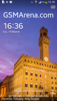
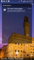
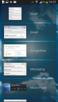
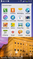
Galaxy S4 has the Android 4.2 widget-enabled lockscreen
The notification area shows a row of toggles, a brightness slider and, of course, the actual notifications. There's a whole grid of toggles, and the top row is always visible. The full grid is revealed either by tapping on a button or by a two-finger swipe (similar to stock Android), but you can also just swipe the row horizontally.
The brightness slider can be hidden to save space and it has an Auto toggle. In Auto mode, it lets you tweak the automatic brightness algorithm, making the display brighter or dimmer than its ambient light sensor will suggest.

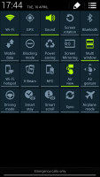
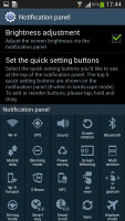
The notification area is similar to that of stock Android
The homescreen on TouchWiz is pretty standard with only the Overview mode standing out as an addition to stock Android. We do like the small thumbnails that guide you when adding a new widget, they show the widget silhouettes, making it easier to find an open spot.
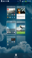
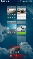
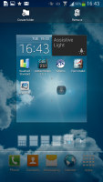
The new overview helps you find an empty spot for new widgets
Sony too has updated its custom launcher to go with the new Android version it runs on. The lockscreen on the Xperia Z uses a new cool animation and has two shortcuts for quick access to the camera (swipe left) and the dedicated music controls (swipe right). When the music player is on, the lockscreen will show the music controls by default, but you can hide them with a swipe. You can also enable Face, Pattern, PIN or Password unlock, in ascending order of security. The Galaxy S4 has Face and Voice on top of that, but it's more of a gimmick.

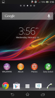
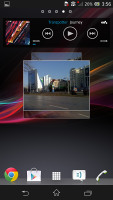
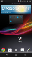
The Xperia Z lockscreen • The classic Android homescreen configuration
The notification area on the Xperia Z features several connectivity toggles (Sound, Bluetooth, Wi-Fi and Mobile Data). There's also a quick shortcut to the settings menu. Naturally the notification pane also displays the various notifications from different apps and you can resize those with pictures in them, as well as lists of emails.
The awesome task manager we saw on the Xperia T is here and so are the so-called "small apps". They are similar to Mini Apps from Samsung, and pop up tiny widget-like applications on your homescreen, which you can move around and use without having to fully open a dedicated app. So far, there's a default set of four: Calculator, Timer, Notes, and Voice Recorder - and it looks like you should be able to stock up on some more from the Play Store as well.
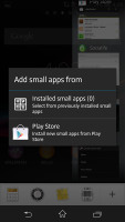
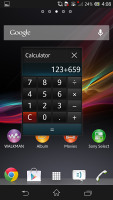
We won't argue which interface is better - it's a matter of personal preference, launchers and lockscreens are easy to change in Android. But the Galaxy S4 has a number of exclusive TouchWiz features over stock Android and the Xperia Z.
The biggest one is obviously Multi-window - it allows for two supported apps to run simultaneously, sharing the screen. How the apps split the screen can be adjusted as desired. Not all apps support it, though.
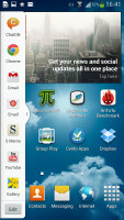


Multi-window puts two apps side by side
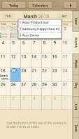
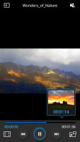
Another thing is Air View - the Galaxy S4 can detect your finger hovering over the screen and works similarly to the S Pen on the Galaxy Note II. It can preview info like the full text of messages and calendar appointments, give you a peek inside folders with images and preview what's ahead in the timeline of a video.
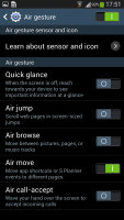
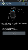
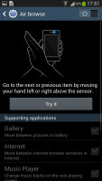
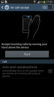
Then there are Air Gestures. A dedicated IR sensor above the screen can detect the direction of your hand waving over the device from several inches and serve to scroll web pages, change tracks and answer calls.
The Smart Screen options are interesting too, they make sure the screen is rotated correctly (the accelerometer-based rotate gets it wrong if you're lying on your side). The other nice thing is that the screen won't turn off while you're watching (or reading) and that the video will pause automatically when you look away and resume when you get back.
S Voice is also on board and while some of the functionality partially doubles that of Google's Voice Search, it can do more. It has a nice Car mode too, which simplifies the UI and makes the font bigger.
Winner: Samsung Galaxy S4. The Samsung smartphone comes with a newer version of Android that, while skinned, is quite close to stock Android in terms of general navigation. It has more flexibility too with many exclusive features.Reader comments
- Xperia galaxy s4
- 05 Feb 2019
- tEZ
Galaxy s4 awesome speaker quality, powerful sound ring. Xperia my favorit to with galaxy s4.
- Samsung galaxy s4
- 20 Oct 2018
- y0L
Samsung galaxy s4
- Vic
- 17 May 2016
- t7X
Your s4 will log and hang man compare to xperia z , your s4 wll stock up


