Android 7.0 on the Galaxy S7 edge: Grace UX-ed Nougat
Grace UX-ed Nougat
General
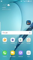
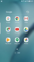
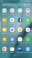
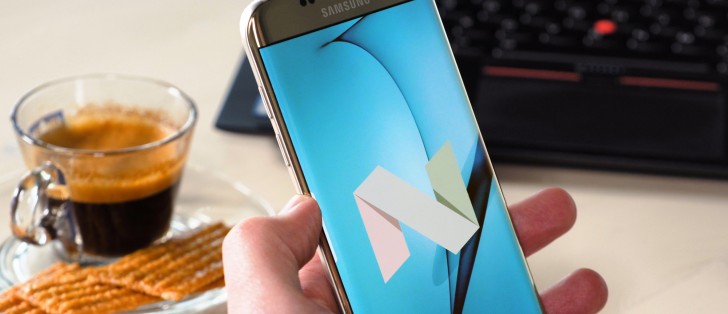
Flat icons, rounded edges, blurred backgrounds here and there - the polishing of TouchWiz already happened on the original Marshmallow build that shipped with the S7 family. It's a little more of the same with Grace UX, as we now see yet smoother icons and more coherent visual designs - don't get us wrong, it's still immediately recognizable as a Samsung, but it's getting to a point where even the less open-minded of TouchWiz haters can learn to like it. Plus it's no longer called TouchWiz, right?
Notifications
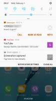
Notification handling is one of the big changes in Nougat, and the way it's implemented on the Galaxy S7 edge is very much identical to Google's stock solution. While there are areas vanilla Android can use some tweaking, notifications on Nougat are already packed with functionality and there isn't really any need for messing with them.
Gone are the separate cards for each notification - instead, it's more of a feed of notifications. If an app has more than one event to inform you of, the notifications from that app are bundled together, so things don't turn into an endless feed of Gmail messages, for example.
You can, however, unbundle those, and act on them one by one. You can go one step further and expand the card to see part of the message body, and then you can go ahead and reply straight from the notification panel.
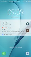
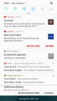
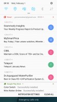
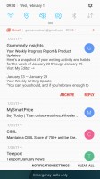

Notifications: On the lockscreen • Bundled • Semi-unbundled • Unbundled notification • Two at the same time
Google calls this Notification Direct Reply and the rationale behind is to allow you to streamline your workflow and save you the hassle of having to go into each separate app. On our S7 edge that didn't work quite as planned though - Facebook Messenger, for one, required us to go to the app.
Quick settings
The Quick settings portion of the notification shade is where the major changes are, compared both to Samsung's previous designs and Google's own Nougat.
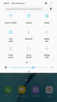
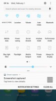
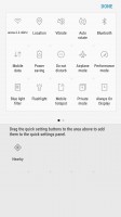
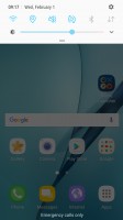
On the first pull only the first six toggles are displayed - just the icons, no text. Pull down a second time or do a two-finger pull (yes, that still works), and you get the full list of toggles, complete with text. Where there's contextual info to be shown, it replaces the button's respective title - under Wi-Fi you'd see the network you're currently connected to, under Bluetooth it's the headphone you have paired.
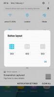
You can choose between three button layouts, or rather you can select between 3 and 5 icons for each of the three rows - that number you cannot customize. You can pick from 20 toggles in total, so if you want to have all of them there and you go for the 3x3 layout you're looking to have 3 panes of toggles. We also found it a bit awkward to move a button from one pane to another, but maybe that's just us being clumsy.
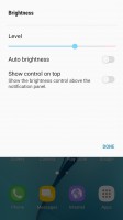
You might have heard us complain about Google's stubborn refusal to put an Auto brightness switch next to the slider. We've also typically pointed out and praised those makers that do put an Auto toggle in immediate reach, and Samsung's been one of them.
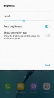
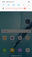
Well, not on the S7's Nougat. Samsung's implemented an in-between solution, where you don't have to go into settings - but there's still an extra tap required. There's a drop down menu next to the slider, containing the Auto toggle and another toggle than controls whether you have the slider displayed at the first pull or the second. That's different than the Grace/Marshmallow on the A-series, too - there's the usual checkbox on those.
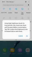
There's also a red area on the slider where the phone warns you that brightness might strain your eyes - much like headphone volume warnings. Well, Samsung, your Super AMOLEDs are the brightest around, but still not as bright as LCDs, so is that really necessary?
Reader comments
- AnonD-659187
- 10 Apr 2017
- uZa
Not worth the update on nougat also samsung keyboard hanging while writing comment, plz give us patched update samsung
- AnonD-659187
- 10 Apr 2017
- uZa
Battery backup is low , keyboard hangs , ui slow , raw imsge capture option removed and you call it an update ?
- Sandeep
- 13 Feb 2017
- g}t
Battery backup are very poor it's so bad to new update...
