Samsung Galaxy S9+ review
Design and 360-degree spin
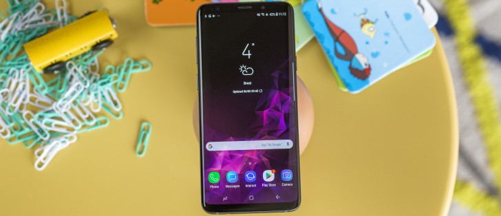
A lot is old and familiar, but there's new too, and where there's new, the new is better than the old. There, that's the Galaxy S9+'s design in one exquisitely eloquent sentence.
If it ain't broke, don't fix it - the saying goes. But broke the fingerprint sensor placement was, so it's a good thing that Samsung didn't persist and fixed it for this generation. Seriously, the off-center location of the reader, high up on the back of the S8+, made it practically unusable, and (literally) opened the eyes of a few people at the office to the benefits of the iris and face unlock options.
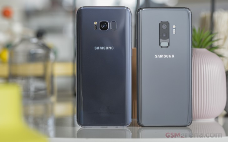 Left - not okay, right - okay
Reaching the sensor was made even more difficult on the Note8 - not only was the phone larger but due to the dual camera setup, the sensor was pushed even further to the side. The S9+ now shows us that there's a better way.
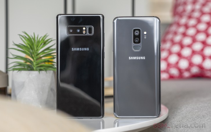 Left - not okay, right - okay
There's more good news for your index finger too. The S9+ is larger than the S9 (well, duh), but the fingerprint sensor is practically the same distance from the bottom of the phone. Nudged one camera module lower, it's no harder to reach than on the more compact S9. So, no fingerprint reader complaints this year? Definitely!
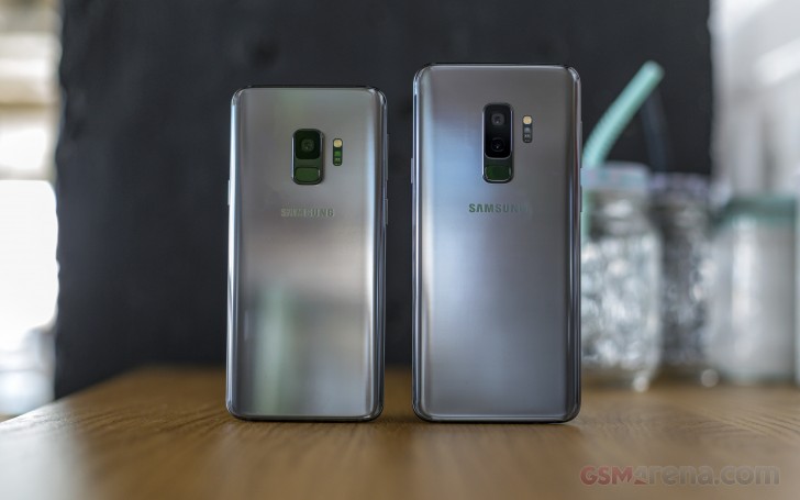
Well, when you put it that way, the less careful folks might still give the camera the occasional smudge. That said, it'll be the telephoto camera and not the main one, so it's the lesser of two evils.
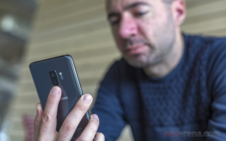
But that just might be us being overly eager to criticize - to be fair, the fingerprint reader is recessed into its frame, so there's tactile feedback where your finger is. Plus, just because you might touch the black glass around the camera, doesn't mean the prints will be in front of the actual lens. Let's say that the time spent writing this paragraph could have been put to better use.
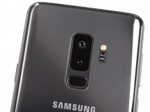
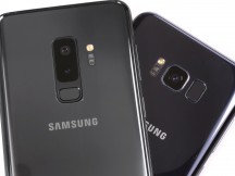
The shiny glass back • Fingerprint reader under the dual camera • 9>8
Moving on, one noticeable difference in the new design is the frame. Polished and shiny on last year's model, matte on the S9 and S9+, it's now a fraction of a millimeter thicker - our calipers showed 3.4mm on the 9th-gen phone, 3.0mm on the S8+. It doesn't sound like much, but the change of finish alongside the added thickness has resulted in a more secure grip on the phone - it our experience, at least.
Continuing on the 'meatier is better' theme, the buttons are now larger. And that means both longer and thicker (except the volume rocker which is just thicker). Big buttons are nice, we like big buttons.
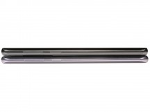
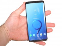
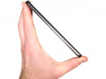
That's what 3.4mm vs. 3.0mm looks like • In the hand
Speaking of grip, you're going to need every bit of it you can get as the phone has gained some weight. Higher-strength aluminum and thicker glass are great for durability, but the S9+ now weighs in at 189g - 16g more than the S8+ and just 6g short of the Note8.
Yes, we know, 'heavy means premium' and all, but we're headed for a point where most recent flagships are getting a little too 'premium' in terms of weight if you know what we mean. We'll give the S9+ a pass, but we're not sure we're okay with a future where phones weigh 200+ grams.
The S9+ is, in fact, 1.4mm shorter than the model it replaces, 0.4mm wider and 0.4mm thicker - that is to say, it's essentially the same size.
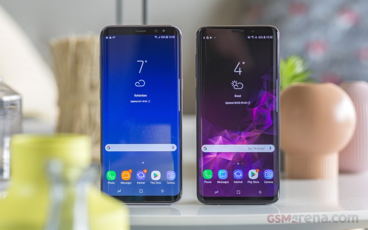
Over on the front, it's the SuperAMOLED display you know and love, now with a marginally better screen to body ratio. Not that you'd expect otherwise at this point, but the 6.2-inch panel is curved towards the sides, and it's also had its corners rounded off. That's all that is missing from the rectangle though - where other makers are going all notched with their phones, Samsung is embracing the bezel. For now, at least. We can't say we object.
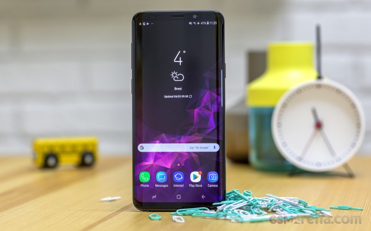
For the S9 and S9+ they've also taken the effort to make the myriad of sensors on top of the display a little less obtrusive - the IR camera, in particular, is now almost invisible, and the selfie cam's cutout is that little bit smaller than it was on the S8. All the usual stuff is here too, including the ambient light and proximity sensors, and the notification LED.
The earpiece now doubles as a second speaker, taking care of the mids and highs for the right channel when in portrait. It switches between left and right channels in landscape depending on orientation. And Samsung's done it without making it look any different than the old one. So why did we have to wait so long for stereo speakers?
As part of the sound system's redesign, the bottom-firing speaker is no longer behind a grille like it was on previous Samsungs. It's now a single opening, with a mesh somewhere deeper in there for protection against the elements. Oh, yes, the S9+ is IP68-rated, it's just that we've gotten so used to phones being dust and water resistant now that it's not that big a deal anymore.
The USB-C port is centered here on the bottom, and there's a pinhole for the primary mic too. The Galaxy S9 and S9+ remain in the ever-shrinking elite club of smartphones with a 3.5mm headphone jack - to be found on the other side of the charging port.
Our review unit happens to be a Duos version - that's dual SIM in Samsung speak. It will take either two nano SIMs or a nano SIM and a microSD card, up to 400GB currently. What it won't take is two nano SIMs and a microSD at the same time. Not a big deal, but also far from ideal.
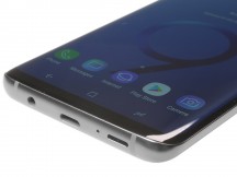
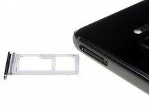
The main speaker, mic, USB-C port and 3.5mm jack • Card slot will take up to 400GB microSDs
Reader comments
- JoanPierre
- 20 Oct 2024
- wr4
Still miles better than the ubl-locked snapdragon version
- BobbyGSM-ARENA
- 06 Oct 2024
- DxV
Check if you're phone is an exynos version, its normal for an exynos phone to overheat
- BobbyGSM-ARENA
- 06 Oct 2024
- DxV
I have the s9+ exynos version, it is pretty fast, and also, i love that it has an heartrate sensor