Samsung Galaxy S9+ review
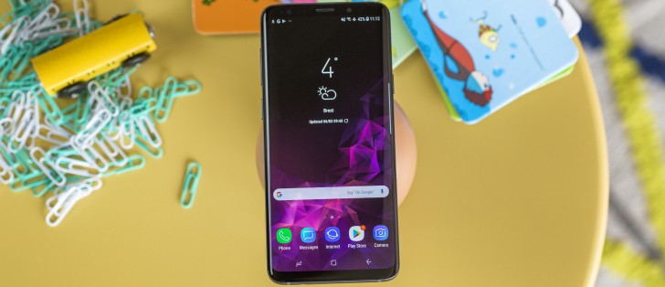
Samsung Experience 9.0 on top of Android 8.0 Oreo
The Samsung Galaxy S9 and S9+ are running Android 8.0. As such, they're the first Samsung phones to boot official Oreo firmware out of the box. On the S9+ there's a newer version of Samsung Experience on top of Google's OS - it's 9.0 now vs. 8.5 on the Note8 and 8.1 on the S8s.
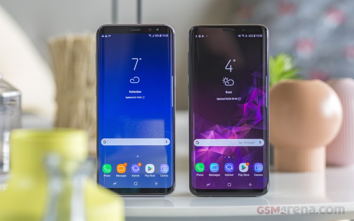 0.9 difference in Experience between these two at the time of writing
The differences are small and mostly cosmetic, and by no means make the S9+ radically different from the model it replaces. That said, certain settings have been moved around, and if you're coming from an existing Samsung you may need a few tries to find their new locations in the menu structure.
Take AOD clock styles, for example. If you can't be bothered to look for AOD in the menu tree, and just type it in the search bar, you won't be able to find the clock designs in the entry that pops up. They're under 'Clock and FaceWidgets' in the 'Lockscreen and Always on display' section of the 'Lockscreen and security' main branch of settings, one down from AOD itself - logical if you access it from the tree, not so much if you go the search route.
Anyways, there's a whole bunch of new clock designs, and you can even change the clock on the lockscreen - so once you've found what's where there are rewards.
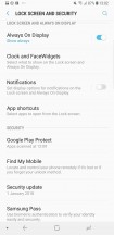
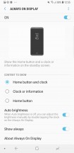
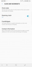
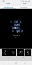
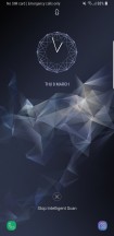
AOD settings • More AOD settings • Clocks styles are here
The lockscreen has the normal camera and dialler shortcuts (which you can reassign to any app), but in our experience, the lockscreen gets ignored altogether. The biometric unlock options (fingerprint unlock, or face, or iris, or the new Intelligent combination of all of those) are just too quick to get you to the homescreen.
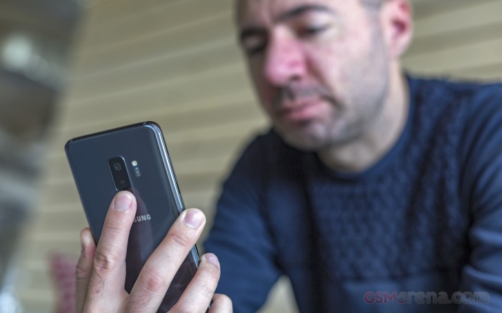
With the fingerprint reader now repositioned, that's a much more viable option than on the previous handsets with an 8 in their names. The setup process is even easier too - you can now enroll a print with a couple of swipes across the sensor. Fret not, you don't need to swipe to unlock like on the Galaxy S5 and Note 4 - here it's swipe to register, tap to unlock. Unlocking is pretty fast - not the fastest, but not an issue by any stretch.
Now, this particular reviewer used iris unlock on both a Note8 and S8 in day-to-day life and had no issues with it. Others have complained though, and perhaps for those Intelligent will work better. There's a catch - it will unlock the phone even with your eyes closed - when it can't find irises it looks for a whole mug. Some of the more privacy-conscious (one way to say paranoid) folks might have an issue with that, and they should stick to iris-only.
You can, of course, have fingerprints enabled too, with either face, iris, or Intelligent Scan on at the same time. PIN, password, and pattern are also options, and you'll need one of them as a backup for the biometrics anyway. A simple swipe is there for those that just don't care.
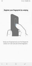
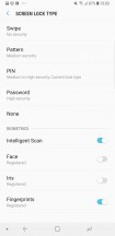
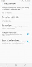

Swipe to enroll • All types of locks • Intelligent scan • Iris screen masks
Experience v.9 builds on v.8's iconography with a new color for the Messages app, and a gradient for the Gallery icon, and that's about it on the surface. Folders still open fullscreen sending the apps up and away from immediate reach - some wouldn't even notice, but if you're coming from a Pixel, it's a bit of an annoyance.
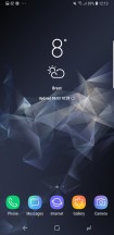
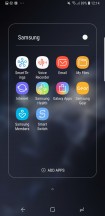
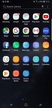
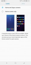
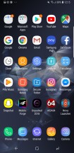
Homescreen • Folder view • App drawer • ...or no app drawer
One new thing this year - you can have a landscape view of the homescreen and app drawer. We're yet to see a use case where that's needed, perhaps something to do with DeX? Sony's been doing it on its Xperias for a while though, so it could be us missing something.
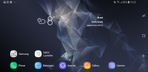
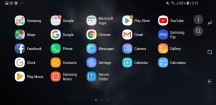
In landscape: Homescreen • App drawer
There are no apparently visible changes in the notification shade - that is to say we saw zero. The task switcher, however, has a neat new trick - you can switch from card view to list view, potentially saving yourself some scrolling if you like to keep a ton of apps open. By the way, the cards no longer have their frames color coded - just the titles. It's a bit more stylish this way, we reckon.
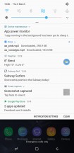
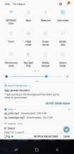
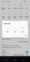
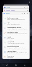
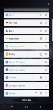
Notifications • Toggles • Toggle grid options • Task switcher: Thumbnail view • List view
Multi-window was Samsung's thing before it was cool and Google thought it wise to implement it natively starting with Nougat. Samsung's still doing it a lot better though and gives a lot more options. You can resize the windows to just about any ratio, you can swap them, and you can even have pop-up apps on top of the two ones that are in multi-window.
A feature introduced with the S8, Snap window, makes it to the S9+ as well. You can crop a small strip of an app, cutting away unneeded interface elements, and have it docked to the top or bottom of the display so you can have it always visible.
App pairs, a shortcut to a split-screen view of two apps that you often use together, came as part of the Note8's Experience. On that phone, you could save the shortcut in the edge panels, but now on the S9+ you can have it on the homescreen - that's what the house icon is for. Neat.
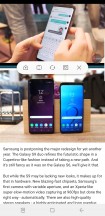
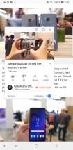
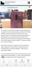
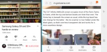
Split-screen multi-window • Pop-up view • Snap window • Multi-window in landscape
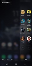
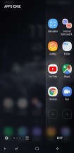
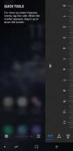
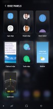
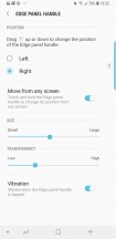
Edge panels, of course. These have been redesigned for the S9 and S9+ though they still offer the same functionality - a set of panes slides in from the side with shortcuts to contacts, apps, tasks, tools or whatnot. Perhaps someone somewhere uses them. For that person, there's now even a task switcher of sorts, for the edge panels.
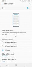
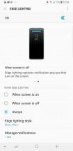
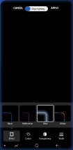
Edge lighting has gotten a redesigned interface for customizations - color, width, transparency, plus a couple of effects have been added. You could do most of it on the S8 too, but it was a little more obscure.
A bunch of familiar gestures and the likes are available on the S9 and S9+ as well. To name a few, you can swipe the fingerprint reader to access the notification shade (was there on the S8, but with that fingerprint placement - no thanks), you can go into a shrunken-down one-handed more (either triple press home, or swipe in from a bottom corner), and you can launch the camera with a double press of the power button. Meanwhile, Smart Stay will use the front camera to determine whether you're looking at the phone so it won't go to standby if you're staring blankly at the screen for a long time. All of these can be switched off.
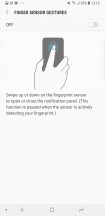
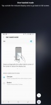
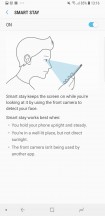
Notification access from the back • One-handed mode • Smart stay
You can find the Secure folder on the S9s too. It's where you can keep files, memos, and apps away from prying eyes. It's locked independently from the lockscreen - one can use a fingerprint, the other an iris. You can also install two copies of an app - one in plain sight and one in the Secure folder. And you can hide the folder too, so people can snoop all they want and will not find anything suspicious.
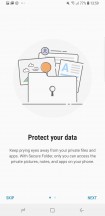
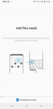
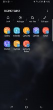
Secure folder: Intro • Creating in process • Inside it • Icon can be customized
Reader comments
- JoanPierre
- 20 Oct 2024
- wr4
Still miles better than the ubl-locked snapdragon version
- BobbyGSM-ARENA
- 06 Oct 2024
- DxV
Check if you're phone is an exynos version, its normal for an exynos phone to overheat
- BobbyGSM-ARENA
- 06 Oct 2024
- DxV
I have the s9+ exynos version, it is pretty fast, and also, i love that it has an heartrate sensor
