Samsung Galaxy S III Jelly Bean review: Bread and butter
Bread and butter
User interface: Project Butter and TouchWiz
The so called Project Butter, which raises UI animations' framerate to a consistent 60 fps, is one of the key novelties of Jelly Bean. Yet, Samsung Galaxy S III was always really snappy, so it's not too easy to spot the differences.
Still, there are a few parts of the interface that became even more more fluid. The UI animations are great; opening and scrolling the app drawer, switching between home screens, opening and closing system apps, everything has a tad more natural feel to it.
Here is a demo video of the Jelly Bean-powered Samsung Galaxy S III in action.
The animations might have looked a bit more "buttery" here, but the visuals of the TouchWiz-ified Android Jelly Bean aren't too different from those of the TouchWiz-covered ICS. Sure, there are a few refreshed icons here and there, but the overall experience is basically unchanged.
The notification area is probably the most noticeable beneficiary of the Jelly Bean update. It now offers a brightness control scrubber (most Galaxy S III units got this via an OTA update back when they were on ICS, but some regions didn't receive that) just below the connectivity toggles. Furthermore you now get the option to fine tune the brightness of the smartphone fine tune it when auto mode is selected.
Moving on, we notice a a big digital clock with the date at the top of the notification area - a minor improvement, but one we found pretty convenient.
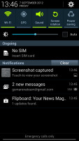
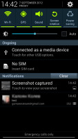
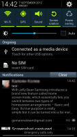
The new notification area • expandable notifications
But there is even more to show off here: individual notifications are now expandable. If you've got an email, for example, the sender and subject will pop up in your notification area and you can expand the entry with a two-finger swipe to reveal the first few lines the email itself. To collapse them again, simply swipe with the opposite move.
With Jelly Bean Samsung introduces a brand new feature called Home screen mode, which essentially lets you switch between two types of homescreen arrangements - Basic and Easy. Its true purpose is to simplify the interface for first time users, but it can be turned into something far more useful.
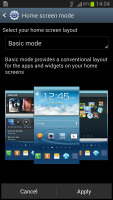
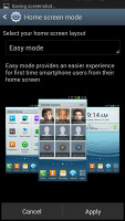


Changing the Home screen mode • the default Basic mode
If you have ever turned on a new Galaxy S III you've already seen Basic mode. This mode is used by default in Samsung droids and gives you the familiar pack of widgets - weather, search, music player and a bunch of shortcuts.
Easy mode, on the other hand, brings a few new widgets with larger buttons, as well as favorite contacts, favorite apps and a keypad on your home screen. This should allow you to use your Galaxy S III with everything on your home screen and minimal interaction with the app drawer, the notification area and other more "complicated" menus.
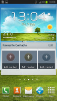
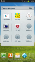
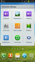
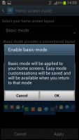
The Easy mode • your modifications will be saved
The best part is, you can customize both modes as you please and your Galaxy S III will save the changes. That way you can easily create two different layouts, e.g. work and fun or travel and home and alternate between them quickly. It can easily be used to mimic what HTC offers with their Scene modes within Sense UI.
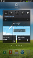
And while we are on the widgets topic, we have to mention their new behavior - they now support automatic resizing and reshuffling. Let's say you are trying to add a new widget on a home screen, but the ones already in place need to be repositioned to make room. With Jelly Bean, they'll do that automatically for you. Also, if the widget you are trying to add is bigger than the available space but supports resize then it will automatically shrink to fit into the free area.
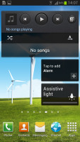
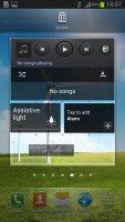
Automatic widget repositioning
The Jelly Bean update brings a couple of minor changes to the folders on the Galaxy S III. For one you can now tap and hold on your homescreen to create folders, instead of needing to press the context menu key. We also got redesigned folder icons. Honestly, we prefer the old design since we could see mini icons of the first six apps inside, while now we only see the first one properly.
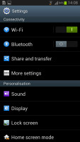
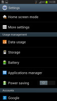
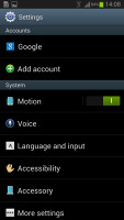
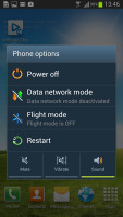
The last thing the Jelly Bean update brings to the UI is the new Settings menu. It's been reorganized to be easier to find what you're looking for, with the less important stuff being put into a 'More Settings' menu for each category. Three sound toggles have been added within the menu trigger by holding the power/lock key (once again some S III users got an OTA update with these on ICS, but some didn't).
Reader comments
- RAMBO
- 19 Jan 2025
- u1v
Hello any one still use Legendary Samsung Galaxy S3 i still love this device because lots of memory ❤️❤️❤️
- Pyron87
- 13 Dec 2023
- XBx
Whatsapp no longer supports android 4.4 any longer, and previous version will not work try a software update.
- Anonymous
- 01 Apr 2019
- NYY
How do you remove safe mode from the screen?
