Samsung Galaxy Tab 3 10.1 review: Third time's the charm
Third time's the charm
User interface
The Galaxy Tab 3 10.1 by Samsung runs a TouchWiz-skinned Android 4.1.2 Jelly Bean build, the same combo you'll see on the smaller Tab 3 variants, as well as members of the Note family (although those have added S-Pen stylus support).
Check out this video we've shot of the user interface in action:
The Tab lineup can be considered the lesser of the two Samsung tablet hierarchies, due to their lack of S-Pen support. Because there's no stylus, many of the nifty features that set Samsung devices apart, like Air View and gesture support, are not present.
That being said, TouchWiz-enhanced Jelly Bean is still one of the more feature-rich Android builds available, with an ample helping of extras that many manufacturers can't match.
By default, the lockscreen comes configured with a standard background with a clock occupying the left half of the screen, and the right half being where you can swipe to unlock.
You can, however, customize the lockscreen to look like the one found on other recent Samsung offerings - like the Galaxy S4 - by adding a rotating travel wallpaper from TripAdvisor, a customizable message instead of the clock, lockscreen shortcuts, and even one of several lockscreen widgets (music player, email, etc.)
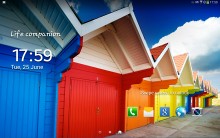
The lockscreen is highly customizable, even supporting widgets
Why Samsung chose to have most of the nifty lockscreen features disabled by default is a mystery, but it's likely to do with conserving the Tab 3 10.1's seemingly insufficient RAM.
As usual, there are alternative unlock routines as well - Face unlock, Face and voice unlock, as well as pattern, PIN or password prompts you can choose from. There are voice-based wakeup commands that can just start S Voice or launch a preselected app, and you can also enable a second clock on the lockscreen that shows up when you're roaming.
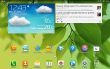
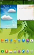
Once you make it past the lockscreen, you'll be greeted by a familiar homescreen. The eight shortcuts that appear along the bottom are visible in both landscape and portrait orientation, all of which are customizable save for the rightmost one, which must always remain the app drawer.
At the top of the notification area there are nine (six in landscape mode) toggles that can quickly enable and disable features. There are more than nine toggles in total, and you can swipe horizontally to get to the others. Or you can tap the upper rightmost button that reveals a grid of all the shortcuts, a total of 13 on the Tab 3 10.1.
You can rearrange this grid, but the top row toggles are always visible. Accessing the notification are with a two finger swipe directly opens the grid of toggles. Another nice trick is to long press on a toggle to go to the related settings (e.g. Wi-Fi settings).

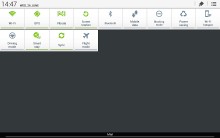
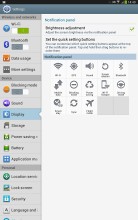
The notification toggles can be customized
Further down we get the Brightness slider with an Auto checkbox. It allows you to adjust the brightness even in auto mode - the backlight strength is still adjusted according to ambient lighting conditions, but you can tweak it to your liking.
The notifications themselves have not changed - they can be expanded to reveal more info and collapsed to save space or dismissed with a sideways swipe. Sometimes they also have helpful buttons on them like "Call back" and "Send SMS" on a missed call notification.
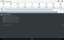
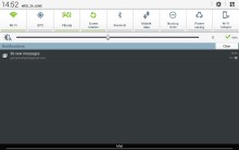
Expanding and minimizing a notification
Finally, at the very bottom of the screen you get a line for connected WiFi network, which turns into "No internet connection" when there isn't a network available.
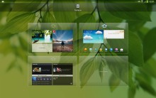
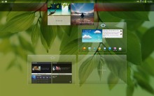
You can pinch zoom to get into the overview mode of all homescreen panes. There can be up to 7 and you can easily add, remove and rearrange panes from here. One pane is marked as "home", that's the one you go to when you press the Home button - any of the available homescreen panes can be set as default quite easily.
The app drawer hasn't changed really since the early days of Nature UX. The app shortcuts are presented as a customizable grid, alphabetized grid or list and you can hide shortcuts (good for bloatware you can't uninstall), view only downloaded apps, uninstall apps and add folders.
As before, widgets are in a separate tab in the drawer.
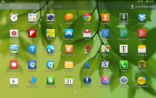
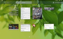
The app drawer houses both app shortcuts and widgets
Pinch to zoom in the app drawer works the same as on a homescreen, giving you an overview of all panes as thumbnails. This is especially useful if you want to quickly locate a widget based on its appearance. You can also choose to have your app drawer ordering to custom, alphabetical grid or alphabetical list. There's a dedicated downloaded pane too, where all your downloaded apps go.
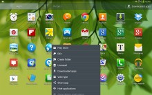
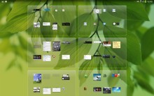
The contextual menu options for the app drawer • a zoomed out look at the app drawer pages
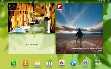
When you drag out shortcuts and widgets to the homescreen you get a list of small thumbnails of all the homescreen panes with the silhouettes of the widgets there so you can check how much space is available on each pane.
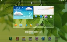
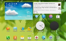
The small thumbnails of homescreen panes make finding room for a new widget a breeze
Once you get several apps running, you can hold down the home button to access the app switcher, which allows you to to go back and forth between apps. You'll see a vertical list with a screenshot and a name for each app - tapping on an app opens it, while swiping it away vertically removes it from the list. There are also shortcuts to a task manager, Google Now, and a Kill all apps button.
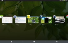
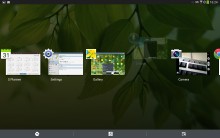
Slide up to kill apps in the app switcher interface
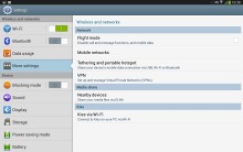
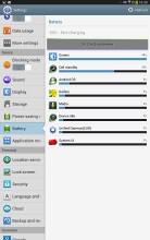
The Settings menu uses a split-screen interface which displays a menu of settings on the left part of the screen, and the relevant toggles and options on the right.
One of the more advanced features that made it into Galaxy Tab 3 10.1 is Smart Stay - it uses the front-facing camera to detect the user looking at the screen, so that it never dims or locks while you're reading. This makes reading web pages and e-books comfortable, even if you've set the screen timeout low to preserve the battery.
Reader comments
- Anonymous
- 21 Dec 2022
- fsF
What wrong with GT-P5210 we can't update we can't install any app
- Dee
- 08 Mar 2020
- YU8
My device cannot read the sim card any suggestions plizzz
- sang
- 27 Aug 2014
- 7tZ
Horrible tab just strats giving problem with in 2 months and warrenty never covers as they give reason of physical damage & service center fake with people
