Samsung Galaxy Tab 3 8.0 review: Middle of everywhere
Middle of everywhere
Latest Android 4.2.2 ticks inside
Samsung Galaxy Tab 3 8.0 runs TouchWiz-skinned Android 4.2.2 Jelly Bean. The TouchWiz launcher is very similar to the Galaxy S4 one, but it's been optimized for tablet usage. Unfortunately, the advanced gesture support of the flagship is gone.
You can see our usual user interface video here:
Keep in mind that because we are reviewing the WiFi-only version, options and settings related to calling will understandably be absent. Still, if you opt for the 3G or LTE-enabled Tab 3 8.0 versions, you'll also get the Phone app and you will be able to make calls and use cellular data.
The lockscreen features the new widgets introduced with Android 4.2, though Samsung fiddled with them a bit. The default lockscreen shows the time along with a personal message overlaid on beautiful photos pulled from TripAdvisor.
The water ripples have been replaced by a lens flare effect but you can switch back to the old one, or disable it altogether. If you like the ripple effect though, it's available in the Lockscreen settings.
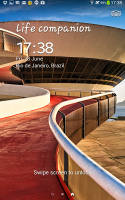
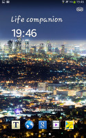
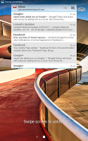
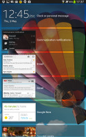
The lockscreen shows beautiful photos and cool widgets
The lockscreen has multiple panes, each containing one widget. The pages to the left contain different widgets - email, Google Now, Messaging, music player, Yahoo! Finance and News, Smart Remote and you can download apps from the Play Store that add new widgets. There are no pages to the right from the default.
There are no app shortcuts at the bottom of the screen by default, but you can enable them and have up to five easily accessible shortcuts.

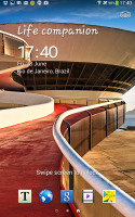
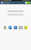
The lockscreen shortcuts are not enabled by default but are still here
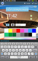
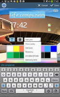
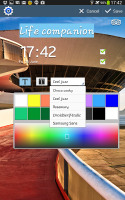
The greeting on the lockscreen can be changed - you can type something else, set a different font and color. You can also disable the personal message altogether and remove the time and date.
There are alternative unlock routines as well - Face unlock, Face and voice unlock, Pattern or Password. There are voice-based wakeup commands that can just start S Voice or launch a preselected app.
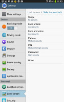
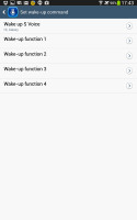
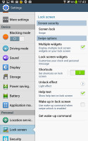
Different lock screen types • Voice wake-up commands
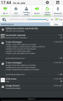
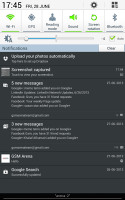
At the top of the notification area there are six (nine in landscape mode) toggles that can quickly enable and disable features. There are more than five toggles, of course, you can swipe horizontally to get to the others. Or you can tap the new button that reveals a grid of all the shortcuts, 14 in total for the Wi-Fi version. You can rearrange this grid (the top row toggles are always visible). A two finger swipe directly opens the grid of toggles. Another nice trick is to long press on a toggle to go to the related settings (e.g. Wi-Fi settings).
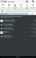
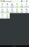
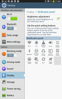
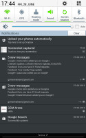
The new notification area is better than the one in stock Android 4.2
Below the toggles is the display brightness slider, complete with an Auto toggle. You can disable this slider to have more room for notifications. As in other recent devices, Samsung has a way of controlling brightness without disabling automatic mode. You define an offset, so your Galaxy Tab 3 8.0 screen will always be slightly brighter or dimmer than the automatically selected level.
The notifications themselves have not changed - they can be expanded to reveal more info and collapsed to save space or dismissed with a sideways swipe. Sometimes they also have helpful buttons on them like "Call back" and "Send SMS" on a missed call notification.
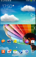
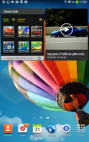
The homescreen looks mostly the same. Samsung has provided many of its own custom widgets like Samsung Hub, S Travel, etc. There's the so called wrap around feature, which lets you scroll homescreens infinitely by always going from the last to the first one.
The Galaxy Tab 3 8.0 homescreen auto-rotates, enabling landscape use of the entire interface.
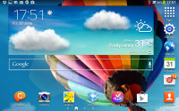
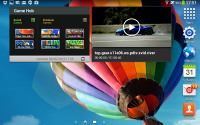
Galaxy Tab 3 8.0 rotates the homescreen like a tablet
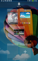
You can pinch zoom to get into the overview mode of all homescreen panes. There can be up to 7 and you can easily add, remove and rearrange panes from here. One pane is marked as "home", that's the one you go to when you press the Home button - any of the available homescreen panes can be set as default quite easily.
The app drawer hasn't changed really since the early days of Nature UX. The app shortcuts are presented as a customizable grid, alphabetized grid or list and you can hide shortcuts (good for bloatware you can't uninstall), view only downloaded apps, uninstall apps and add folders.
You can also maximize space in the app drawer by stacking apps into folders.
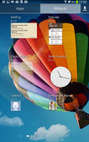
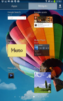
As before, widgets are in a separate tab in the drawer.
Pinch to zoom in the app drawer works the same as on a homescreen, giving you an overview of all panes as thumbnails. There's, by the way, a dedicated pane, where all your downloaded apps go.
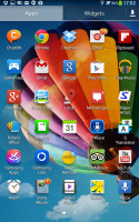
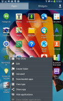
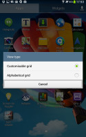
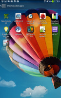
App drawer at a glance • options
When you drag out shortcuts and widgets to the homescreen you get a list of small thumbnails of all the homescreen panes with the silhouettes of the widgets there so you can check how much space is available on each pane.
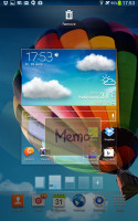
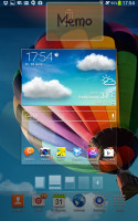
The small thumbnails of homescreen panes make finding room for a new widget a breeze
The App switcher interface is unchanged - there's a list of thumbnails of all the recent apps, apps can be swiped to dismiss and there are three buttons at the bottom, Task manager, Google Now and Kill all apps.
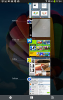
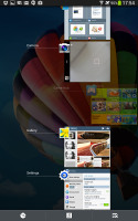
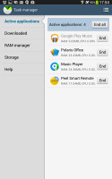
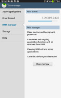
The app switcher • Task manager
The Galaxy Tab 3 8.0 comes with Multi-window, which lets you run two apps side by side on the screen. You can adjust the dividing line giving one app more space. Only compatible apps can be used with Multi-window, for now that means mostly the ones that come preinstalled on the phone.
You can move the small arrow that brings up the taskbar with the Multi-window apps to make it easier to reach with your thumb. You can also move the whole thing to the other side of the screen. That improves ergonomics a bit.
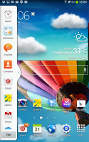
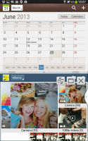
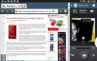
Multi-window mode on the Galaxy Tab 3 8.0
Samsung tweaked the Settings screen to use a tabbed interface. There's four of them - Connection, My device, Accounts and More. You can find the relevant features in their corresponding place - display, for instance, is in the My device tab.
We like what Samsung has done with the latest iteration of TouchWiz. The company has put together an impressive list of features and options, but that's not a bad thing - the default setup is good enough for regular users, while power users get to have it their way without the need for third party apps.
Reader comments
- Higgy
- 11 Mar 2020
- 3J6
Still use mine great phone and tablet had it since 2014 still haven't replaced the battery
- Tebza
- 20 Dec 2017
- rjd
How do I insert sim into my Samsung tab 3 SM-T310
- wafiy
- 10 Dec 2014
- tuf
How much the price for this tablet in malaysia?
