Samsung Galaxy Young S6310 review: Just for starters
Just for starters
User Interface
The Samsung Galaxy Young runs Android 4.1.2 Jelly Bean out of the box, skinned with the latest TouchWiz launcher, dubbed Nature UX. The user interface is basically identical to that of the Galaxy S III mini and the S II Plus: they have the same Android version and screen resolution.
Beyond the obvious benefits to the user experience compared to stock Android, a clearly lowrange handset takes advantage of basically the premium combination that powers all of the company's midrange models.
We've shot a brief video showing off the user interface here.
The lockscreen is a standard "tap and drag in any direction to unlock" affair and there're ripples accompanied by water-drop sound as you drag your finger. There are a number of unlock routines to choose from: motion, face and voice among others.
There're three customizable lockscreen shortcuts (down from five on the big S III and Note II), and you can drag one to activate the corresponding app.
The dock at the bottom of the homescreen fits three custom shortcuts or folders. The rightmost one always opens the app drawer, but the other four can be set to any shortcut or even a folder.
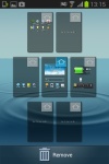
As usual, you can pinch to zoom out and manage homescreen panes - add, delete or just reorder them. You can have 7 panes at most, which are enough to fit plenty of content even if you use widgets that cover an entire pane.
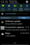
The notification area is quite feature-rich and offers quick toggles for Wi-Fi, GPS, Silent mode, Screen rotation, Bluetooth. You can swipe to the side to get even more: Mobile data, Blocking mode, Power saving and Sync.
Below the toggles is the brightness slider (there's no automatic brightness toggle here though). There is also a couple of other useful things like the Settings shortcut in the upper right corner, the time/date to its left and the carrier name at the bottom.
In Jelly Bean, notifications can be expanded to show more info. They can be expanded and collapsed with a two-finger swipe and the top one is expanded by default (if the app that put up the notification supports it, of course).
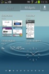
The app drawer accommodates both app shortcuts and widgets. Unlike stock Android, you cannot move between tabs by swipes - you have to explicitly hit the widget tab. Some will find this more logical (scrolling past the available apps to find yourself in the widgets is not as intuitive).
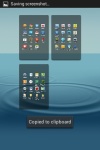
Using pinch-to-zoom reveals an overview of the pages and lets you rearrange them, but you can't create new ones. Hitting the menu key reveals some more options, including hiding apps or enabling tap-to-uninstall mode.
The app drawer has three view modes: a Customizable grid (where you can freely rearrange icons), Alphabetical grid and Alphabetical list (this one makes shortcuts easy to hit, but isn't very space efficient). You can also view just the downloaded apps by hitting the Downloaded apps icon.
Jelly Bean comes with a selection of widgets, with some custom additions by Samsung. Some widgets are resizable too - a feature we've seen in some custom UIs is available natively in Jelly Bean. Widgets automatically move out of the way when you're reorganizing the homescreen.
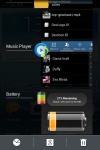
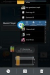
Once you get several apps running, you can use the task switcher to go back and forth between them. It's a Ice Cream Sandwich-style vertical list with a screenshot and a name for each app. A sideways swipe removes the app from the list.
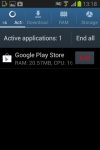
There are three buttons at the bottom of the list - one to bring out Samsung's home-brewed task manager, one to launch Google Now and a 'Kill all apps' button.
Overall, the Nature UX on top of Android 4.1 looks great and the Galaxy Young does pack most of the cool software tricks of the midrange Samsung entries. And despite the lack of a blazing fast chipset, the Galaxy Young handles the heavy Samsung skin equally well.
Performance benchmarks
The Samsung Galaxy Young is powered by a Qualcomm MSM7227A chipset, which packs a 1GHz ARM Cortex-A5 processor, 768MB of RAM and Adreno 200 GPU. Those are hardly the guts of a benchmark champion, but they are quite common among entry level smartphones.
We've compared the Galaxy Young with other entry- and mid-level devices to give you a clearer picture as to which ones have the edge when it comes to performance.
Benchmark Pi
Lower is better
-
Samsung Galaxy S II Plus
409 -
Samsung Galaxy S II
452 -
Sony Xperia S
536 -
Sony Xperia go
543 -
Sony Xperia sola
551 -
Samsung Galaxy Fame
603 -
HTC Desire X
639 -
LG Optimus L7
773 -
Sony Xperia J
790 -
Sony Xperia E dual
800 -
Samsung Galaxy Young
831 -
Sony Xperia tipo
987 -
Sony Xperia miro
1037 -
Samsung Galaxy Ace Plus
1037
Quadrant gives the smartphone an all-round grade for processing (calculative and graphic, memory speed, SD card writing, etc). The Galaxy Young scored just below the Xperia E here, but managed to beat Sony's last-year entry.
Quadrant
Higher is better
-
Samsung Galaxy S III
5450 -
Sony Xperia T
4774 -
Motorola RAZR i
4125 -
Sony Xperia SL
3396 -
Sony Xperia J
1859 -
Sony Xperia E dual
2362 -
Sony Xperia E
2135 -
Samsung Galaxy Young
2005
SunSpider
Lower is better
-
Sony Xperia E
2107 -
HTC Desire X
2259 -
Sony Xperia E dual
2824 -
Sony Xperia J
2853 -
HTC Desire V
3299 -
Sony Xperia tipo
3531 - Sony Xperia miro
3532 -
LG Optimus L7
3661 -
Samsung Galaxy Young
3578 -
Samsung Galaxy mini 2
5911 -
HTC Explorer
10784
BrowserMark 2
Higher is better
-
LG Optimus G
2555 -
Nokia Lumia 820
1760 -
Samsung Omnia W
1632 -
Samsung Galaxy S III (JB)
1247 -
Sony Xperia E
992 -
Sony Xperia E dual
975 -
Samsung Galaxy Young
908 -
Sony Xperia J
587
Vellamo
Higher is better
-
Samsung Galaxy S III
1641 -
LG Optimus 4X HD
1568 -
LG Optimus G
1522 -
Meizu MX 4-core
1468 -
Google Nexus 4
1310 -
Samsung Galaxy Fame
1234 -
Samsung Galaxy Young
1072 -
Sony Xperia E dual
1065
Reader comments
- Anonymous
- 10 Nov 2019
- ypc
I want this phone how can I get it
- chavo
- 31 May 2018
- P9q
my phone doesnt have the samsung app how do i get it installed
- not
- 11 Jun 2016
- gy8
not good, when i try open youtube links at facebook the pages won't open..
