Samsung Galaxy Z Fold4 long-term review
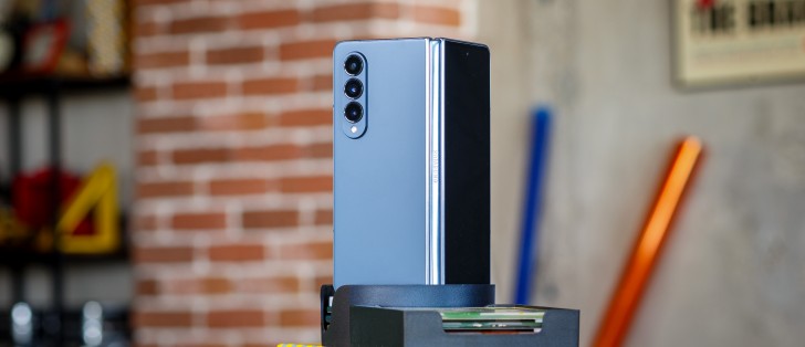
Cover display aspect ratio
We want to start this section by acknowledging that Samsung has been listening to complaints about how tall the outer screen has been in previous iterations of the Fold line. Thus, the Fold4's "Cover display" (as Samsung calls it), is now less tall than the Fold3's. The aspect ratio went from 25:9 to 23.1:9.
As those numbers strongly imply, the problem is that it's less tall by only a teeny tiny amount, and so the issue with typing on the outer screen remains - keyboards are simply too cramped due to the form factor, meaning you'll have a much more error-filled experience. However, it's now about 5% less so than it was on the Fold3. Progress? For sure, but this is still a far cry from what most of the Fold4's competitors are offering.
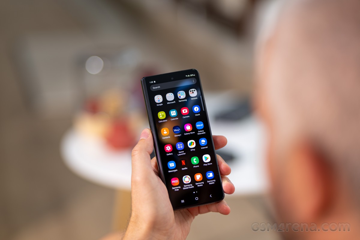
We're not sure what Samsung's plans are, on this matter, for the Fold5, but while we do really appreciate the fact that it's been listening, we're hoping for an even less tall form factor the next time around. We understand why the outer screen is this narrow - when you factor in the thickness of the device, making it a normal aspect ratio would have meant it would be impossible to hold and operate with one hand, for most people, when closed.
That makes sense. However, there's another way to fix that problem: by making the phone thinner. The thinner it would become, the more wide the outer screen could get without impeding usability when folded. But with a hinge that leaves a gap in its closed state, such thinness is impossible to achieve.
So, first Samsung needs to develop a gapless hinge, then work on making the phone thinner, and then obviously slap a wider Cover display on there. With these tweaks, the hardware of the Fold line would get as close to perfect as possible nowadays for this form factor, and it would complement the software experience, which is top notch, very nicely. We're still dreaming of this, and hoping, and waiting.
Inner screen crease
The Fold4's inner screen folds in half! How about that? Okay we know foldables aren't a new thing anymore, but it's still a pretty magical experience to use one, to this day. And for some reason, it seems more so on these phone-folds-out-into-a-mini-tablet style devices than on the Flips of the world.
At the point where the screen folds, there's an inevitable crease, which a lot of Samsung's competitors have recently done away with almost entirely. The Fold4, on the other hand, still has a very definite, very obvious, impossible to ignore crease in the middle. It's clearly lagging behind the competition in this regard, although the size of the crease here is almost always a non-issue in day-to-day use.
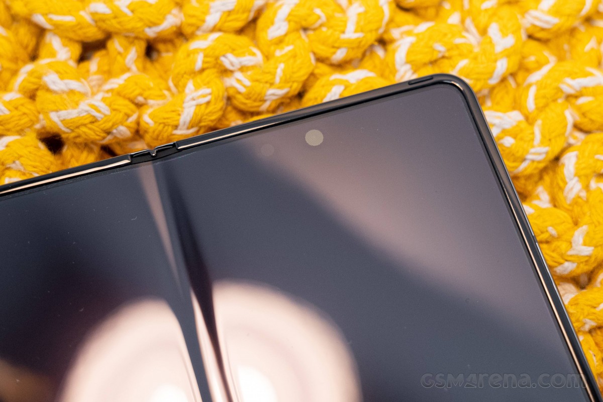
Thanks to the size of the screen, you aren't going to have your finger touching the crease a million times a day, unlike what happens with the Flip4, for example. That's simply due to how the Fold4 folds, and how you're most likely to hold it when using it, and what you and most people use their phones most for these days - it's a ton of vertical scrolling. If you open the Fold4 like a book and then don't switch orientation, you'll never feel the crease when scrolling. And even if you go to the inner screen's 'landscape' orientation, the sheer size means you aren't likely to touch the crease a lot.
Of course none of this negates the fact that such a prominent crease feels out of place in this day and age, but it is what it is. Hopefully improvements will be made in this area on the Fold5, otherwise Samsung's foldable hardware game would be desperately out of sync with its competitors.
Brightness, quality
The Fold4 has a very good inner screen, considering the context of it folding. Brightness does not reach the levels of a slab style phone, but is miles away from what the first Folds were able to deliver. This inner screen can even be seen outside on a bright sunny day, though if the sun is hitting it directly things become rather iffy. Still, find a shaded spot and you're golden.
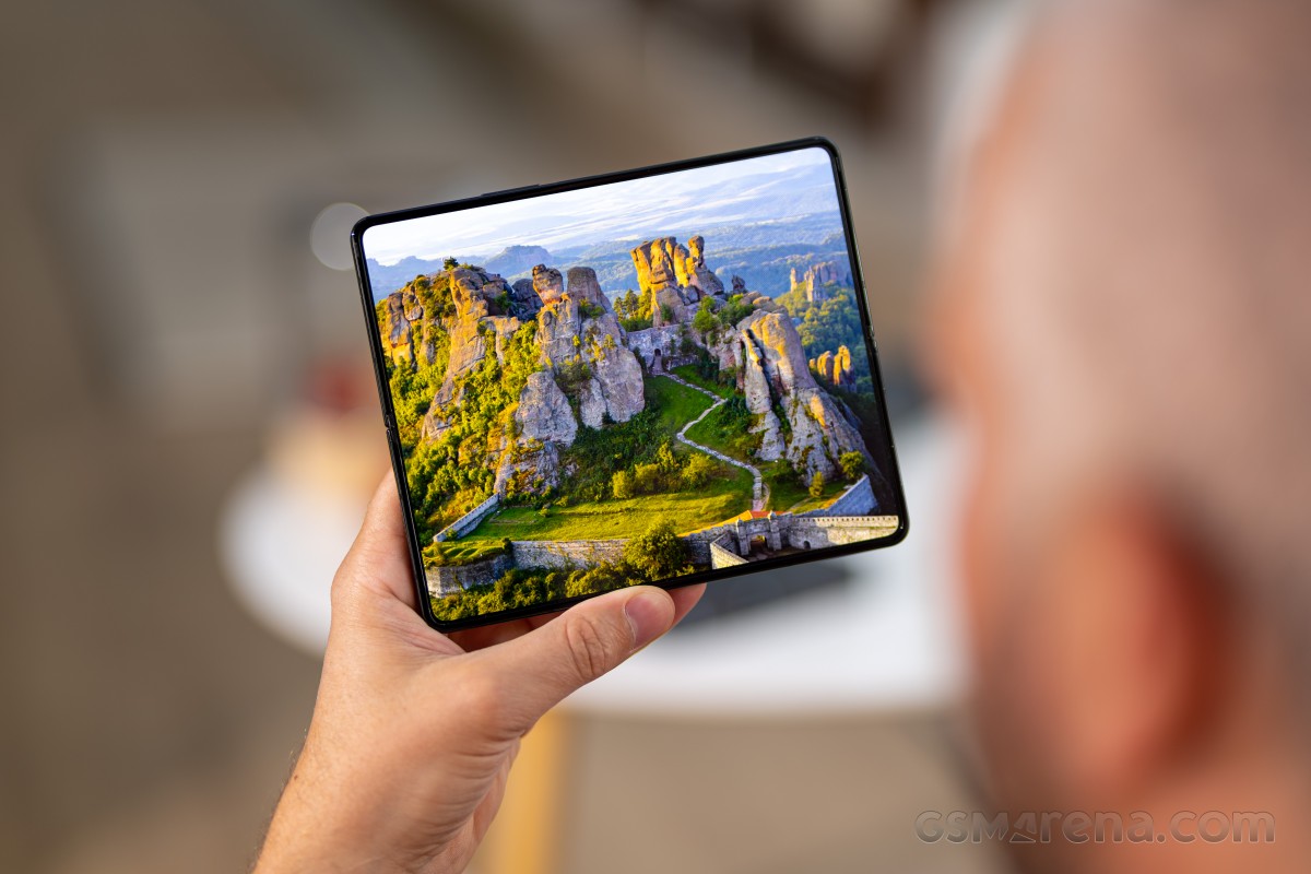
The outer screen feels brighter than the inner one, without the difference being like night and day. It is definitely the more usable of the duo when you come in contact with direct sunlight, and we assume it's the one that will get most use when out and about, since one-handed use is actually possible. To us, the inner screen feels a bit more reflective than the outer one, which might be due to the plastic protector on top of the ultra-thin glass. This makes it ever so slightly harder to see in bright sunlight, since more of it is reflected back into your eyes.
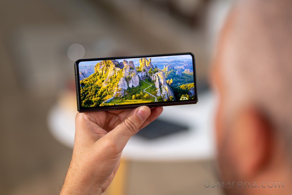
At the other end of the spectrum, both screens get dark enough for rather comfortable use in pitch black environments, and if that's not enough, you can always employ the Extra dim feature in Android, which does what the name implies and takes things even further with a customizable intensity slider.
There's a weird quirk in One UI, however, which we've also encountered on the Galaxy Z Flip4. The auto brightness never actually gets to the 'zero', aka leftmost point on the manual slider, no matter how dark an environment you enter. There's always a little bit of extra dimness you can achieve simply by manually taking the slider to the leftmost point, but you'll have to do this every single time since it's not remembered as it should be. All the other minor adjustments we made with the slider were in fact remembered, which is why we think this may not be a bug but an intended function - not that we can figure out what its purpose could possibly be.
Speaking of auto brightness, the algorithm is generally very good for both screens, among the best we've dealt with in the past year or so. It's not perfect, but you won't find you need to make a ton of adjustments each day.
As you'd expect from a Samsung device with panels made by Samsung, the quality is outstanding on both displays. There's the recently simplified Screen mode selector on board, which has you choose between Natural (tuned to sRGB), and Vivid (which is tuned to the P3 color space).
Both of these work very well in their default states, and while you only get the default for Natural, you can tweak Vivid to your liking with a white balance slider as well as individual sliders for red, green, and blue. Note that the default Vivid state is a bit too cold, so amping up the warmth with that white balance slider is something we'd recommend - this also helps get closer to the DCI-P3 target.
There's no way you won't find a setting that works for you. As for us, we're simple and just chose Natural and that was it - most content is still tuned to sRGB, so in theory this gets you the most accurate colors, at the expense of some of that 'pop' that Vivid can deliver.
Refresh rate
120 Hz is so standard right now across multiple price ranges that it's getting a little bit boring talking about it. Both of the Fold4's screens go up to 120 Hz, as they should, and in both cases the implementation is great, as you'd expect from a phone that's this premium.
The choice you get, as usual in One UI, is between "Standard" (60 Hz maximum) and "Adaptive", which goes up to 120 Hz. Both of these are peak rates, achieved when you're interacting with the screen. When you aren't, the refresh rate drops with either setting so that battery life is enhanced. In practice, we've never felt that the phone picked a refresh rate that was too low for comfort - interactions always felt smooth enough, which means the algorithm that varies the rates is very good, and that's great.
Eye comfort shield, Always On display
One UI's Eye comfort shield (aka the blue light filter) is the same one we've been used to for a while now. You can let it automatically adjust your screen's colors based on the time of day, with warmer hues at night, or pick a custom intensity level from the slider, and schedule the feature to come on and off at specific times or sunset to sunrise. It's all pretty flexible, but it's missing features like a black and white mode (hi, ColorOS) or that plus an option for desaturated colors and textured backgrounds (MIUI still does it best to this day).
That said, it's there and it works very reliably. The same goes for the Always On Display. This one can be shown at all times, made to follow a schedule, shown for new notifications only, or shown when tapping the screen. Of course the more you have it be there, the more battery it will consume, it's just how these things work.
One UI's Always On Display is still the only one we're aware of that has an Auto brightness setting, and when it's on this means it won't light up a dark room for no reason, nor will it be illegible in direct sunlight. Win-win, we think. Additionally, it has a screen orientation choice, for those who would love to see it in landscape mode - another feature we gather is rather unique. But while we did set Auto brightness to on, we left the AOD in its default Portrait orientation mode - we're not edgy enough to change that, it seems.
On the customization front, there aren't as many options as you get in some other skins, but probably more than enough for 99% of people. You can select a bunch of clock styles, colors, or use stickers, AR Emoji, Bitmoji, or an image from the Gallery. It's a useful feature that's now pretty much expected to appear in all phones out there, and it's here, and it works well, and it's definitely much more customizable than those in stock and stock-like skins.
Reader comments
- Anonymous
- 02 Oct 2024
- sfN
The inner screen foldable technology isn't mature. Many have had their inner screen fail just after the warranty including myself as described here https://youtu.be/jI0NkxL5Ovo
- hydrus
- 03 Sep 2024
- arR
I own Fold4 for about a year and... it's great and terrible. I absolutely love and hate the form factor. Dual-screen design is absurdly fantastic. Can't say how much I love Fold for it's inner screen. But the device is also heavy,...
- Anonymous
- 11 Jul 2024
- Pxn
dont buy fold. just after 3-4 months there were display problems. company didnot respond because its warranty for 3 months only. if display problem araises.. you have to pay 60k. better go for any other model except fold series.


