Samsung Gear S review: Between two worlds
Between two worlds
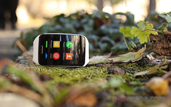
Tizen OS User Interface
The Samsung Gear S is powered by Tizen, the wearable OS of choice for Samsung at the moment and for a good reason. The platform has come a long way since its early days and now offers a very pleasant and fluid experience. It also looks the part with stylish animations and vivid colors.
Almost every menu and function on the wearable feels like a natural extension to their own TouchWiz from the dark stylish color scheme all the way to title bars and menu placements. So if you are accustomed to Samsung's signature UX preferences, you should feel right at home with the Gear S. But even though Tizen delivers a very pleasant experience as a whole, there are a few problems worth noting.

For one, the control scheme seems needlessly overcomplicated and a little counter intuitive. The device features four main swipe gestures, one from each side of the screen as well as a few other, less important ones.
While at the main watch face view, you can swipe left to view notifications and keep swiping to switch between notification groups or in other words the different apps, simple enough.
Swiping right takes you to a series of different screens with what appear to be widgets. Each screen shows one widget at a time and swiping right takes you through media controls, fitness apps, news and calendar, with the final screen left empty. All of them are subject to user customization.
But this is where the confusion starts to set in. Swiping down serves as a back button almost universally across all menus and apps, with the notable exception of the home screen, where doing the same, reveals a pull-down menu with the battery and connectivity status as well as controls for volume and brightness.
Swiping up on the other hand is quite naturally used for scrolling down, again with the notable exception of the home screen, where it opens the app drawer.
Notifications are nicely executed on the device with nice bright colors and clear application icons. Aggregating multiple notifications is somewhat confusing, but the wearable definitely serves the purpose of informing you in a timely matter on you smartphone's activity. One thing that feels missing though is the actionable notifications, much like the ones in Android Wear.
Currently, there is no option for a quick reply with the notable exception of text and email messages, which can be handled through Gear S's own applications for a reply. Perhaps this can be fixed in a future update as it would truly bring a whole new level of freedom to users.
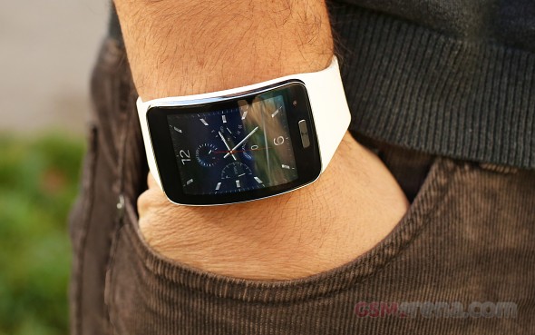
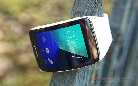
Watch faces are another huge aspect of every wearable and unsurprisingly Samsung has its own take on them as well. The built-in options are not a lot, but they are beautifully drawn and look amazing on the AMOLED display.
Some of the watchfaces are clean and simple with just an analog or digital clock and a few resemble actual watches. One of the nicer features is the addition of shortcuts to various apps right on the home screen as well as the current notification count, steps and other real-time information.

A lot of styling options have been made available on the Gear S. In addition to watch faces there are also wallpapers and color themes, but there's not much downloadable content in this department. The available watch designs are not nearly as plentiful or original as the ones for Android Wear. There are a few apps available for easy drag-and-drop watch face creation, but again, nothing too spectacular.
Speaking of availability of content, Samsung has made some interesting decisions as to how the wearable behaves. Firstly, it does require a Samsung smartphone and preferably a fairly recent one to set up initially. Needless to say this limits the Gear S's target market immensely. Hacks are available to get it running on other devices, even iOS, but this is the only approved way to work with the device so if you don't own Samsung smartphone there is little incentive for you to get the wearable in the first place.
While connected to the smartphone the device is controlled entirely by Samsung's own Gear manager. While it looks simple enough and seems to be a single application doing all the heavy lifting in reality the app is more of a framework. This of course is necessary, so that the wearable may receive access to all the Android functions it needs to access, but it comes at a price with over 10 additional installs during the application setup. All of these components remain very much hidden from the user, but their presence is felt mainly in RAM requirements and to some extent battery life, although that can't be accurately judged while the Bluetooth is connected.
The whole Gear manager suit, while very simple in design does feel a little bloated, mainly because it seems redundant to be implementing proprietary APIs and services when most of the functionality is already available for use by Android Wear devices and will be pretty much incorporated in the OS itself starting with the current Android 5 release. But that is simply just another aspect of Samsung's ever present battle to create a flavor of Android as detached form Google as possible.
Application delivery is subject to pretty much the same presumptions and apps can be installed on the Gear S only through the Gear Manager on a smartphone. Samsung uses its own App store to distribute everything from watch faces to the application themselves. Installing apps on the smartwatch seems to leave no footprint on the phone, which is definitely a nice thing. No separate shortcuts or additional applications are left on you handset. The watch apps are all visible through the Gear manager along with any settings they might have.

The store does have some interesting apps but nothing too impressive. There seem to be only a few active developers, besides Samsung that know what they are doing and utilize the device properly. The selection is not exactly rich and when we take into consideration the fact that many of the apps for previous Gear models also work on the Gear s, its dedicated library really becomes less impressive.
Most basic things are covered and even some advanced features. The availability of a version of Opera Mini is really a nice little touch and makes a lot of sense given the ample connectivity options. It works surprisingly well and is really convenient for a quick Google search on the go.
As a whole, the Gear S is crippled by its closed-off, proprietary nature that inhibits it to partake in the rapid development taking place over on the standardized Android Wear stage.
Typing is expectedly a chore on the 2-inch display. But Samsung has really put a lot of effort into making the most out of what they have to work with. The keyboard works surprisingly well for numbers, but letters are almost impossible to type, let alone fast.
There is a pretty solid prediction mechanism working in the background that learns your typing habits and does a pretty good job of it. It even requests access to certain parts of your handset, like contacts and messages and manages to familiarize itself with the terms and people you refer to most often. Of course, in order prediction to work you need to get the charcters right to begin with which rarely is the case. There is an option for swipe input, but much of the same problems stand. A watch is just something that is not intended for typing.
A lot of the integrated applications on the Samsung Gear S exhibit a very dualistic behavior depending on whether the device is connected to a smartphone and has a working SIM card of its own. Phone, Message, Contacts and Media Player all double as both internal controls for the device itself or remote controls of the connected device. This does get very confusing at times, despite the fact that there are separate logs and menus for some features.
This perhaps is the biggest shortcoming of the Samsung Gear S. And this ambiguity of character plagues the otherwise nice device in almost every possible aspect.
Reader comments
- Tomgibson201
- 12 Jul 2020
- mE0
Hi . I am wondering do you need to have a sim card in this or will it link to the phone via app/Bluetooth so then I can take calls . Messages . Notifications on Facebook. WhatsApp ect ect. Many thanks. Tom
- Gustocow
- 11 Apr 2020
- 0Rd
I've toyed with idea of getting newer model, but cant find anything with same kind of function...with exception of the lack of NFC, this watch has everything and I swap out my sim from phone when going for run, which means I'm still contactable if ...
- Bossycool
- 02 Feb 2020
- rKY
Who else is reading this in 2020?? I've used it for four years straight.. still looks great and works like a charm.