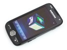
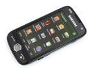
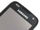
Samsung I8000 Omnia II review: A surprising experience
A surprising experience
Unboxing the Omnia II
We didn't get the retail package so the contents of the box might be different from what we have here. We got a charger, which plugs into the microUSB port, a microUSB cable and a headset.
The two-piece headset has its remote ending on a 3.5 mm jack so you have quite a choice of alternative headphones to use with the phone. Or you can bypass the remote entirely thanks to the 3.5mm audio jack on the phone itself.
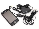
The contents of the box in which our Omnia II arrived
The retail box will also include manuals and a disk with software as well as a carrying pouch, though as we didn't get one, we can't really comment on its quality.
Samsung I8000 Omnia II 360-degree view
It measures 118 x 59.6 x 11.9 mm and weighs in at 117 grams. Tiny it isn't, but the 3.7" touchscreen takes up most of the real estate on the front with very little spared for the bezel. But when you consider just how many features are packed into the phone, that size and weight seem pretty damn good.
The Samsung I8000 Omnia II might seem big at first sight but it isn't really. It's noticeably smaller than the Omnia HD and not much bigger than the iPhone.
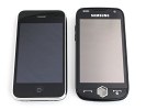
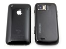
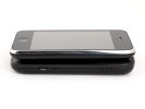
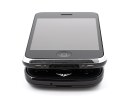
Size comparison: Apple iPhone vs. Samsung I8000
Design and construction
From a distance all touchscreen bars look practically the same - a huge touchscreen display with perhaps a few buttons below it and that's it. Still, the Omnia II preserves the spirit of Samsung styling and is very easily recognizable as a Samsung device. Maybe their devices are becoming a little too samey - if it weren't for the size difference and the red Samsung styling of the Jet back, the Omnia II and the Samsung Jet would be indistinguishable even to our trained eyes.
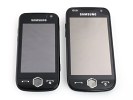
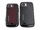
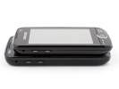
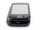
Samsung S8000 Jet and I8000 Omnia II side by side
Things haven't changed much overall since the pre-release version we used in the preview, there's mainly been just a little polishing and tweaking of the design.
The Samsung I8000 Omnia II front is quite sleek with black glass framing the display, while the surface of the buttons has a "brushed" appearance that helps keep fingerprints away.
There used to be a silver strip edging the front of the device in the pre-release unit, but that has now been replaced with the same black plastic that covers the rest of the phone. We quite liked that strip, as it gave the device some individuality.
The front, much like the front of a TV set, is dominated by the display. It's an AMOLED unit, 3.7 inches in size and is at the limits of one hand usability. With a WVGA resolution of 480 x 800 pixels, it's among the highest resolution examples on the market and it's certainly the highest resolution AMOLED display on a mobile phone.
As far as sensitivity goes, Samsung showed that even resistive touchscreens can be very sensitive and we're happy to report that the touchscreen on the Omnia II is almost as sensitive as the one on the Jet.
The display is supposed to use Samsung's Advanced Resistive touchscreen technology and though you can't really spot the difference without a direct comparison to other devices, it seems to do its job very well, reacting to even very light touches. Plus sticking to the resistive type of display has the added bonus of being able to use it with anything you want - stylus, pencil, nails, gloves, etc. Writing, scrolling, typing, zooming - everything is as easy as on the capacitive screens of Samsung's M7600 and S8300.
The only things that stop it from being perfect are the limited number of colors - 65K - and, of course, the disappointing sunlight legibility. The limited number of colors is quite a downer as banding ruins almost every color gradient.
There's also no slot for a stylus. So, in the original Omnia tradition the I8000 Omnia II users will have to do with an attached one on a lanyard if they insist on having one.
A stylus is not really needed most of the time thanks to the touch-friendly TouchWiz interface and even the Windows Mobile 6.5 OS, which shows through occasionally, is trying to shed the need for a stylus. Handwriting recognition is about the only place where a stylus is a must. But then, there are many people that prefer using a stylus to a finger - so those are definitely catered for.
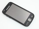

As big a screen as they could fit, 0.2" bigger than the iPhone's, but AMOLED
There are three hardware buttons on the front - the Call and End keys obviously and the center button. The center Cube button has changed quite a bit - it's transparent with some sort of 3D effect which looks cool but it no longer glows. Glowing was better - the light pulsed smoothly, which looked great, and also notified you of events such as the battery going low.
Another change to the Cube key is that it no longer launches the Cube menu. Instead, it brings up Samsung's four-section menu. That change is for the better as the Cube menu is pure eye-candy and serves no practical purpose. The newly assigned four sections of the menu keep things organized slightly better than the standard WinMo menu does.
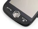
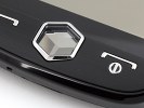
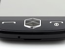
The buttons on the front are large and easy to hit
The video call camera, a proximity and ambient light sensors are crammed in above the display.
Reader comments
- AnonD-348524
- 05 Jan 2015
- veS
My phone samsung omnia ll GT-I8000 the phone off.how can open?
- AnonD-348524
- 05 Jan 2015
- veS
Samsung Omnia cant on.phone status off.how to open?
- vhin
- 24 Sep 2013
- vaN
how to open a phone off.because no signal and always airplane mode.and my contacts is not look.
