Samsung I8000 Omnia II review: A surprising experience
A surprising experience
Windows Mobile 6.5 runs smoothly
As we mentioned, only after you switch off the TouchWiz customization you can get to the underlying Windows OS. Normally, we wouldn't attempt doing that at all, but this time it's Windows Mobile 6.5 we're talking about here. We just had to get to it.
A new homescreen
You probably know from all those screenshots that have appeared online that the default WinMo 6.5 homescreen consists of a scrollable list. What you may not know, unless you've watched a bunch of demo videos, is that some items of that list are in fact side-scrollable.
By scrolling sideways you gain access to different phone features from one single item. For example scrolling the Getting started item sideways allows you to set the clock, email account, device password, Bluetooth, custom wallpaper, custom ringtone, upload music or finally even remove the Getting started item for good once you're ready setting up the essentials.
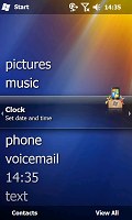
The getting started tab allows you to set up some of the basic feautures of the phone
Another example is is Pictures, which allows you to browse the thumbnails of the photos in your gallery by side sweeps. Touching a photo opens it fullscreen in the photo album.
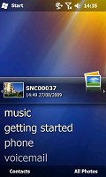


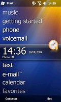
Some of the tabs available on the default Windows homescreen
Tapping on the music tab will start the media player. We would have preferred it to launch the Samsung Touch player instead as this is certainly our weapon of choice for listening to music on the Omnia II, but we guess that could be tweaked by Samsung later on.
The Clock item provides you with information about the current time and date as well as displaying the operator logo. Clicking over it brings you to the default windows alarms screen. Once again we are sorry that it doesn't open the proprietary Samsung application instead as it is a whole lot nicer.
The Text and email tabs display an indication if you have received a new message or an email, while at the same time providing you with a one-click access to the message composer and the inbox respectively. You can scroll previous messages or other mailboxes by the usual side sweeping routine.
Calendar tab monitors your appointments for the day and allows you to quickly set a new one. The today screen in the calendar gets opened if you press it.
The final tab is reserved for the Internet Explorer Mobile favorites. Just as one might expect pressing any of the bookmarks opens it in the web browser.
Moving on to the main menu
Pressing the Start menu icon at the top right no longer opens a drop down menu full of shortcuts. Instead it opens what we like to call the new Windows Mobile "Main menu". It's got icons ordered in that oh-so-popular honeycomb pattern that so many people can easily recognize as pure WinMo 6.5 stuff thanks to numerous official and leaked screenshots.
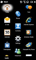
The honecomb pattern of the main menu
In the new main menu you've got all the installed programs plus shortcuts to the settings menu. That Settings menu has also received a facelift and displays icons in the same honeycomb structure.
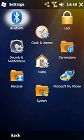
The settings menu is also redesigned
The perfectly flat structure of the Main menu can surely get a bit clumsy in time due to the huge number of icons piling up (iPhone users with loads of apps installed will know what we mean) but still we'd prefer that over the confusing experience that so many Widows Mobile new adopters have enjoyed in the past.
Check out our quick demo video of Windows Mobile 6.5 running on Omnia II:
And there's those other bits and pieces
Further on, all menus have a larger font that allows for more thumbable operation.
Another nice change brought by the new version of the OS is the option to alternate tabs by simple finger sweeps wherever Windows offers you tabbed screens. You no longer need to aim for the tiny titles at the bottom of the screen as on the WinMo 6.1 handsets - you just swipe your finger across the screen and the next tab opens instantaneously.
Not so revolutionary as evolutionary
This is the first time that we meet Windows Mobile 6.5 in person - preloaded on a real device, lock'n'loaded, ready for work. It's true that it's hardly the overhaul the Microsoft OS calls for. But until Windows Mobile 7 arrives, the v.6.5 should do it for the end user. Especially with the kind of help the cellphone manufacturers give by heavily customizing the user experience.
The response of Windows Mobile 6.5 as presented by Omnia II to us is surprisingly top-notch - we might even dare call it among the best of touch-UI-class. Scrolling and generally going through all the menus is a wonderful experience.
It's not that the TouchWiz UI is any different, but with this one everything is practically instantaneous - just as a comparison to the old Windows Mobile we all know and "love".
The 800MHz CPU that the Omnia II has on board does a marvelous job offering performance unthinkable for WinMo devices no more than three generations ago. The speed should no longer be considered one of the key disadvantages of the Microsoft OS and looking at the 6.5 revamp neither should looks. To sum it up, the Omnia II is probably the most responsive and fast ticking WinMo device we've seen to date.
Reader comments
- AnonD-348524
- 05 Jan 2015
- veS
My phone samsung omnia ll GT-I8000 the phone off.how can open?
- AnonD-348524
- 05 Jan 2015
- veS
Samsung Omnia cant on.phone status off.how to open?
- vhin
- 24 Sep 2013
- vaN
how to open a phone off.because no signal and always airplane mode.and my contacts is not look.