Samsung I9003 Galaxy SL review: Through different eyes
Through different eyes
User interface gets a Froyo boost
The Samsung I9003 Galaxy SL runs a TouchWiz-enhanced Android 2.2 Froyo. At this point most of the first-gen Galaxy S units have too received a Froyo update so the experience on those devices is pretty similar, if not identical. We’ll still list the changes brought by the OS upgrade here.
We’ll be reusing texts from past reviews but you should rest assured that we’ve updated all the content to match the Galaxy SL specifics.
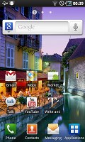
Now let’s go through the user interface description quickly. The homescreen fits up to 7 panes, which can be managed quite easily. A pinch zoom on screen takes you to the edit screen where you can add, remove and rearrange the panes as you see fit.

Editing the homescreen panes is as easy as it gets
The Samsung home-baked widgets are still here and even new ones are added. Some of them are preinstalled, while others are available for free from the Samsung Apps repository. Still there are so many of those available over at the Android market that custom widgets are hardly considered a selling point any more.
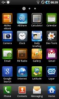
The four shortcuts docked at the bottom are still here. You use the rightmost of them to alternate between homescreen and app drawer and the rest can lead to whatever apps you want.
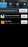
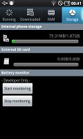
An interesting change brought by Samsung for the Android 2.2-compatible version of their TouchWiz launcher is the built-in task manager. Coming complete with a homescreen widget that shows the number of currently active apps, it saves you the need to install a task killer on your own.
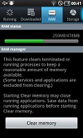
It’s exactly that task manager and its readings that completely convince us that Samsung wasn’t completely honest when they announced the I9000 Galaxy RAM capacity.
Back in the day the company confirmed twice that the handset packs 512 MB, just like the I9003 Galaxy SL now.
However the new handset reports 478MB worth of available RAM (after the slice reserved for the OS), while the original Galaxy S was showing south of 340MB.
Obviously the original Galaxy S has some good 138MB less amount of RAM than the new SL despite Samsung claims both have an equal amount of 512MB on board. We suppose the less powerful GPU consumes less RAM, which explains where some of the difference comes from.
Moving on, the Android 2.2-running I9003 Galaxy SL brings a few new live wallpapers. Again, there are plenty of those in the Android Market, so it’s not much of a differentiating feature.
However the improved notification area is one of our favorites. Packing Wi-Fi, Bluetooth, GPS and Mute toggles since Eclair it now adds an automatic rotation switch. These handy shortcuts can save you a whole load of digging in the Settings.
The system lock screen has remained relatively unchanged – you now need to swipe to the left or rather (rather than upwards) to remove the virtual glass pane covering your phone. There are cool alternative unlocking patterns too when you have a missed event – a message or a call.
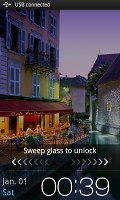
The lock screen hasn’t changed either
Finally, we come to the performance. The Samsung I9003 Galaxy SL packs a new TI OMAP 3430 chipset, rather than the home-brewed Hummingbird on the I9000. Yet both of those have a 1 GHz Cortex A8 CPU on the inside so UI navigation is equally smooth. Froyo speeds up app performance too, though you probably won’t feel the update as a 2-5 times better as it says on the Froyo box.
However you should keep in mind that the Samsung I9003 Galaxy SL comes with the less powerful PowerVR SGX530 GPU, instead of the PowerVR SGX540. That should result in somewhat less stellar performance in apps that support hardware 3D acceleration.
Since our pre-release unit obviously had some issues with the benchmark tests we won’t be publishing its results for the time being. We’ll update the review once we get hold of a retail unit.
Phonebook gets an extra point for swipe gestures
A typical Android smartphone, Samsung I9003 Galaxy SL has a phonebook with massive functionality and practically unlimited capacity. However the Samsung customizations give it an edge against competitors that use the same platform.
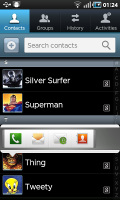
We are mostly talking about the swipe gestures that really take functionality up a notch. In the main contact list, or any other list with names and numbers, a swipe to the right on a name will dial the contact’s default number, while a swipe to the left will start the New message interface.
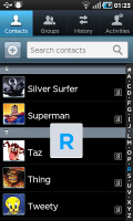
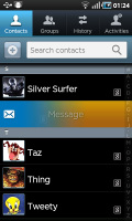
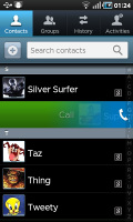
The phonebook does a great job * Swiping on a contact’s name or number in the log will start a call or launch the message composer
Of course, there’s also quick contacts pop-up support but those require two clicks rather than a swipe. On the other hand it also offers video call and email as options so it has its uses.
The handset displays the phone memory, SIM-stored and all Google contacts in the phonebook. There is a dedicated setting for that, so you really can have all of your contacts gathered in one place. You can search the entries by either flick-scrolling the list or using the alphabet scroll at the side of the screen (another Samsung-made feature).
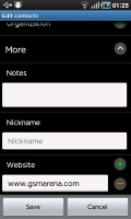
There are many info fields that you can assign to each contact, but it still remains perfectly organized. You have all the types listed (numbers, email addresses, etc) and there's a plus sign on the right - clicking it adds another item of that type. Pressing the minus sign under it deletes the unneeded field.
Reader comments
- AnonD-214979
- 10 Jan 2015
- tuf
I like samsung galaxy sl..becoz he like galaxy s..i used have 2 years...just ram not power..
- jay
- 19 Mar 2014
- apM
don't bought this kind of mobile you just wasting your money.......
- varsha
- 19 Apr 2013
- vbP
I using this phone over a year n a half. I m more than happy. But from last two months i m facing stupid problem .. In house im using wifi ... When i go out it switched on its own but when i m back it dosen't n some time in wifi area also it changed...
