Samsung I9100 Galaxy S II review: Brightest star
Brightest star
User interface: TouchWiz launcher got an update too
Hardware changes all seemed good, but if recent years have taught us anything is that it’s the user experience which counts. Well, Samsung must’ve known that too and they put a due amount of R&D effort into improving the TouchWiz launcher.
The changes brought by TouchWiz 4.0 start at the very lock screen, which you can now remove by swiping in any direction, rather than just sideways. The cool feature where missed events (messages, calls etc) get their own unlock patterns is still here too.
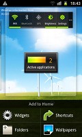
The heart of every Android smartphone, the homescreen, got plenty of tweaks too. You get that rectangular design for the widgets, which freshens up the looks, and several new widgets to improve the functionality. The process of adding widgets has been visually enhanced too with fresh transition effects.

The screen got several tweaks and upgrades
The power widget, which controls the radios on your handset has been improved and now lets you control the screen time out straight on the homescreen in addition to providing one-click access to the settings menu. It’s those two additions that make this widget worth using. On the previous Galaxy smartphones its functionality was almost entirely doubled by the notification area shortcuts.
This seems the right place to mention a couple of new live wallpapers that come preinstalled on the Samsung I9100 Galaxy S II. They are actually developed in cooperation with Accuweather and display the current weather conditions on the whole screen. Think Sense UI weather widget, but on a larger scale. The two different wallpapers in fact only differ by the background – one has a few wind power propellers, while the other uses a beach.
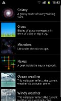
The new live wallpapers are pretty cool
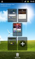
Editing the homescreen panes is business as usual – you pinch zoom-out to display an aggregate view of all panes, which you can then easily rearrange, delete or add.
The numbered dots that identify the homescreen panes serve as a scroll bar too. A press and hold on the dots lets you scroll sideways through the resized images of the available homescreen panes in one short go rather than with several swipes.
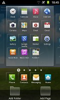
There was some work done on the app launcher too. For one, you can now create folders inside it (though given that folders are enabled on the homescreen we don’t see much use for that here).
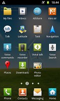
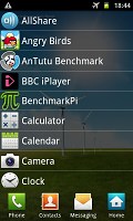
The app launcher got some updates too
Still, creating folders is pretty easy stuff – in edit mode you drag the icons you want over to a blank folder icon at the bottom of the screen. Then you drag the folder to the screen on which you want it to be placed and pick a name for it.
You can create new menu pages in much the same way – browsing through your existing ones and picking the icons that you want to have placed on the new page.
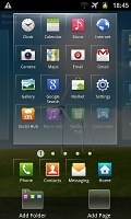
Needless to say the app launcher panes can be rearranged exactly like you would the homescreen – pinch zoom and some swiping around does the trick quickly and intuitively.
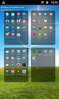
Rearranging the main menu panes
The notification area has been slightly redesigned in TouchWiz 4, but there aren’t any major changes to functionality there.
On the other hand, the task manager, which Samsung kindly preinstalled, has seen some functional updates. The RAM screen has been modified and there is only one clear memory button now, instead of the two in the previous version. Now, with 1GB or RAM and with the new Gingerbread policy of keeping resource-hungry background processes in check, we are not sure you will need to enter the task manager all that often, but it doesn’t hurt having it.
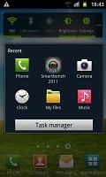
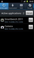
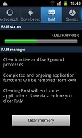
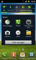
The task manager that comes preinstalled on the Galaxy S II
Plus, accessing the task manager is as easy as it gets – you can either place the widget on your homescreen or use the shortcut that appears below the task switcher when you press and hold the Home button.
The final noteworthy change brought by TouchWiz 4 is the introduction of gesture controls. Of course turn-to-mute is nothing new how about tilting your phone to zoom in and out in the gallery or the web browser. Or turning it sideways to move widgets around the homescreen or icons around the app drawer. It's much like the gesture controls of the LG Optimus 2X and Black but the gestures are activated somewhat differently.
With the Exynos chipset doing its magic inside, the overall user experience is pretty smooth on the Galaxy S II. For more on this, join us on the next page, where we’ll take a closer look at the dual-core Cortex-A9 CPU and the Mali-400MP GPU and their performance.
Reader comments
- Loudman
- 09 Aug 2024
- PAh
August 2024 and my Oppo is very lost with all my ID, both physical copies and now pretty useless online type - even safer than ever in the ether somewhere till some minor miracle reunites us... Yesterday I was handed a pink Samsung I9100 Galaxy S I...
- Durga Bali
- 26 May 2024
- 867
Great phone, my favorite one. I made a big mistake buying HTC Incredible S instead of the Galaxy SII. Regretted lot of times as SII is better than Incredible S. At that time, I was fascinated with HTC Sense UI and so blindly bought Incredible S. Wron...
- safin asa
- 15 May 2023
- X$7
You could do that on other site sir. Maybe search "framework beside galaxy S2 India"
