Samsung Galaxy S4 Active review: Uncharted waters
Uncharted waters
TouchWiz is stuffed with features
The Samsung Galaxy S4 Active comes with the same software as its non-rugged sibling. This means the latest Android, 4.2.2 Jelly Bean, and a laundry list of new TouchWiz features. The Galaxy S4 family combines the best of both worlds and while it seems familiar, there's plenty new below the surface - so much in fact that you'd need a couple of days just to get accustomed to all the features.
Here's a user interface video to start you off, which also shows the new air and motion gestures in action.
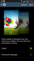
We start with the lockscreen, which features the new lockscreen widgets introduced with Android 4.2, though Samsung fiddled with them a bit. The default lockscreen shows the time along with a personal message. You have to enable an option in the Settings to get all the widgets, while you're there you can also enable the beautiful random wallpapers from TripAdvisor (with text at the bottom about where the photo was taken).
The water ripples have been replaced by a lens flare effect though, if you prefer, you can switch back to the old one or disable it all together.
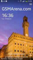
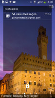
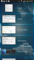
The lockscreen shows beautiful photos and cool widgets
Anyway, once you enable that option the lockscreen offers multiple panes, each containing one widget. The page to the right of the default one is special and can either be a list of favorite apps (the default TouchWiz setting) or a shortcut for the camera (as in pure Android).
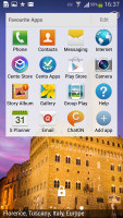
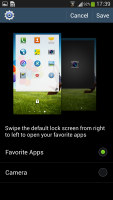
Favorite Apps are the default for the Galaxy S4 • the camera alternative
The pages to the left contain different widgets - email, Google Now, Messaging, music player, Yahoo! Finance and News and you can download apps from the Play Store that add new widgets.
There are no app shortcuts at the bottom of the screen by default - the Favorite Apps widget to the right has taken over that role, but you can enable them and have up to five easily accessible shortcuts.
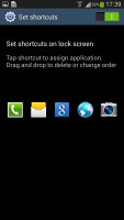

The lockscreen shortcuts are not enabled by default but are still here
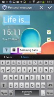
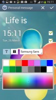
You can change the greeting on the lockscreen by hitting the edit button. You can type something else, choose a different font and color. You can also disable the personal message altogether and remove the time and date info.
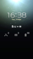
Another nice trick is the Quick glance option we first saw on the Galaxy Note II. It uses the proximity sensor to detect you reaching for the device and it lights up the screen that shows the time, missed call and message counters, battery charge and music track info. This is just one of many Air Gestures, we'll see the rest later.
At the top there are five (or eight in landscape mode) toggles that can quickly enable and disable features. There are more than five toggles, of course, you can swipe horizontally to get to the others. Or you can tap the new button that reveals a grid of all the shortcuts, 20 in total. A two finger swipe works too. You can rearrange this grid (the top row toggles are always visible).
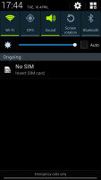
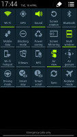
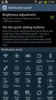
The new notification area is better than the one in stock Android 4.2
Below the toggles is the display brightness slider complete with an Auto toggle. You can disable this slider to get more room for notifications. The Auto toggle automatically adjusts the brightness but you can use the slider to tweak that, depending on whether you want a darker or brighter display.
The notifications themselves have not changed - they can be expanded to reveal more info and collapsed to save space or dismissed with a sideways swipe. Sometimes they also have helpful buttons on them like "Call back" and "Send SMS" on a missed call notification.
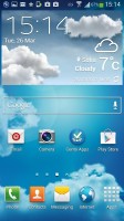
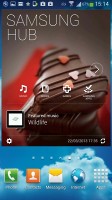
The homescreen looks mostly the same. Samsung has provided many of its own custom widgets like Samsung Hub, S Travel, etc. There's a wraparound feature, which lets you scroll homescreens infinitely by always going from the last to the first one.
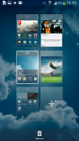
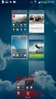
You can pinch zoom to get into the overview mode of all homescreen panes. There can be up to 7 and you can easily add, remove and rearrange panes from here. One pane is marked as "home", that's the one you go to when you press the Home button, you can choose a different homescreen as the default quite easily.
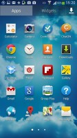
The app drawer hasn't changer really since the early days of Nature UX. The app shortcuts are presented as a customizable grid, alphabetized grid or list and you can hide shortcuts (good for bloatware you can't uninstall), view only downloaded apps, uninstall apps and add folders.
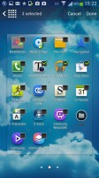
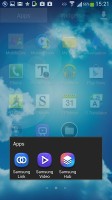
You can also maximize space in the app drawer by stacking apps into folders. You can either drag icons on top of each other in edit mode or you can check multiple app via the create folder option.
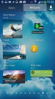
As before widgets are in a separate tab in the drawer (this is what stock Android dictates).
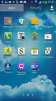
Pinch to zoom in the app drawer works in a similar way to the homescreen - it gives you a glance overview of all panes as thumbnails which you can rearrange (but not delete). There's a dedicated downloaded pane too, where all your downloaded apps go.
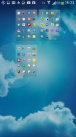
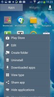
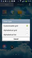
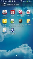
App drawer at a glance • options
When you drag out shortcuts and widgets to the homescreen you get a list of small thumbnails of all the homescreen panes with the silhouettes of the widgets there so you can judge how much space is available on each pane.

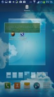
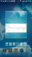
The small thumbnails of homescreen panes make finding room for a new widget a breeze
The App switcher interface is unchanged - there's a list of thumbnails of all the recent apps (apps can be swiped to dismiss) and three buttons at the bottom, Task manager, Google Now and Kill all apps.
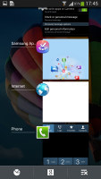
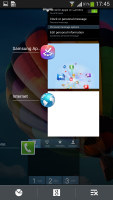
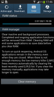

The app switcher • Task manager
The Galaxy S4 Active comes with Multi-window. This lets you run two apps side by side on the screen. The dividing line between the apps can be moved to give one more space and there's a full screen button if you no longer need the other app. Only compatible apps can be used with Multi-window, for now that means mostly the ones that come preinstalled on the phone.
You can move the small arrow that brings up the drawer with the Multi-window apps to make it easier to reach with your thumb. You can also move the whole drawer to the other side of the screen.
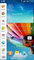
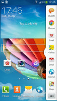

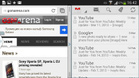
Multi-window mode on the Galaxy S4 Active
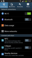
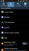
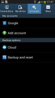
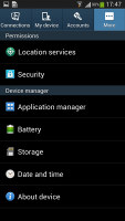
The settings menu has been redone in the latest TouchWiz version. Instead of a scrollable grid of icons and sections Samsung has went with a tabbed interface. On top you get four tabs - Connection, My device, Accounts and More. You can find the relative features in their corresponding place - display, for instance, is in the My device tab, while Wi-Fi settings ar ein Connectin.
It makes navigating the settings menu much faster and more intuitive.
We like what Samsung has done with the latest iteration of TouchWiz. Despite pilling feature upon feature, the whole thing really feels intuitive and well organized. There's still a learning curve, but it mostly involves users finding out they can tweak TouchWiz to their liking or that they have some functionality out of the box (where other phones would need third-party apps).
Google has put a lot of work into Jelly Bean to make the interface buttery smooth and the powerful hardware inside the Galaxy S4 Active contributes too.
Reader comments
- AnonD-495136
- 30 Jan 2016
- AMj
They're not loud per se, (the do make very little noise) but I'm a very light sleeper (thank you Parris Island) and I heard my EX-gf snooping through my phone because I heard the keys in my sleep. Yup, that's why she became the EX. Only few will real...
- Caffa
- 12 Jan 2016
- 2GU
No they don't, they are a silent soft touch button. I didn't like them at first but they prove themselves underwater and have grown on me.
- AnonD-462451
- 09 Nov 2015
- t7%
Looking to purchase this active phone, one question though, are the physical buttons below the screen "loud"? As in do they "click" or "pop" when pressed? (Not through the speaker, etc, but actual noise. Thank in advance...
