Samsung I9300 Galaxy S III review: S to the third
S to the third
User interface
The Samsung Galaxy S III runs on the latest Android available at the moment - 4.0.4 Ice Cream Sandwich, which has been heavily modified by the latest TouchWiz UI from Samsung.
We've already seen the interface, but the video demo warrants another look. It is the quickest way to get a feel of the UI:
The interface is strongly influenced by what Samsung did with the ICS update of the Galaxy S II, but the new flagship predictably received the better treatment for both looks and functionality.
The lockscreen is a great example of that. It's a standard "tap and drag in any direction to unlock" deal and there're ripples accompanied by water-drop sound as you drag your finger. Four customizable shortcuts are available at the bottom of the screen - drag one up to activate the specific app.
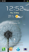
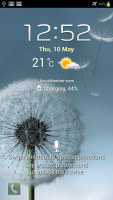
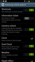
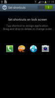
The lockscreen packs a ton of new functionality
You can also enable a news ticker at the bottom of the lockscreen, which is a great way to stay up to date on current events. The ticker can be expanded to view all news items.
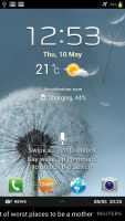

The news ticker keeps you up to date with current events
You can enable a second clock on the lockscreen, which shows up when you're roaming. There's also help text that will be useful at first, but you can disable it when you've discovered all the tricks. You can also disable the regular clock, the weather display, the ripple effect and the voice prompt that lets you do a voice command right on the lockscreen.
There's one final cool but not so useful trick - you wake the phone (tap the power button or the home key), then press and hold the screen and rotate the phone horizontally. It will unlock and start the camera as soon as it's in the right orientation to snap a photo. We found that it's quicker to just keep a Camera shortcut on the lockscreen and use that.
Once you make it past the lockscreen, you'll notice that the dock at the bottom of the screen now fits five custom shortcuts or folders. The rightmost one opens the app drawer as usual, but you can change the other four to any shortcut you like or even a folder full of shortcuts.
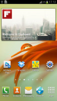
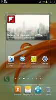
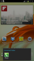
The dock at the bottom of the screen now has four customizable shortcuts
Speaking of the bottom of the screen, you'll notice that there aren't any on-screen control keys - Samsung decided to stick with their traditional hardware Home button flanked by capacitive Menu and Back buttons, instead of the on-screen Back, Home and Task switcher buttons.
This makes upgrading from a Galaxy S II (or just about any other Samsung droid) to the S III a pretty smooth experience. On the other hand, Google's guidelines say that an on-screen menu button goes in the top right corner of the screen. This means doubled functionality and you don't get one-click access to the task switcher (you have to press and hold the home button as before).
Moving on, the notification area looks pretty much the same - you get Wi-Fi, GPS, Silent mode, Screen rotation and Power saving (which replaced the Bluetooth toggle). There are five more toggles just off screen. You can scroll them sideways to reveal more functions - Notifications (toggles icons in the top row of the screen), Mobile data, Bluetooth, Driving mode and Sync.


The notification area has more toggles
The first five toggles are visible by default, so you always need to scroll for the other five. Pushing Bluetooth to play second fiddle is quite deliberate - Ice Cream Sandwich comes with Android Beam, which uses NFC for sending files, bookmarks and links, and the Galaxy S III builds on that functionality with S Beam - it does the NFC handshake, but switches to Wi-Fi Direct to speed transfers up. We'll get back to that in the Connectivity section of this review.
Even though the dock at the bottom fits five icons, the homescreen and the app drawer fit only four on a row. However, there are now five rows in the drawer so you still get more shortcuts per page.
Following the ICS convention, the app drawer has a tab that lets you pull out widgets to the homescreen easily. This wasn't available on the ICS-running S II. Unlike stock ICS though, you cannot move between tabs by swiping through the pages - you have to explicitly hit the tab. Some will find this more logical (scrolling past the available apps to find yourself in the widgets takes some getting used to).
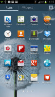
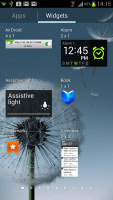
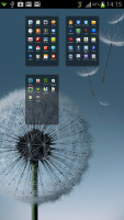
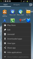
The app drawer houses both app shortcuts and widgets
The app drawer has three view modes - Customizable grid (where you can rearrange icons freely), Alphabetical grid (if you think you can find apps quicker if they're alphabetized) and Alphabetical list (this one makes shortcuts easy to hit, but isn't very space efficient). You can also view just the downloaded apps.
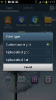
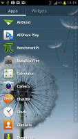
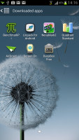
The available view modes for the app drawer
The app drawer has a zoomed-out overview too that lets you rearrange pages, but you can't create empty ones. Hitting the menu key reveals some more options, including hiding apps or enabling tap to uninstall mode.
Once you get several apps running, you can use the task switcher to go back and forth between them. It's an ICS-style vertical list with a screenshot and a name for each app. Swiping an app sideways removes it from the list.
There's a button at the bottom of the list to bring out Samsung's home-brewed task manager as we saw on the updated Galaxy S II, but now there's an extra button - Remove all. This is the quickest way to clear up both the list and some RAM (though we didn't encounter a situation where the Galaxy S III ran out of RAM).
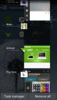
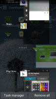
The task switcher has two custom buttons courtesy of Samsung
Let's go back to the homescreen and the widgets. Ice Cream Sandwich comes with various widgets and Samsung have added more still. Some widgets are resizable too - a feature we've seen in some custom UIs is now available natively in ICS.
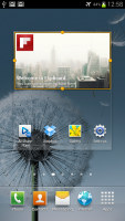
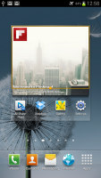
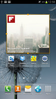
To resize a widget, you tap and hold on it as if you're going to move it but after the phone vibrates, you lift your finger. Four handles appear that let you resize the widget in every direction. How much you can stretch/squeeze a widget depends on the widget itself - it will glow red if you've moved beyond the supported size.
As usual, you can pinch to zoom out and easily manage homescreen panes - add, delete (but you can't have more than seven) or just reorder them. You can have 7 panes at most, which are enough to fit plenty of content even if you use widgets that cover an entire pane.
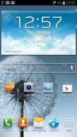
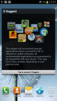
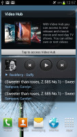
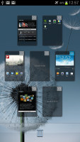
You can have at most 7 homescreens
Live wallpapers are a great way to prettify your homescreen, but also make it useful too. The News wall creates an attractive slideshow of headlines, while Stock wall does the same for stock quotes. Photo wall creates a collage of photos from your Gallery.
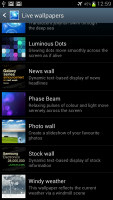
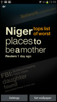
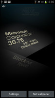

Three of the new live wallpapers in action
One of the features that debut on the Galaxy S III is Smart Stay - it uses the front-facing camera to detect if the user is looking at the screen, so that it never dims or locks while you're reading. This makes reading web pages and ebooks very comfortable, even if you've set the screen timeout low to preserve the battery.
Reader comments
- Anonymous
- 23 Dec 2024
- 8N2
Samsung galaxy slll
- Medic
- 08 Aug 2023
- kS4
obsolete.... more like obsolete battle show!!
- Anonymous
- 28 Dec 2022
- nxN
What do you expect from an obsolete device ?
