Samsung I9300 Galaxy S III review: S to the third
S to the third
All-in-one phonebook
The phonebook hasn't undergone dramatic changes in its new Ice Cream Sandwich attire on the Galaxy S III. It still packs an incredibly wide range of features and virtually unlimited storage capacity. The four tabs on top are still present, albeit slightly redesigned, and provide access to the Phone app, Groups, Contacts and Favorites.
As usual, there are various options to filter contacts by phone numbers, groups and multiple sorting. You can import/export contacts to/from the SIM card but you can't display them alongside the phone memory entries.
Samsung have kept the swipes in the phonebook, enabling quick dialing (right swipe) or sending a text message (left swipe).
The Quick contacts feature is there too, displaying, upon a tap on the contact picture, a pop up menu with shortcuts to call, text, email or Google Talk.


Quick contacts in TouchWiz UI 4.0
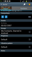
Tapping on a contact reveals all the details available. In Ice Cream Sandwich fashion it shows only two tabs (used to be four). The first one is the About tab, which shows the person's photo on top. If configured, the right tab displays their latest updates from social networks or Google Talk.
Information is perfectly organized into different sections for phone, email, etc. You can use the back button to go to the full contact list, or tap on the top left corner, just like in vanilla ICS. The top right corner has shortcuts to contact editing and favorites.
If the phone book finds duplicate contact entries, it'll prompt joining them. Furthermore, there're a plethora of options once you hit the Menu button. You can view the call history, as well as join, unjoin and share contacts.
Samsung has even added a built-in reject list. It acts like a third party blacklist app and blocks the numbers on it from calling you.


Adding a contact to reject list
A new feature lets you choose a specific vibration pattern as an incoming call alert, just like you would a ringtone. A set of predefined patterns is offered, but you can make your own too.


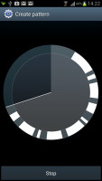
Vibration patterns can be assigned to each contact
There's plenty of contact information you can assign to each contact and it still remains neatly organized. You have all the types listed (numbers, email addresses, etc) and, just like the previous version of TouchWiz UI 4.0, there's a plus sign on the right - tapping it adds another item of that type. Pressing the minus sign under it deletes the unneeded field.
Of course, the real flexibility of the phonebook becomes apparent when you sign into your social networks. After syncing, the phonebook will automatically merge contacts (you can do it manually too), so that the contact details are pulled from the social networks too.
Telephony is great, voice commands are easy
The in-call quality of the Samsung I9300 Galaxy S III was really good with a crisp and loud sound. Reception was also problem-free and we didn't suffer dropped calls though in areas of very poor coverage the sound would occasionally break up.
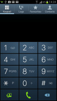
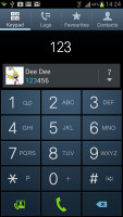
The dialer and call log have been slightly redesigned and can be accessed through the phonebook, each with a separate tab. Smart Dial is available and works as advertised - it searches names and numbers simultaneously. Only one contact is shown (with contact photo) and you can tap the down arrow to view the rest (the number above the arrow indicates how many contacts have matched your query).
One of the features that debuts on the Galaxy S III is Direct Call, which lets you dial a number by lifting the phone up to your ear while browsing contacts or reading/composing a message.
Voice dialing is available too and taken care of by the newly added S Voice, which activates on a double tap of the home button. All you need to say is "Hi Galaxy" and speak your command (e.g. "call Dexter"). Or "play " and off it goes. It takes a while to process voice commands but it has more uses than other voice-recognition apps for Android.
We are going to look at S Voice in full length later on in the review, but in short its Samsung's answer to Apple's Siri and it gets the job done, though not without hiccups.

S Voice is a nice start, but needs more polishing
The dialer also offers quick shortcuts for making a video call or sending a message instead.
Thanks to the proximity sensor, your screen will automatically turn off during a call. The available options during a call include taking a note, using the keypad, muting, holding the call or adding another call to this conversation.
The call log is the tab next to the dial pad. It displays all the dialed, received and missed calls in one list sorting your call history by contacts.
We also ran our traditional loudspeaker test on the I9300 Galaxy S III. It scored a good all-round mark, meaning more often than not you'll hear it, save for the noisiest environments. More info on our loudspeaker test as well as other results can be found here.
| Speakerphone test | Voice, dB | Ringing | Overal score | |
| 66.6 | 65.9 | 66.6 | ||
| Sony Xperia S | 72.7 | 61.8 | 69.6 | |
| HTC One S | 65.1 | 64.6 | 76.7 | |
| HTC One X | 65.1 | 66.0 | 75.8 | |
| Samsung I9300 Galaxy S III | 75.1 | 66.5 | 75.0 | |
| Samsung I9070 Galaxy S Advance | 74.2 | 66.5 | 75.7 | |
| HTC Titan | 75.8 | 66.2 | 82.7 | Very Good |
| 76.6 | 75.7 | 84.6 | Excellent |
Versatile messaging
The messaging department is quite straightforward: there are no folders here, just a new message button. Under that button is a list of all your messages organized into threads.
Swiping on a message header will do exactly the same as in the phonebook - a left swipe starts a new message, while swiping to the right will start a call.


The Galaxy S III messaging center and swipe functions
There's application-specific search that lets you quickly find a given message among all your stored SMS and MMS.
One thing we really appreciate is that the tap to compose box is much bigger - as big as can fit on the screen, no more viewing only 2-3 lines of text from your message.
To add message recipients, just start typing the corresponding name or number and choose from the contacts offered.
Adding any multimedia content to the message automatically turns into an MMS. You can either quickly add a photo or an audio file to go with the text or compose an MMS using all the available features (like multiple slides, slide timing, layout, etc.). The multiple slides are all shown inside the compose box.
You can use S Voice to dictate your message or use Google's built-in voice recognition software if you don't feel like typing. If the latter is often the case, Samsung provides the option to change the input methods.

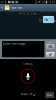
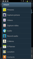

Responding to a message and the different options
When you're composing a new message you can use the Translate option to translate it into another language. The same goes for messages you've received. This feature probably won't see much use but it's there you ever need it.
What will come in good use, however, is the new Direct call feature. When you are reading a message from someone, their number will be automatically dialed by just lifting the phone up to your ear,.
Moving on to email, the Gmail app has grown handy shortcuts at the bottom of the screen but is mostly unchanged. It supports batch operations, which allow multiple emails to be archived, labeled or deleted. The default app supports multiple Gmail accounts, but there's no unified inbox.


The Gmail should be pretty familiar to everyone by now
A cool feature in Gmail is that you can swipe left or right to move between messages in your inbox.
The shortcuts on the bottom of the screen are new email, search, labels, refresh and settings.
There is also a generic email app for all your other email accounts and it can handle multiple POP or IMAP inboxes. You have access to the messages in the original folders that are created online, side by side with the standard local ones such as inbox, drafts and sent items.


The standard email app also does a good job • the combined inbox
The Galaxy S III also features a combined inbox, which brings together all your mail in a single folder. This can be quite handy if you have lots of accounts and you just want to check if there is a new message needing your attention.
Turning the phone landscape activates the split view - the left side of the screen shows the list of emails, while the right side shows a message. This is the same kind of interface we've seen on the Galaxy Tab though the bigger screen there made it actually useful - half of even a 4.8" screen isn't enough for comfortable reading.
Google Talk handles the Instant Messaging department. The G-Talk network is compatible with a variety of popular clients like Pidgin, Kopete, iChat and Ovi Contacts.
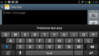
Text entry is handled by the standard Samsung QWERTY keyboard, which offers very big and comfortable keys. In landscape mode, the keyboard takes up most of the display and the even bigger keys make it one of the most comfortable virtual mobile keyboards around.
Reader comments
- Anonymous
- 23 Dec 2024
- 8N2
Samsung galaxy slll
- Medic
- 08 Aug 2023
- kS4
obsolete.... more like obsolete battle show!!
- Anonymous
- 28 Dec 2022
- nxN
What do you expect from an obsolete device ?


