Samsung M8910 Pixon12 review: By the dozen
By the dozen
TouchWiz UI 2.0
Samsung M8910 Pixon12 comes with the latest edition of the home-baked TouchWiz interface. The same interface powers the multimedia flagship of the company's feature phone lineup - the Samsung S8000 Jet. Well technically, there's no Media Gate (the Cube) on the Pixon12 but the rest is pretty much identical.
We did experience lags with some of the previous TouchWiz handsets but the Pixon12 is a whole different story. Responsive and fast, the user interface offers great touch experience, boosted even further by lively icons and nice transition effects.
If you have been keeping track, you would know that the number of available effects has been reduced since the early pre-release samples of the S8000 Jet, but what has remained is still enough to make the Pixon12 quite a treat to navigate.
By the speed of it, even if it's not publicly announced, the Samsung Pixon12 is probably running the same powerful hardware as the Samsung Jet. Plus, the same exceptionally sensitive screen completes a really responsive and sweetly performing touch device.
Samsung have made it a tradition not to repeat the same homescreen arrangement twice and the Pixons12 follows suit. This time around, you get three different non-scrollable screens that you can alternate by sideways sweeps. The current selection is indicated by three thin bars at the top.
You can fill up each of those homescreens with as many widgets and you can assign a different wallpaper to each screen.
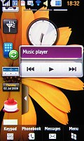
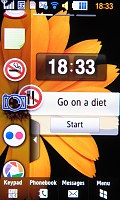
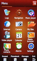
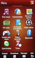
The Pixon12 comes with the latest and greatest of TouchWiz UI
The widgets are mini-applications that you can use to customize your home screen. One shows the time in two time zones, another has the weather and so on. Even the operator logo is a widget and can be tucked away.
Some widgets are handy like the AccuWeather thingy that shows the local weather and a clock with two time zones. There are others like the 'Go on a diet' or 'Quit smoking' that count the days you've been 'clean'.
There are widgets that simply serve as shortcuts to an application, but there are also some widgets that help you run the others. One brings up settings for both the offline widgets (the one that don't need an internet connection) and online widgets (such as the aforementioned AccuWeather) where you can set up the network connections for the online widgets. The other very helpful 'meta' widget help you search for new widgets to download.
Selecting a widget to download launches the browser and directs it to a page with a short description of the widget and a screenshot. At the time of writing, there aren't too many widgets (24 to be more specific) to download but this number should increase as the user (and developer) community grows.
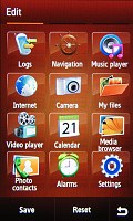
Aside from the homescreen, Samsung have also rearranged the main menu. It now stretches over three different screens, which are sweep scrollable sideways. The reason that so much more space was needed is the fact that almost all apps are now brought to the main menu, arranged in a flat iPhone-like structure. You will only need to dig deeper for the settings but if those were also to be brought to the fore, the main menu would most certainly have become a huge mess.


The main menu now has a flat strcture
Samsung have also given users the option to reshuffle the menu as they like. A press on the small icon at the top right enters Edit mode, which allows you to simply drag each icon to the place you want it. Another tap on the icon and you are good to go.
In both the main menu and the homescreen, you have a button bar at the bottom that shows four keys time - keypad, phonebook, messages and a button to toggle between the homescreen and menu.
The Samsung M8910 Pixon12, like most recent Samsung phones, comes complete with multitasking. The task manager gets launched by pressing and holding the hardware Menu key. It has a nice 3D view and a more classical grid one. You can alternate or even close the tasks straight from there. A "End all applications" key is also present in case you don't want to waste time closing application one by one.
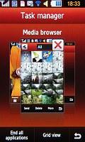
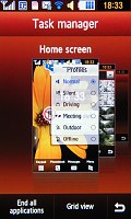
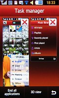
The nice task manager also has a cool 3D view
A true cheer raiser around the office is the Samsung M8910 Pixon12's Smart unlock feature. First featured on Samsung S5600 and Samsung S5230, Smart unlock allows users to not only unlock the phone but open a menu item or an application, or even dial a contact, just by drawing a letter on the unlock screen.
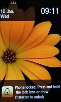
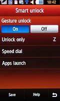
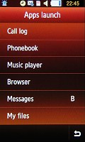
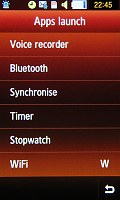
The smart unlock is a real favorite around the office
Each letter from A to Z can be set to trigger one of those actions. For instance, you can use it to start features like the music player, messaging, web browser, Java apps or the dialing keypad.
Phonebook is pretty good
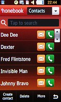
The Samsung M8910 Pixon12 comes with a phonebook that can store up to 2000 contacts with multiple fields. You can assign a photo to each contact, or even a video if you so wish. On the downside, those pics can only be used as caller ID and are not visible in the contact list. You can view contacts in the phone memory, the SIM card, or both.
The Pixon12 offers two search patterns for the phonebook. The first is the traditional search by typing a part of the contact's name. It doesn't work all that well with the virtual keyboards however. You have one extra click to open the text box to type and only after you tap 'Done' do you get to see the search results.
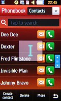
So, we ended up using the alphabetic scroll most of the time. Quite nicely, Samsung have provided the option to place the scroll bar on either side of the screen to facilitate single-hand usage for both left and right-handed users.
Frankly, the Pixon12 screen size favors single-handed use anyways but we guess the variable scroll-bar position is still a nice touch. Of course, the kinetic scrolling is also available in the search but it's not quite so convenient in longer lists, is it?
We are pretty glad that this time Samsung found enough space next to contact's names to place a Send Message and a Call button. The photo you may have attached is not displayed.
When editing a contact there are first and last name fields along with a field for the display name. So you can have a contact appear by his nickname while still keeping the contact's full name on record.
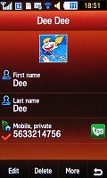
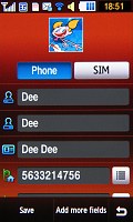
Editing Dee Dee's info in the phonebook
Another useful feature to avoid duplicate entries is that the phone will display a warning if the number for the new contact you just entered is already in the phonebook.
Reader comments
- Anton
- 13 Jan 2010
- ns8
People you forget that Motorola ZN5 has also variable aperture (2.8/5.6)
- Teddy
- 29 Nov 2009
- vGj
y do you say its not a smart fone? is it just the OS? please tell me what features are missing compared to smartphones...
- BLINK
- 20 Nov 2009
- t7G
they all paid SE for the patent
