Samsung S3850 Corby II preview: First look
First look
User interface – feature phone TouchWiz
We’ve already met the latest TouchWiz for feature phones with our Samsung Star II review and now it’s time for another round.
The Samsung S3850 Corby II enjoys many of the usability-enhancing features of the Bada OS and, unless you’re an app predator, you won’t miss a smartphone OS very often.
You won’t have access to the rich Android Market or even Bada’s apps store, but there’s still a good selection of Java apps (Opera Mini, Google Maps, even an official Facebook app) and even games. Samsung Apps will come in handy here.
The TouchWiz homescreen is widget-based and you can place around as many widgets as you can fit. When you run out of space, you can add new homescreens and easily rearrange the old ones.
Tapping the Widget button lets you pull out more widgets (or put some away) from the tray at the bottom.
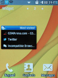
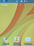
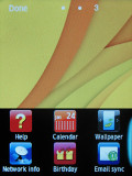
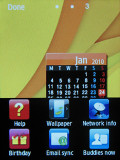
The TouchWiz UI homescreen • Adding new widgets
You can put as many widgets as you can fit on the homescreen and they can’t overlap. If there isn't enough room on the current homescreen, it will automatically scroll to an empty one when you pull out a widget.
There are 9 widgets preinstalled but you can download more from the Samsung Apps store.
At the bottom of the screen there are three virtual buttons – Keypad, Contacts and Messages, which are visible both on the homescreen and in the menu. They can’t be changed unfortunately.
The main menu stretches over several different screens (up to five), which are sweep-scrollable sideways. Only native apps can be put in the menu – you can’t put a shortcut to your favorite Java app.
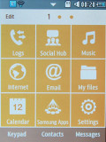
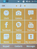
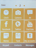
The main menu • Editing the main menu
Anyway, each page in the main menu is a 3 x 3 grid of shortcuts. The buttons are big and easily thumbable. This time Samsung has gone for a simple two-color design instead of their usual colorful set of icons.
The shortcuts can be rearranged or you can get them sorted automatically based on how frequently you use them.
Some shortcuts in the main menu also show a number in their top right corner – like number of missed calls, unread emails and so on.
The S3850 Corby II features multitasking complete with a task manager. As usual, you press and hold the menu key to bring up the task manager and you can switch between apps (both native and Java) and kill apps.
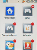
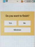
The task manager • The Exit/Minimize menu doesn’t show up on all apps
To minimize an app, you hit the menu key. The red key works a little inconsistently – it exits some app but brings up a dialog for others (which offers to exit the app, go back to the app or minimize it). Maybe when the software is finalized, the whole thing will become more consistent.
An Android-inspired feature is the panel on the top of the screen – you open and close it with taps (no dragging) and from there you can toggle Wi-Fi, Bluetooth and silent mode on or off – just as on the Samsung Star II.
The music player and radio controls also appear there when the respective app is active. This way the playback controls let you control the playback from almost anywhere (the panel is accessible from anywhere but Java apps).
The Corby II lock screen is the typical Samsung “sweep to unlock” variety.
When you have a missed call, the lock screen displays a piece of jigsaw, which you need to put in place to unlock the phone and open the call log.
The other thing you’re likely to see on the lock screen is the CD icon on top. It appears when the music player (or radio) is on or it’s paused and shows the track info along with the skip and play/pause buttons.

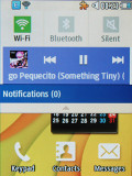
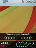
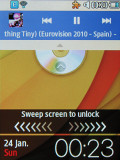
The notification area • The lock screen
The Samsung S3850 Corby II packs an accelerometer, which does the two usual tricks – screen rotation and turn to mute – but there’s a handy shortcut with it too. A double tap anywhere can launch one of the phone apps – browser, contacts, music player, or anything else from the main menu really.
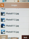
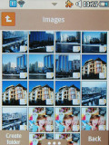
The Gallery is built into the file browser
The file browser on the Samsung S3850 Corby II serves as the Gallery too. You’ll want to switch to the thumbnail view, which is better for browsing photos, but if you need to manage files, then the list view is the better option.
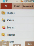
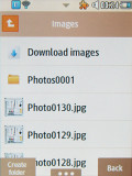
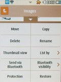
The galley doubles as a file browser too
Once you open a picture to view, you can sweep your fingers across the screen to see the next image without having to return to the image list.
There’s no pinch zooming despite the fact the Corby II has a capacitive display. Instead, you have the one-finger zoom, which kicks in after you touch the image with your thumb for a second or two. A minimap in the top left corner will help you navigate once you zoom in.
Browsing images in landscape mode is also available and the rotation is automatic thanks to the built-in accelerometer.
Reader comments
- Yosel
- 06 Dec 2023
- XVx
I like Samsung corby ii because it small size make easy to handle and functional too
- There was a
- 23 Oct 2023
- CDB
There was a dictionary on this phone...where can i find it
- Anonymous
- 20 Jan 2023
- uSZ
I missed this phone
