Samsung Galaxy Xcover 2 review: Gone fishing
Gone fishing
Nature UX ready to impress
The Samsung Galaxy Xcover 2 runs Android 4.1.2 Jelly Bean out of the box, skinned with the latest TouchWiz launcher, dubbed Nature UX. The user interface is basically identical to that of the Galaxy S III mini and the S II Plus: they have the same Android version and screen resolution.
Beyond the obvious benefits to the user experience compared to stock Android, a clearly midrange handset takes advantage of the same premium combination that powers the Galaxy S III and the Galaxy Note II.
We've shot a brief video showing off the user interface here.
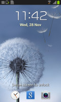
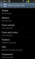
The lockscreen is a standard "tap and drag in any direction to unlock" affair and there're ripples accompanied by water-drop sound as you drag your finger. There are a number of unlock routines to choose from: motion, face and voice among others.
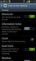
There're three customizable lockscreen shortcuts (down from five on the big S III and Note II), and you can drag one to activate the corresponding app.
The dock at the bottom of the homescreen fits five custom shortcuts or folders. The rightmost one always opens the app drawer, but the other four can be set to any shortcut or even a folder.
As usual, you can pinch to zoom out and manage homescreen panes - add, delete or just reorder them. You can have 7 panes at most, which are enough to fit plenty of content even if you use widgets that cover an entire pane.
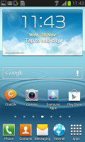
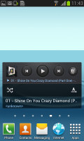
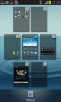
The Galaxy Xcover 2 homescreen
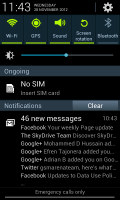
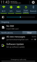
The notification area is quite feature-rich and offers quick toggles for Wi-Fi, GPS, Silent mode, Screen rotation, Bluetooth. You can swipe to the side to get even more: Mobile data, Blocking mode, Power saving and Sync.
Below the toggles is the brightness slider (there's no automatic brightness toggle here though). There is also a couple of other useful things like the Settings shortcut in the upper right corner, the time/date to its left and the carrier name at the bottom.
In Jelly Bean, notifications can be expanded to show more info. They can be expanded and collapsed with a two-finger swipe and the top one is expanded by default (if the app that put up the notification supports it, of course).
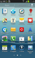
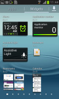
The app drawer accommodates both app shortcuts and widgets. Unlike stock Android, you cannot move between tabs by swipes - you have to explicitly hit the widget tab. Some will find this more logical (scrolling past the available apps to find yourself in the widgets is not as intuitive).
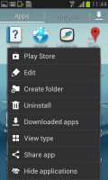
Using pinch-to-zoom reveals an overview of the pages and lets you rearrange them, but you can't create new ones. Hitting the menu key reveals some more options, including hiding apps or enabling tap-to-uninstall mode.
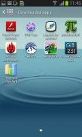
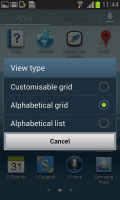
The app drawer has three view modes: a Customizable grid (where you can freely rearrange icons), Alphabetical grid and Alphabetical list (this one makes shortcuts easy to hit, but isn't very space efficient). You can also view just the downloaded apps by hitting the Downloaded apps icon.
Jelly Bean comes with a selection of widgets, with some custom additions by Samsung. Some widgets are resizable too - a feature we've seen in some custom UIs is available natively in Jelly Bean. Widgets automatically move out of the way when you're reorganizing the homescreen.
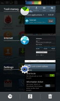
Once you get several apps running, you can use the task switcher to go back and forth between them. It's a Ice Cream Sandwich-style vertical list with a screenshot and a name for each app. A sideways swipe removes the app from the list.
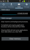
There are three buttons at the bottom of the list - one to bring out Samsung's home-brewed task manager, one to launch Google Now and a 'Kill all apps' button.
Overall, the Nature UX on top of Android 4.1 looks great and the Galaxy Xcover 2 does pack most of the cool software tricks of the flagship.
And despite the lack of a quad-core chipset, the Galaxy Xcover 2 handles the heavy Samsung skin equally well. It wouldn't choke on a heavy live wallpaper either.
Reader comments
- Riaan
- 02 Jun 2017
- fXi
The phone is almost useless due to one BIG shortcoming. Memory. It has almost nothing and you can't load a single app on the SD disk. You can't even update all the pre existing apps on the phone. It was a pain to work with and switched me off from Sa...
- Anonymous
- 12 Feb 2016
- CAX
Why can't I move apps to my sd card. I mean those already installed. Thanks .. email: kelvistem@gmail.com
- Anonymous
- 20 Jun 2015
- fmg
Please I need the price of X cover2
