Sharp Aquos S2 hands-on review
Display
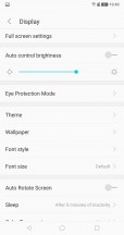
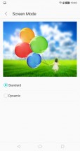
The Aquos S2 has a 5-inch 2040x1080 IPS LCD. The image quality is generally good but with a flaw; the color saturation is way over-the-top. This makes the colors really pop off the screen, which most people will probably really like but if you want accurate colors, you are not going to get them here. The display settings let you adjust the color temperature and for some reason, make them even more saturated.
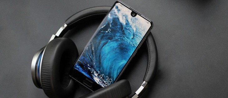
In terms of how all the weird cut-outs look, we have to admit they are extremely distracting. As if it wasn't bad enough to have a giant wart right in the middle, you have these corners that look like the ears have been cut off. In apps with dark status bars, this isn't really noticeable but in other apps it sticks out like a sore thumb. Eventually, you get over it as you are looking at the bottom thirds of the screen most of the time but it's still quite jarring every now and then.
Battery Life
While we didn't put the Aquos S2 through our usual rigorous battery life test, in our regular use the phone frequently gave us about 5-6 hours of screen-on time. This includes taking pictures, using social media applications, browsing the web and some phone calls. Despite the seemingly small 3020mAh battery, the efficient Snapdragon 630 processor in our review unit barely sips power, making going through an entire day of use easy.
Software
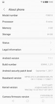
The Aquos S2 runs Sharp's Smile UX on top of Android 7.1.1 Nougat. Having not had a lot of experience with Sharp phones in the past, we were curious to see how it stacked up.
Smile UX, for the most part, isn't particularly intrusive or overbearing like some of the other Android skins out there. One could even blame it for being simplistic, to the point of wondering why Sharp bothered designing it at all instead of just going with stock Android design.
The launcher is a good example of this, which is very basic. It has the same iOS style app layout that everyone loves to hate. That is to say, there is no application drawer and all the app icons permanently sit on the homescreen. In terms of customizability, you can change the animation between page turns, icon density and whether to have the icons bottom to top or top to bottom. There is also something called HiBoard, which is a page to the left of the first homescreen, where you can search for things and get app suggestions, again, similar to Spotlight on iOS. And that's pretty much it.
We eventually ended up installing Google Now Launcher because we didn't like how the default launcher added boxes around some icons while left others alone or had app shortcuts when you pressed and held on certain icons. Also, we kinda like having an app drawer. The default launcher also had buggy weather widgets that just wouldn't pull weather data no matter how much we tried and just kept displaying N/A in large font.
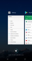
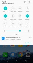
Moving on, we noticed the notification shortcuts have been reskinned but didn't have any particularly new functionality. Same for the multitasking or overview screen, which had MIUI (or old iOS) like large side scrolling app windows with an option to close all of them. You can choose to minimize this to a smaller window that pops up at the bottom of the screen instead of taking up the entire screen.
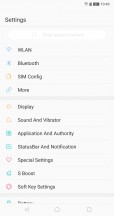
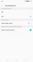
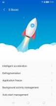
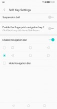
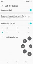
The Settings app has also been redone completely, with fewer options on the main page but clicking on each load up additional options within. Among the list of interesting features here includes an option to enable Dual Apps feature (but seemingly only for QQ and WeChat), a screen record feature and an option to make the fingerprint sensor to double up as navigation key (short tap goes back, long tap goes Home and a slide opens recent apps).
All the other apps have a custom design too but there is nothing particularly striking about them. Again, it feels like Sharp could have just gone with the stock design and applications in Android. A custom UI just delays future updates, something we aren't particularly sure of this device to begin with as we didn't see any during our time with it.
We should mention the way the software handles the display. Despite the 17:9 aspect ratio, most of the time the apps only have access to the 16:9 window below the camera notch, with the remaining area around the notch being used for the status bar. This is similar to how things are handled on the Essential Phone, except the Essential Phone has a 19:10 display, meaning the area below the notch is still more than all the 16:9 phones.
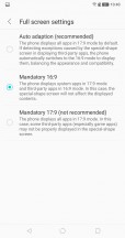


Fullscreen settings • How apps look
Some apps can access the area next to the notch to display content, such as the Camera and Gallery app. You can also force other apps use the entire screen, so apps like YouTube and games will go edge to edge. As you can imagine, the problem with this approach is that the notch will cut right through your content, which in case of games means you could be losing out on important information on top.
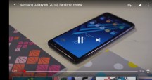
Video don't spread as far as the notch so there is a black bar
Overall, it's not the greatest solution and perhaps Sharp had the right idea with the original Aquos Crystal.
Reader comments
- jazpo
- 09 May 2021
- Kg%
2021 version of this wd still compak size.. pleassss
- Poo face
- 22 Jun 2018
- XSS
IGZO screen or not? It's impossible to find out.
- Anonymous
- 10 Feb 2018
- kui
But what of dongles? They are the ultimate accessory ! ^_^ . -Add satire.
