Siemens CX75 review: Bluetooth, MP3 and chrome
There will always be plenty of memory
There is not much to be found on the side parts of the device. On its right side there are two oblong, chromium-covered buttons, which start the camera or activate the Push to talk function. The same pair of buttons regulates the volume of the earphone during a phone call. AT the bottom part of the opposite side of the phone you will only find the slot of the infrared port.


System connector and memory card slot • side buttons • Infrared port • nothing else to be found on phone's left side
At the bottom of the device is mounted the system connector, which is identical with the one in the CX65 series. Above it there is a narrow door, which protects the slot for the memory cards of the RS-MMC type. We did not obtain a memory card together with the test model. The phone however turned out to be fully compatible with a memory card from Nokia 6630. Similar to Siemens S65, the CX75 model can use regular size MMC cards. The problem is that such cards overrun the frame of the phone.


Memory cards are inserted from below; they can be removed while the device is working
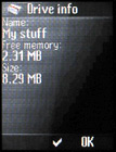
The memory card is most exercised as a storage space for multimedia data. As for the messages, the phonebook, the applications and the rest of the emergency data, they all use the internal memory of the phone, whose capacity is 14 MB, according to the official description, provided by the manufacturer. The indicator in the tested device, however, measured 8.29 MB only.


Memory control • Drive info
Smaller display, big keypad
The display has undergone many modifications. The most remarkable one is the increase of the pixel density, which used to be frequently battered in the older Siemens models. Unfortunately, the fineness of the picture has not been managed by increasing its resolution, but by decreasing its size. Unlike the forerunner, this model's display is finer indeed. The grating among the pixels becomes visible only after extremely close examination. The color performance is also better - the new model is capable of viewing 262K, which is a significant step forward, compared to the 65K in the older one. What a pity the display is so small. The one of the forerunner could have fit into this new body and provided it had featured higher resolution, the result could have become a heavy weapon against the competition.


Display at direct daylight • the picture is finer than the one of the forerunner
Just the opposite is the situation with the keypad, which uses the entire surface available on the front cover of the phone. The numeric keys are big enough. Even if you have bigger fingers, you will not happen to press the wrong key. Each line is slightly bulged, easing this way user's tactile orientation; the columns are separated by clear-cut channels. The keys require a bit stronger pressure. On the other hand, they respond with a clear reaction accompanied by a click. The click sound of the keys is quite loud and could become a disturbing factor in certain discrete moments.


Keypad is brilliant; the keys of the numeric keypad are big and comfortable to use
The main element of the functional part of the keypad is the joystick. The joystick of the testing piece is placed a bit off its middle which reminded us of the forerunner Siemens CX65, which suffered this infirmity even after having been launched on the market. Due to the jelly cap the joystick is equipped with your finger will not slide sideways. Yet, it is much too imbedded, which makes it a little bit difficult to control. Moving the joystick sideways is effortless, confirming choices by pressing it is sure and, finally, your finger sits firmly on it and does not slip the wrong way.
There are five functional buttons around the joystick: two context keys, highlighted by juts, the green and the red earphone and a button for quick access to the internet browser, which you won't even notice at first sight. It is praiseworthy that the internet button does not interfere with the rest of the keys preventing this way the user from pressing it unwontedly.
Pressing the joystick opens the main menu; each way has a fixedly assigned particular function: phonebook, camera, ringing tones and event list (messages, missed calls etc.). Both the functions of the context buttons and those assigned to the individual keys of the numeric keypad are possible to change.
The backlighting of the keypad is white, making both the legends of the keys and the gaps between them dazzle.


Backlighting is intensive enough
The graphic designers were on a holiday
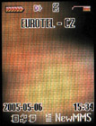
When you turn on the phone, the device follows the standard procedure of asking you, whether you are being serious of your intention. Provided you confirm your decision, the phone welcomes you into the old familiar environment. Nothing has changed: the indicators stating the coverage and the battery or the state icons are displayed in the top state line; below them is the logo of the GSM operator. In the bottom state line are the legends of the context keys' functions; above are given the details about the current date and time. As usual, you can use your favorite wallpaper as a background.
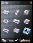
Quite an unpleasant surprise is waiting for you in the menu. It is standard, with a matrix of 9 units. We used to comment on Siemens CX65 because of its weirdly designed menu, which looked as comics. We also criticized the main menu of the S65 model for being much too abrupt; its icons were quite rough and difficult to differ one from another. The main menu of the new CX75 model resembles the one of S65 model. Its icons are small. They are white, with light grey shades and orange decorative elements. The problem here is that one hardly tells them apart. When selected, the icons get slightly bigger and get wrapped into a pale blue color shade. I am far from being a fan of the coloring books many Asian mobile phones are full with, but I still think that too strong stylization maligns.


Stand-by display and main menu
If you run into difficulties with recognizing the symbols of the individual icons, help yourself with their descriptions, which appear in the upper left corner of the display. Displayed in the upper right corner is the number of the according shortcut selection. The nested menus are texts only. The display can view seven lines. If you feel the font is much too small, you can view the menu in one line only and get this way a really big font. The overall picture can be automatically changed in accordance with the ringing profiles.
In fact, the structure of all menus in the new phone is identical with the one in Siemens S65. The standard graphic scheme has not been modified either, which means it is inverse, again. The phone offers five preinstalled graphic themes to choose from.


Two more graphic themes; you can choose out of an overall number of six
Reader comments
- Clilevediep
- 21 Jul 2011
- 3Vm
learned a lot
- aladdin
- 29 Jun 2007
- N7P
when i record video it recording good but whithout voice or sound can you tell me why
- ZJ
- 13 Jan 2007
- Sqj
I have been using this CX-75 handset for past few months. Honestly speaking, it is an excellent device with all good features.The drawback is only about the battery backup as it was less then expectations.Rest is fine.


