Sony Ericsson Aino review: I know fun
I know fun
Desk stand and headset - a great addition
The desk stand and the headset are great and they mean more bang for your buck (and some buck it is). Very few phones come with a wireless headset, most opt for a wired one, and desktop cradles are very rare.
If we have to describe the headset in one word, that word would be "awesome". It may sound too much for a tiny tube of black and white plastic (about 6 cm in length) but this thing does nearly everything you'd need to be in charge of your music or calls. On top there's a 3.5 mm audio jack, the bottom features the charger port, which connects to the docking stand, and the power button.
The front of the Bluetooth headset is actually semi-translucent and reveals four multi-colored LEDs, which offer basic visual feedback. For example, a single click on the power button flashes a number of lights corresponding to the available battery charge.
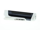
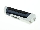
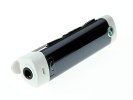
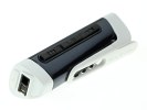
The headset viewed from all sides
The headset is a full-featured remote control. The Call button on the front can do voice dialing, accept and reject calls (it's even enabled for call-waiting). The playback controls on the side include skip tracks (or fast-forward/ rewind upon a press-and-hold) and a play/pause button. The mic hole is just above the call button.
The volume control is on the opposite side and it's touch sensitive - slide your finger towards the plus sign to turn the music up or towards the minus sign to turn it down. The LEDs automatically appear to visualize the volume bar.
Interestingly, the headset also acts as an antenna for the FM Radio on the Aino, so no worries, you don't need to connect an extra pair of headphones just to listen to the radio.
Now for the only gripe with the headset - whenever you have music playing, the LEDs pulse to the rhythm. We would've liked an option to turn them off. We don't quite fancy wearing Christmas decoration all the time.
If the wireless headset's battery dies you can't unplug the headphones from the remote and jack them into the phone itself. Not in the Fast Port at least. And there's no 3.5mm jack as well.
We gotta admit that the range of this thing is exemplary - its A2DP streaming connection ran happily over a distance of more than 5 meters, which included 2-3 solid walls. Now we don't specialize in Bluetooth headsets, so take our words with a pinch of salt, but we've never seen another Bluetooth headset go as far as that one without serious sound interferences.
The Aino and its magical wireless headset didn't stay in our hands long enough for a proper battery test. We left the headset playing music at the highest volume for 2 hours and made a couple of phone calls all through the headset and its battery charge indicator went down a single notch. It may last 5 or 6 hours but we'd recommend you dock it in overnight to make sure it doesn't run out of juice right in the middle of a busy day.
Another wireless headset that pulls off radio stunt is the MW600 and it’s even cooler. It tops the one that comes with the Aino (model number MH100) with an LCD screen. Strangely, the list of compatible handsets includes only low end phones and the Sony Ericsson XPERIA X10 - the Aino isn’t listed for some reason.
The Aino desk stand is mostly covered in plastic matching that of the phone itself - that means it's black or white, depending on which color version you bought. At the bottom there's a very discreet Sony Ericsson logo.
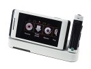
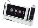
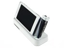
The desk stand could have been better
In the left part of the cradle, there's a Fast Port - this is where the Aino goes - and on the right is the power plug for the headset. The bottom has four rubber studs, which hold the stand in place. It can charge both the Aino and the headset at the same time and it holds the phone in landscape mode - ideal for viewing video and photos.
Well, not quite. The Fast port is the only physical connection of the phone to the cradle and we gotta say it gives it quite some wobbles when you touch it.
Though they felt almost like they're going to break any moment, the projecting legs of the cradle plug managed to survive operation with the docked Aino. Certainly the sensitivity of the touchscreen did help to an extent, allowing for applying little or even no pressure on the screen at all.
The real issue is the limited functionality of the Touch menu - it can't even start a proper slideshow so the Aino can serve as a picture frame. At least, when docked, you can use the phone as a nightstand clock
On the back of the cradle there are not one but two Fast Ports - one for charging, the other for USB connection. They are not interchangeable and can't carry sound through. A jack for external speakers would have been nice too, but we guess the wireless headset can handle that well enough.
User interface: to touch or not to touch
The Sony Ericsson Aino is blessed with the ambiguous gift of touch. We say ambiguous, as it's definitely got the hardware to support it, but it only works in landscape mode within a limited multimedia menu (well, with the only exception of some touch-enabled Java apps). This touch menu grants access to multimedia features such as gallery, music, video and FM radio, and it's also the only means to operate the camera.
Leaving this brand new touch menu aside, the Aino interface is the regular Sony Ericsson feature phone UI used in most of the company's top handsets. You can only navigate around it using the D-pad on the keyboard - touch doesn't work here. The only exception is when you install a touch enabled Java application (Opera Mini in our case), which seemed to work like a charm with the Aino touch system even in portrait mode and had its own virtual QWERTY keyboard.
But even without that extra touch functionality, there are a few other tweaks to set the new-wave Aino apart from the elderly C901 and W995.
The user interface is Flash-based, all the visual eye-candy implied. Let's just say that it's hard to find a better looking or more customizable feature phone interface than Sony Ericsson's - especially now that it has just been updated again. The Aino uses even more animations and 3D backgrounds than any other previous handset of the house.
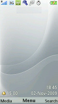
The standby screen is arranged in the usual manner with information on top indicating signal strength, currently used data carrier, active connections and battery status. At the bottom of the display, just above the context keys are their labels.
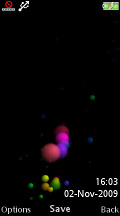
The well-known Sony Ericsson home screen
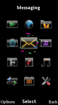
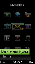
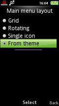
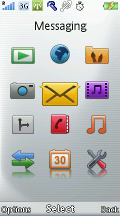
The options for the menu layout are the standard foursome - theme-dependent, 3 x 4 grid of icons, rotating view and single icon view.
The rotating view features three animated front icons on the display, the center one showing the active selection. The other two icons are half-hidden, just as an indication of what comes next. Five other menu icons can be seen in the dim background.
The icon view displays a single icon at a time and a vertical bar featuring tiny pictograms for the other main menu entries. Neither of those view modes works with shortcut keys. Only the Grid view allows quick numeric keypad access.
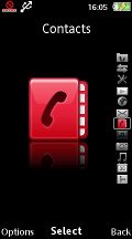
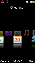
The alternative main menu layouts
The well-known Activity menu offers quick access to a user-defined list of favorite features, web, recent events and, of course, the Running Apps tab that takes care of multitasking.
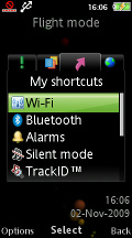
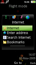
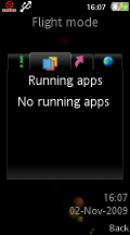
The Activity menu is among the best examples of feature phone multitasking
The interface is visually appealing and snappy. Auto rotation is enabled in the Media Center and is generally quite responsive. That goes for the stock media menu, of course. The new touch media menu works in landscape only and rotation is not an option.
Sony Ericsson Aino supports Flash Lite themes, which change the color scheme and wallpaper. Our handset has two themes preinstalled: Clarity and Unlimited. The latter is specially designed for the Aino.
Sony Ericsson handsets have an extra option for their wallpaper - you can use an application as background instead of an actual image. Of course you can't just use any application - the choice is limited to a few apps. In the Aino it's just one actually and near useless - the Bluetooth Robot.
The touch-controlled parts of the interface are all media-related, so they'll be covered later in the review.
Reader comments
- melly
- 30 Apr 2013
- tZk
How can buy this phone
- mr. love
- 26 Nov 2012
- 9xf
how can i upgrade my mobile,s software....i am facing a lot of problems
- AnonD-16467
- 04 Aug 2011
- bJ{
No do not buy. I have aino. -Slow speed. -No symbian -No android It mean no good game and app. -Just play back of mp4 and 3gp(video). -No front cam. -Low volume of music in headset. -No full touch. -Take time to restart more than ...
