Sony Ericsson G705 review: Slide-o-matic
Slide-o-matic
Sony Ericsson G705 360-degree spin
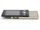
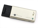
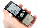
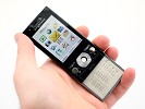
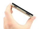
Sony Ericsson G705 measures 95 x 47 x 14.3 mm and weighs 98 grams. The neat phone is quite compact and relatively slim, though maybe of a little too basic styling for the feature load it carries.
Design and construction
Sony Ericsson G705 is entirely made of plastic. And no, that's not a criticism. That it looks just like any other Sony Ericsson slider will probably pass too.
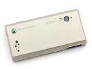
The point is it looks a rather low-end Sony Ericsson slider. It's just that the exterior does the excellent feature set no justice at all. Especially in the Silky Gold variety we got for our test. It does feel like "Hey, we've got a nonsense of a phone, let's paint it gold so it gets noticed." Not fair at all to a handset that does deserve enough credit for redefining midrange feature sets.
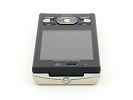
The front panel, which is entirely made of glossy black plastic, could've done just great without the golden accents. The repeating circle pattern of the OK, Call and End keys would've been a nice touch to a conservative styling dominated by straight solid lines, was it not for the offensive color.

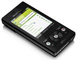
Official photos of the two color combos
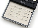
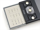
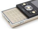
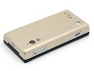
The slide-out flatbed keypad follows suit to make us absolutely certain the Majestic Black version of the handset is the way to go. The brushed gold-painted rear and sides of our G705 unit are enclosed in a silver frame (eyebrows duly raised) and topped with a glossy black slider, so it almost feels like they put together bits form two different handsets.
The only good thing about the gold bits is the brushed plastic is utterly immune to fingerprints, as opposed to the glossy front, which is quite susceptible to smudges.
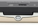
A 2.4" QVGA display dominates the front panel. Above it, an ambient light sensor, earpiece and video-call camera share the topmost section of the front.
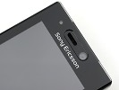
Earpiece and video-call camera above the display
The 2.4" 256K-color TFT screen has nothing to do with the mineral-glass-covered display of C905 and its superb contrast and vivid colors. Sunlight legibility is passable.
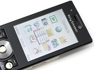
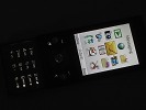
G705 display is the average one
Under the display, a round D-pad is flanked by two blocks of controls of a symmetric semicircle pattern. The one on the left features a soft key and the Activity menu key, a round Call knob squeezed in. On the right there's a soft key, Clear key and the round End button.
The three golden knobs - OK, Call and End key - only make sense with the slider up and the gold-painted keypad revealed. Otherwise they are a cheesy accent on the low key black front.
The Call and End knobs are too sunk in for a comfortable press. On a different note, the two soft keys, along with the Clear and Activity Menu key, are quite user-friendly.
D-pad size is OK, and tactility quite commendable, never mind the low stroke. The confirm key though is totally flush with the surrounding surface and thus way less comfortable than it size suggests.
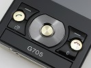
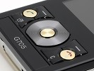
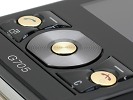
Control and navigation on the G705
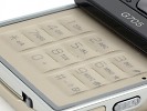
Sliding the phone up reveals the flatbed alphanumeric keyboard with subtle ridges between rows and fine clefts between columns for great touch orientation. Tactility is further improved by the slightly bulging keys, resulting in tangible terracing. The top row of keys isn't affected a jot by the slider form factor and enjoys plenty of head room.
The soft white keypad backlighting is relatively even. The rightmost column of keys only has a warmer tint - an inevitable spillover from the alternative purple backlighting in web-browser mode. The keys are shortcuts for the web related search, bookmarks, home and zoom features.
When in standby, the keypad locks automatically upon sliding the phone closed, and that's non-negotiable.


The keyboard backlighting in normal and web modes
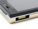
The left side of Sony Ericsson G705 features nothing but the regular Fast Port. The M2 memory card slot in G705 is hidden under the battery cover, an etched M2 logo marking its location. We wish the Fast port was sealed - would've looked way better.
The volume rocker and shutter key are the controls on the right side of the phone. Both are slim and quite rigid, tactility quite poor.
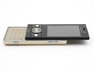
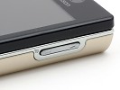
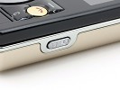
Volume rocker and camera key on the right
The top part of the G705 features a novelty - a tiny play-stop key that will launch the music player from any point in the interface, except the camera and during a call.
The music knob is teensy tiny, rendering a proper press almost impossible - you just need to push it with your nail. It's very helpful though, allowing you to pause your music without even taking the handset out of the pocket. If you started the player and locked the keypad, you'd still be able to stop it by a single click on that key.
It would've been absolutely fabulous if the music key was totally independent of the key lock - allowing you to resume playing without unlocking. This is not the case with our just-about-retail unit, but maybe the final firmware version will see to it.
Bottomside we only see the rear cover latch - the tiny knob with a padlock pictogram we get to see more of lately - and the lanyard eyelet.
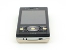
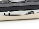
The rear cover lock and lanyard eyelet
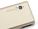
Topside at the rear is the 3.2 megapixel camera lens. Right next to it is the photo LED and the camera light sensor. All the way at the bottom of the G705 are the random-sized dots of the loudspeaker.
The same pattern is replicated - with a purely ornamental purpose - on the padding of the slider.
Removing the battery cover unveils the standard Sony Ericsson BST-33 Li-Po battery with a capacity of 950 mAh. The same unit is widely used across quite a range of Sony Ericsson handsets.
The manufacturer claims the battery should provide up to 400 hours of standby and up to 10 hours of talk time in a GSM-only network.
In reality, battery life ranged over two to four days on a single charge, depending on GPS and Wi-Fi use.
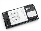
G705 powered by a standard Sony Ericsson BST-33 Li-Po battery
Overall, the G705 is a neat package that handles relatively well and offers a mixed bag of ergonomic comfort and blunders. A nearly great keypad and a handy music key offset against a questionable D-pad and card slot buried under the rear cover.
The biggest letdown however is the rather cheapish build and feel for the features offered. Ah, and one last thing… Silky Gold makes no sense.
Or maybe it does. It makes the alternative black styling - neat and low-key as it is - truly Majestic Black.
Reader comments
- Bertie
- 16 May 2011
- Rx9
Cool! That's a cvleer way of looking at it!
- Chynna
- 16 May 2011
- TjS
Tahkns alot - your answer solved all my problems after several days struggling
- Holman Mesa
- 22 Sep 2010
- Pan
Is an excellente review of this phone, i'm planning buy it in few months. Thanks for your professional opinion Greetings from Colombia!!!
