Sony Ericsson Mix Walkman review: Music to go
Music to go
Simplistic four-corner UI
The Sony Ericsson Mix Walkman has the latest Sony Ericsson feature phone interface for touchscreen, sweetened with social services and a Walkman music player.
The familiar four-corner touch UI does well to imitate the homescreen and main menu of the Mix Walkman’s smarter siblings.
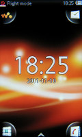
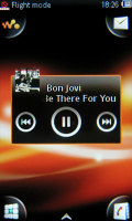
There are no widgets on the homescreen but you do get two homescreen panes, each with a different function. The first shows the time and the date, while the second one holds your five besties from the Friends app (more on that later). A third homescreen appears when you're running the music player.
The handy four-corner shortcuts from the Xperia mini make an appearance here as well. By default, they take you to the Walkman player, Message composer, Phonebook and dialer / call log. You can switch them with any four shortcuts of choice though (just tap and hold anywhere on the main menu).
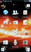
Replacing a four-corner shortcut
At the top of the screen there is a thin strip with status info about battery, signal strength and active connections such as WLAN or Bluetooth.
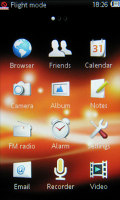
The app launcher can be pulled up from the bottom of the screen and it features a 3x4 grid of icons arranged into horizontal pages. Newly installed apps go on these pages as well, and icons can be rearranged.
The Mix Walkman doesn’t support multi-tasking and there is no task switcher. A file browser is nowhere in sight either.
The Sony Ericsson Yendo uses a regular feature phone CPU and it showed throughout the user interface. The phone was painfully slow. However, we stumbled upon a firmware update and surprise - the performance got notably better. In case your Mix Walkman runs the older version, go ahead and download this and follow the on-screen instructions.
Even with the new firmware, the Mix Walkman is hardly a match for even low-end droids. In the end though, it’s not as laggy as it used to be.
Good phonebook
The Mix Walkman phonebook has space for 1000 contacts and 5000 numbers. It lets you input multiple phone numbers and there are additional fields for stuff like email and postal address, organization, ringtone or birthday.
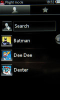

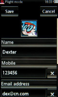
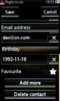
The Mix Wakman phonebook • editing a contact
When viewing a contact, the various details are displayed in sections. Tapping on a given number dials the contact while opting for the envelope icon next to it launches the message editor. Those two buttons fill an entire horizontal row so that they are more thumbable. The bad news is there’s no socially-relevant stuff in the phonebook. It leaves it all to the Friends app, which in turn can only handle five favorites at a time.
Reader comments
- Languageman
- 01 Mar 2023
- b8t
What language are you saying?
- Sony hater
- 05 Aug 2013
- fCU
I hate tis phn. Save my Money to buy phn and c wat i got. M never buying again. Wt kind of phn cnt upload pictures, da name is 'walkman` bt cnt even hear unles i push it against da wall. This phn projet manager should b fired.
- sirajul
- 04 Apr 2013
- t1$
This phone is very very bad.
