Sony Ericsson Satio review: Shooter by vocation
Shooter by vocation
Design and construction (continued)
The right side hosts an array of controls. The three located towards the bottom are all camera-related. There's a nicely responsive shutter key with distinct half-press for autofocus, a button to toggle camera modes and a dedicated gallery key. The volume rocker is further up and it isn't totally irrelevant to imaging either, as it doubles as a zoom lever.


A host of camera controls on the right side of the handset
The power key of the Sony Ericsson Satio is placed at the top, right next to the loudspeaker. As on any other Symbian handset, you can also use the power key for switching profiles on the device.
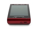
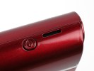
The power key and loudspeaker are on top
All there is at the bottom is the lanyard eyelet.
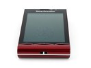
The lanyard is attached at the bottom
The back of the Sony Ericsson Satio reveals its other standout feature. The 12 megapixel camera lens is underneath the stylish cover , accompanied by both xenon and a LED flash. The dual flash solution makes sure the Satio is covered in low-light conditions for both stills and video recording. There are also a couple of tiny apertures around the camera lens, which we guess are some kind of light sensors.


The star of the show: 12 megapixel autofocus camera
Having seen the Satio in action in our recent 12 megapixel shootout, praises for the image quality will hardly be a spoiler. The imaging performance is impressive and we'll gladly shoot a few more rounds with the Satio in the camera chapter of this review.
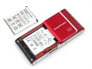
Removing the battery cover on the Satio reveals the 1000 mAh Li-Po BST-33 battery. BST-33 batteries are nominally 900 mAh so we're wondering where did those additional 100 mAh get from, but the pure specs are not the point.
Considering the screen size, you can hardly expect miracles from it, but it still managed to last through the day even if we never gave it a break. Since we doubt it any of you will be taking a hundred photos a day and endlessly fiddling with the other phone features, you have good reason to expect a longer gap between charges.
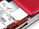
We have to mention that Sony Ericsson have gone for a strange solution for the SIM compartment on the Satio. You place the card on a small plastic tray, which slides in under the lens cover. It's probably a neat trick to save some space but the plastic tray looks pretty fragile. If you're in the habit of frequently changing SIM cards you should be careful.
Summing it up, the general build quality of the Satio is quite good and the materials used are both nice looking and durable. The handset feels perfect in the hand and, despite being a bit thicker at the top, it is evenly weighted so there is no risk of it slipping out of your hand.
The ample touchscreen is a treat in terms of image quality, and the response is quite pleasing. The camera controls are very user-friendly, and the active lens cover does well to both enhance the imaging experience and highlight the phone's key feature. Our main concerns with the Satio are the absence of a standard USB port and 3.5 mm audio jack.
To sum it up, there a few hardware issues, which are not make-or-break perhaps, but still a nuisance in a high-end device. Ergonomics are quite up to scratch though and the Satio handles nicely.
Interface
Sony Ericsson Satio runs the Symbian OS 5th edition but you'd never tell by just looking at the homescreen. It's a clean break from how other manufacturers see the touch-operated Symbian.
For starers we have prepared a short video demonstration of the user interface of the Satio. It should give you a better idea of most of the changes introduced by Sony Ericsson.
The homescreen uses a tabbed interface but not like the "Vertical icon bar" often seen (though rarely used) in Nokia handsets. There are five tabs, which are in effect five alternative homescreen panes: favorite contacts, bookmarks, home, photos, shortcuts.
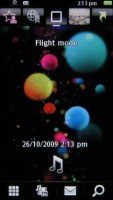
The S60 5th edition homescreen has grown tabs
There are five shortcuts on the top of the display, one for each tab. Alternatively, horizontal finger sweeps can be used to navigate between the tabs. The transition itself is visually pleasing with its smooth animations - even if you switch from the first to the last tab, things will roll across the screen with no lag at all.


The other four tabs of the homescreen
The home tab is a typical homescreen - wallpaper, operator name, time and date (though time is also visible in the status row on top) and music controls. The music controls act as a shortcut to the music player and if there's a song playing it will display track info (with album art) and basic player controls. There are four additional shortcuts at the bottom - Dialer, Media, Messaging and Web search.
The home tab is placed in the center. The leftmost tab is the favorite contacts tab, which gives quick access to a selection of contacts. They are displayed in a list with contact photos if available, so nothing fancy. Tapping a contact, brings up a popup with three options - Call, Message, View in contacts.
The second tab is the bookmarks and it does what it says. You can add new links but you can have eight at most. Another thing we would've liked is favicons in the list.
The fourth tab - photos - shows a vertical list of all your photos, sorted by date. It comes with kinetic scrolling and is the fastest way to view the latest photos.
The fifth tab is the shortcuts tab and holds a list of eight shortcuts - be they shortcuts to applications or bookmarks.
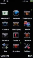
The main menu is more standard - there's a choice between a grid and list arrangement, and by default the shortcuts are arranged so that they resemble the typical Sony Ericsson menu. The icons will feel very familiar to experienced Sony Ericsson users.
The rest however is S60 5th edition - the D-pad and soft-key based navigation translated into touchscreen. Lists still require a double tap to select and confirm, while icons take just a single tap. There's a shortcut to the task switcher or you can long-press the menu key.
Reader comments
- DDV
- 28 Aug 2015
- U2S
This Sony Ericsson Satio was gonna be my Samsung Galaxy back in 2009 and now seeing how far smart phones has come in the last six years...wow! No, ended up not owning this phone but it was going to be my goal to get it after having a HTC HD2 for over...
- Anonymous
- 27 May 2014
- Rx6
hi i was wondering if anyone new how to fix this phone as only my left side of my screen works
- shan
- 14 Apr 2014
- Xjf
What is made original county?
