Sony Ericsson Xperia arc S review: S as in Sophomore
S as in Sophomore
Well accessorized
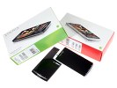
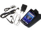
The Sony Ericsson Xperia arc S comes in a compact box accommodating the handset itself as well as a few standard-issue accessories. Those include a USB charger, a microUSB-to-USB cable (used for charging and computer connections), a charger head and an in-ear headset.
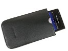
A leather carrying case and an 8GB mircoSD card are supplied too. There was no HDMI cable in our box, but as with the original Xperia arc, package contents must be a region-specific thing.
Sony Ericsson Xperia arc S 360-degree spin
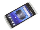
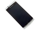
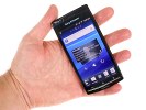
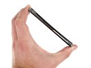
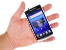
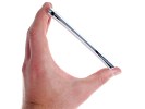
Do we need to say it again? The Sony Ericsson Xperia arc S is the same phone as the original Xperia arc. At 125 x 63 x 8.7 mm, it's the same size and the same elegant appearance. The Xperia arc S comes with different paintjobs but is still made of plastic, hence the exact same weight of 117 g.
Reality display
The 4.2” 16M-color LCD screen of the Xperia arc S has FWVGA resolution (854 x 480 pixels). It’s a capacitive touchscreen and we had no issues with response. As you would expect in a modern day smartphone, multi-touch input is enabled too so there’s nothing to worry about in terms of physical interaction with the device.
The key feature of the Reality displays is the Sony Bravia Mobile Engine, which in our original Xperia arc review, we found to be more than just a marketing gimmick. You can find out more about how it improves the image quality by boosting contrast and sharpness here.
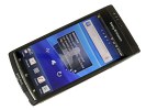
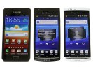
The Reality display boasts excellent picture quality
When viewed at the proper angle the Reality display is among the best screens on the market. It’s got more vibrant reds and greens than the iPhone 4's Retina display. Some people will probably prefer it over the Samsung SuperAMOLED screens too, which tend to oversaturate. We still find Nokia’s ClearBlack screens though to be the champion in color rendering.
Those observations were confirmed by our contrast test, which the Xperia arc S passed with flying colors. The contrast of its 4.2” screen topped our charts, even though its brightness fell slightly short of the iPhone 4 result.
Of course, an LCD unit is unable to match the deep black contrast of an AMOLED screen, but given that limitations Sony Ericsson has done an excellent job.
The Reality screen’s Achilles’ heel is viewing angles. The advantage it holds against the competition quickly disappears as you tilt to wider viewing angles. The text on screen might remain visible but contrast degrades very quickly and colors get vastly distorted. It’s an unpleasant effect that you cannot see with the IPS matrix of the iPhone 4 or the two current best AMOLED technologies (ClearBlack and SuperAMOLED).
Design and construction
The Xperia arc S is a beautiful phone: tall, super slim, that subtle curve adding extra style. And the handset looks dazzling in white. We have the black version too but it's nowhere near the exquisite feel and compelling presence of a white clad Xperia arc S.

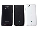
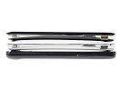
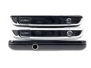
The Sony Ericsson XPERIA arc S is quite the looker
The glossy surfaces of the black arc S are easily covered in smudges and the phone quickly loses its appeal. Your black phone will certainly require extra care to keep its great looks. The white one doesn't have to worry about that. It surely gets the same amount of grease, but you can't see it.
Below the Sony Ericsson Xperia arc S display we find the usual three Android controls - a Back button, a Home key that brings up the task switcher upon a long press and a Menu key.
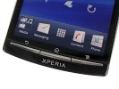
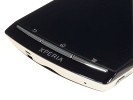
You get back, home and menu buttons below the display
The three keys we mentioned are all well-defined, so even if a bit thin, they’re unlikely to pose a problem.
Above the display we find the proximity and ambient light sensor, a status LED and the earpiece.
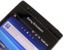
The earpiece and its companions
The left side of the Xperia arc S holds the 3.5mm standard audio jack.
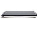
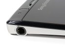
The 3.5mm audio jack is on the left
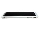
The power/lock key and the microHDMI port are at the top of the Sony Ericsson Xperia arc S. The power key is too small to be comfortable, though being slightly raised helps a bit. It certainly takes some time getting used to.
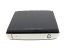
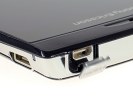
The HDMI port is neatly covered with a plastic lid • The power button isn’t particularly comfortable to use
The microUSB port is in the top right corner with a status LED above. The thin volume rocker is below and the miniscule camera key is all the way at the bottom. It is too small and placed too close to the corner. If Sony Ericsson were to redesign anything on the original Xperia arc, the shutter key would've been a solid candidate.
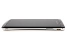
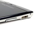
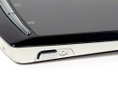
The camera key is pretty tiny too • There’s no protection for the microUSB slot
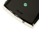
The location of the 8 megapixel camera lens on the back is also the same as before - too close to the edge and extremely likely to get covered by a finger when holding the handset in a position to shoot. You have to be extremely careful not to ruin your shots. That’s a problem with the iPhone 4 too, by the way.
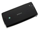

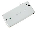
You should mind your fingers when shooting
The loudspeaker grill is the other thing to note at the back. It’s placed on the other end of the rear panel and due to the phone’s curved design it won’t get muffed too easily.
Removing the battery cover reveals the non-hot-swappable microSD slot, the SIM compartment and the second microphone pinhole, used for active noise cancelation during calls.
The battery is a 1500 mAh unit that is said to last up to 460 hours of stand-by or up to 7 hours and 25 minutes of talk time.
In reality, we managed to squeeze just over two days of moderate-to-heavy use (a few calls, an hour of browsing and per day, along with the usual imaging and sound tests).
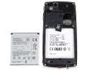
Unfortunately, the microSD card is not hot-swappable
In conclusion, the Xperia arc S does well to stay true to the original. After all, the Xperia arc is one of the least likely phones to need a facelift anytime soon. Some usability compromises had to be made for the phone to look as impressive as it does. The tiny shutter key and the camera lens location don't quite make sense in a phone of otherwise brilliant imaging credentials. The non-hot-swappable microSD card and the placement of the connectivity ports high at the sides are other things to consider.
The inward curve is a bold design decision. Subtle but compelling, it's what gives the handset its classy and sophisticated look. Not as comfortable to hold as the Sony Ericsson phones using the human curvature design (outward curve), the phone has style and elegance to spare.
Reader comments
- Gamit vasant
- 06 Jul 2016
- Hkt
phone update the software
- nyaaw
- 04 Jan 2015
- Rxn
Best 8mpx ever! Battery Life it depends on how you use it.. It lasted a whole day and never drained the battery..
- bida
- 01 Jul 2014
- fm%
l need know the life span of the battery
