Sony Ericsson Xperia mini review: Small is the new big
Small is the new big
Light-speed Gingerbread
The Sony Ericsson Xperia mini runs Android 2.3 Gingerbread and Sony Ericsson have that covered with the Timescape UI. The mini inherits the corner-based homescreen from the previous generation of minis, but Sony Ericsson have done some extra work on it.
Since the user experience isn’t too much different from that on the other Xperia phones released this year, we’ll reuse some portions of the text of our previous reviews. You can rest assured that we’ve reflected all the Xperia mini specifics.
The corner UI aside, the rest of the interface is pretty much similar to what we saw in the Arc, the Neo and the Play - though resized to fit the HVGA resolution.
We guess there should hardly be a person left unfamiliar with the Android 2.3 Gingerbread and the latest Sony Ericsson skin, but we're still going to cover the basics just in case.
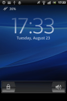
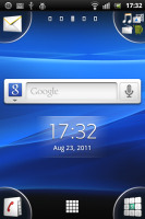
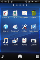
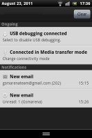
The Sony Ericsson Xperia mini UI
We quite like Sony Ericsson's Overview mode on the homescreen. You pinch to zoom out on any of the 5 homescreen panes and a new pane sets in with a cool transition effect to display all of your active widgets. If there is not enough space for all the widgets, they start floating on the screen overlapping.
The Overview mode is similar to HTC’s Leap view or what Samsung have on the Galaxy S. However, widgets are not ordered in mini screens, so small that you cannot actually see what’s on each of them. Widgets are shuffled together instead so they can better use the space. They are as big as possible and thus easier to tap on.
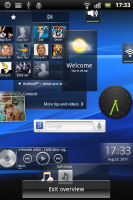
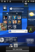
Overview helps you find the widget you are looking for
Now let's see about the four corner tabs on the homescreen. They can host up to four shortcuts each, as easy to assign as a simple drag-and-drop. If a corner has a single shortcut (just the dialer for example), the respective app launches automatically upon a tap. If there is more than one shortcut - the tab expands so you can make your choice properly. You can't put folders there though.
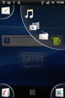
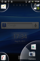
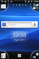
Putting shortcuts in the corners
Creating folders on the homescreen is nice and simple, the way it’s done on the iPhone. You drag an icon over another and a pop-up appears, prompting you to select a name and layout for the new folder.
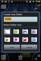
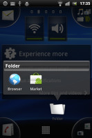
Creating folders is possible too
The Sony Ericsson Xperia mini supports both static and live wallpapers. There are 15 static wallpapers and a single live one (Maps), but you can always get more at the Market or use a picture from your personal gallery.
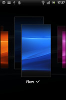
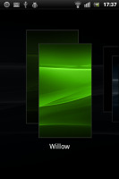
The Xperia mini has themes enabled too but the implementation is pretty basic: a theme only changes the wallpaper and the system menus. On a positive note, if you like Sony Ericsson's wave theme but you are tired of watching it in blue, now you can have it in a lot more colors.
Inside the main menu, you will see shortcuts in the bottom corners. They let you sort your icons within the grid – you can either go for the automatic options (alphabetical, most used or recently installed) or you can manually move the icons.

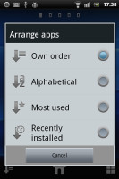
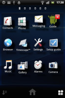
There are different menu sorting options for the app launcher
The new Sony Ericsson app called LiveWare is preinstalled on the Xperia mini pro. It lets you set the behavior of your handset when paired with an accessory. You can have an app launch automatically when headset, headphones or a charger is connected. You can, for example make the mini start the music player each time you plug-in your headphones or go to picture frame mode each time you connect a charger.
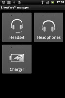
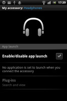
LiveWare lets you have an app launch automatically when an accessory is connected
Text selection is a major change in the user interface since Gingerbread - it's done by placing two large pointers either side of the marked text. You can then drag each of those easily to make the selection you need. It really doesn’t get much simpler than that.
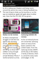
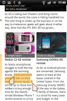
Text selection is improved in Android 2.3 Gingerbread
As far as general performance is concerned, the Sony Ericsson Xperia mini does splendidly - no lags, no freezes, no problems whatsoever. It uses a Qualcomm MSM8255 Snapdragon chipset featuring a 1 GHz Scorpion CPU and the Adreno 205 GPU - the same as the Xperia Neo, Arc, Pro and PLAY. But it's even faster because of the lower screen resolution (HVGA). You can see for yourself in the benchmarks below.
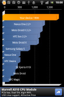
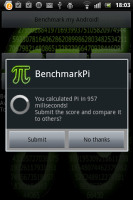
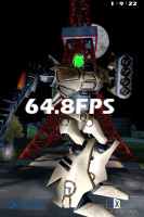
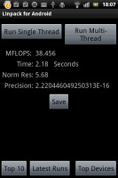
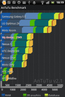
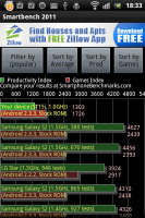
Sony Ericsson Xperia mini benchmarks
But it’s not synthetic benchmarks that we should focus on – the real life performance matters here and the Xperia mini is smooth as silk. Not that we expected less - Sony Ericsson is getting everything right in this respect lately.
A better Timescape UI
The Timescape brings all your communications together: an aggregate view of your SMS, MMS, email, call log, Facebook and Twitter updates. Timescape has a tabbed structure, allowing you to filter the contents by type and get all relevant information in one place.
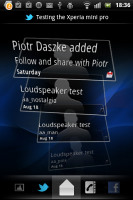
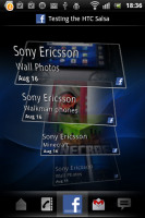
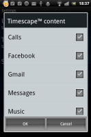
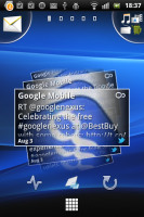
The Timescape app • The Timescape widget
With Timescape you not only see the latest activities and updates of your contacts but also share your own status, reply to received messages or return a missed call.
The best part of the new Timescape is that you can set it as a homescreen widget. It will show all of your updates as tiles. You no longer need to sacrifice all your homescreen real estate.
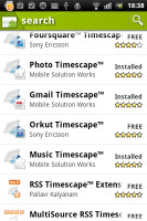
If all these functions are not enough, there are free Timescape plugins on the Android Market for Sony Ericsson users. Currently, you can update your Timescape with mixi, Foursquare, Orkut, Gmail, Music and Photo extensions.
Reader comments
- 628992533100
- 16 Jan 2021
- XM7
very much different. xperia mini in addition to smaller also already support android. if lumia 520 still windows phone
- satya
- 26 Apr 2016
- Xu4
Styliest phone I want this type but 2gb ram 16gb rom camera 13 mp and display 3" all higher model features
- yeah
- 15 Jul 2014
- PA7
It's a great phone !since 2012 and still good condition now!
