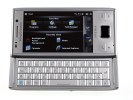
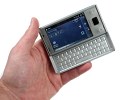
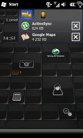
Sony Ericsson XPERIA X2 review: Another one in
Another one in
Display: 3.2 inches of disappointment
The Sony Ericsson XPERIA X2 features a 3.2 inch resistive touchscreen of WVGA resolution. The only difference with the X1 is the added 0.2 inches in diagonal. That's a good start as the X1 display was too small for the high resolution it offered and it was hard to hit the small items on the screen with your thumb. However, we do feel the XPERIA X2 needs a even larger screen to make a difference.
Not only that but the X2 display isn't as sensitive as we expected. Even if you decide to operate using only the enclosed stylus, things won't change too much. And one more disappointment concerning the display, the sunlight legibility is not great. Due to the mirror-like surface it's hard to see a thing on the display if you tilt the smartphone a few degrees to the sides.
Both the display and keyboard backlighting are very good, but we shouldn't expect any less than that.
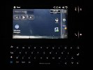

The display and keyboard in the dark perform commendably
Windows Mobile 6.5 pushes X2 to the limit
The Sony Ericsson XPERIA X2 runs Windows Mobile 6.5. We already discussed the changes in our Samsung Omnia II review and the dedicated OS overview, but let's have a quick recap and go through the new features one more time.
Update, 03 Feb 2010: As the official Sony Ericsson XPERIANCERS blog has it, the company roadmap has two OS updates planned for the X2. The first one in March will take Windows Mobile 6.5.1 (currently running on the X2) to 6.5.2. In May users will be able to update to 6.5.3, which will update a lot of the core OS functionality. Those upgrades will also fix known bugs, improve usability and stability, and enable the dormant video telephony and the FM radio.
Update, 07 Apr 2010: The first update has arrived. This update enables video telephony and the FM radio as well as a few other things.
Unfortunately, Windows Mobile 7 upgrade is not planned for XPERIA X2 as the hardware supposedly doesn’t meet its requirements.
Visually, Windows Mobile 6.5 upgrades the older ver. 6.1 with a brand-new and much prettier homescreen. It also swaps the Start menu with a regular "main menu", which displays all your applications and links to system functions in a honeycomb grid.
Other visual enhancements include the addition of ClearType font rendering as seen on desktop Windows rigs and the ability to scroll tabbed windows with cross-screen sweeps. Context menus have now gotten more thumbable, there's kinetic scrolling - which works just as it does on the iPhone - and finally the graphics are generally prettier throughout the system.
You probably know the default WinMo 6.5 homescreen consists of a scrollable list. What you may not know, unless you've watched a bunch of demo videos, is that some items of that list are in fact side-scrollable.
By scrolling sideways you gain access to different phone features associated to a given item. For example, scrolling the Getting started item sideways allows you to set the clock, email account, device password, Bluetooth, custom wallpaper, custom ringtone, upload music or even remove the Getting started item for good once you've set up the essentials.
Another example is Pictures, which allows you to browse the thumbnails of the photos in your gallery by side sweeps. Touching a photo opens it fullscreen in the photo album.
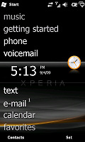
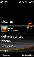
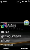
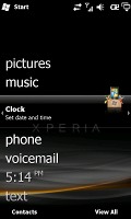
Some of the tabs available on the default Windows homescreen
Pressing the Start menu icon at the top right no longer opens a drop down menu full of shortcuts. Instead it opens what we like to call the new Windows Mobile "Main menu". It's got icons ordered in that honeycomb pattern that so many people can easily recognize as trademark WinMo 6.5 stuff.
In the new main menu you've got all the installed programs plus shortcuts to the settings menu. That Settings menu has also received a facelift and displays icons in the same honeycomb layout.
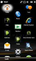
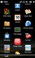
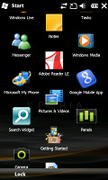
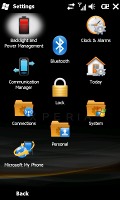
The honecomb pattern of the main menu • the settings menu is also redesigned
The perfectly flat structure of the Main menu could definitely get a bit clumsy over time due to the huge number of icons piling up (iPhone users with loads of apps installed will know what we mean), but we'd still prefer that over the confusing experience that so many Widows Mobile new adopters have had in the past.
Unfortunately, Windows Mobile 6.5 on the XPERIA X2 is not as responsive as we'd hope given that this is the company's latest high-end PocketPC. There is noticeable lag at times, though the interface has been optimized a lot since the pre-release unit we based our preview on. Still, the persistent lag combined with the relatively slow and unresponsive touchscreen, gives the impression of a sluggish UI, something that does Sony Ericsson no favors. And then you remember the XPERIA X2 runs on the same hardware as X1 and the reasons for this become obvious. Trying to run a hungry, modern OS on outdated hardware is not exactly a recipe for success.
The 0.2 inch bigger screen makes some difference from the X1, but still can't deliver the desired experience. The stylus is still needed for some buttons and items which are not fully touch-optimized. The Samsung Omnia II that we had in for a review not long ago was way more responsive and had much better performance.
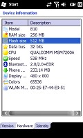
The Sony Ericsson XPERIA X2 uses the same CPU as its year-old predecessor
Finally our attention is caught by the task manager. It's very similar to the previous XPERIA X1 and all WinMo running HTC smartphones, but prettier. If you press the dedicated icon on the status bar, a list with all running apps will open. There you can end all unnecessary programs to free some RAM. As usual the second tab displays all kind of memory stats like RAM usage, storage or memory card space.
Reader comments
- Anonymous
- 16 Jun 2015
- fuw
please i need a french version
- ram
- 27 Dec 2012
- 2C%
I have a sony Ericson xperia x2 mobile Arabic language but how can change to english
- Akki
- 08 Sep 2012
- fCG
Dude I Am Thinking to buy this phone today.. so have u used it should i buy it or not..???
