Sony Xperia 1, 10 Plus, 10, L3 hands-on review
Xperia 10 and 10 Plus design
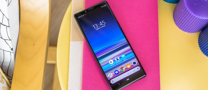
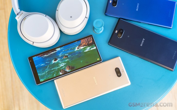
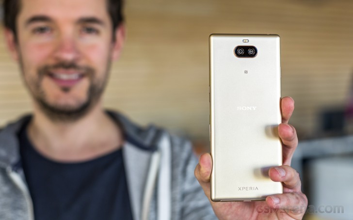
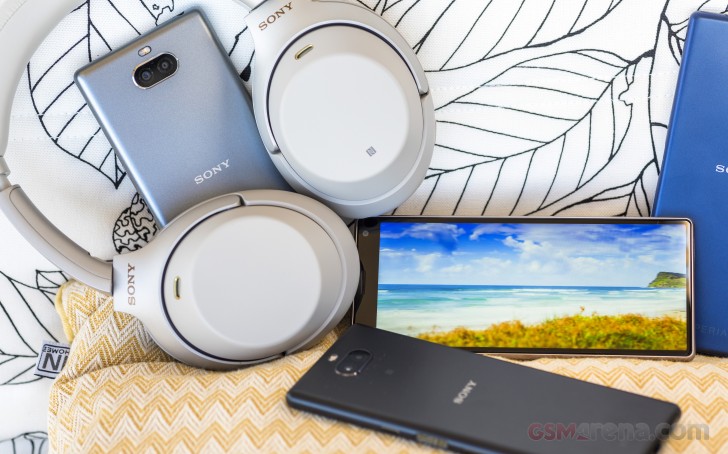
Moving on to the Xperia 10 and Xperia 10 Plus, we end up in what Sony is now calling its "super mid-range" family. Technically speaking, this new pair is more or less a direct successor to the "XA" line. However, unlike the XA2 or its other variants, the new Xperia 10 and 10 Plus do come a lot closer to their premium counterparts in terms of design (the Xperia 1 in this case).
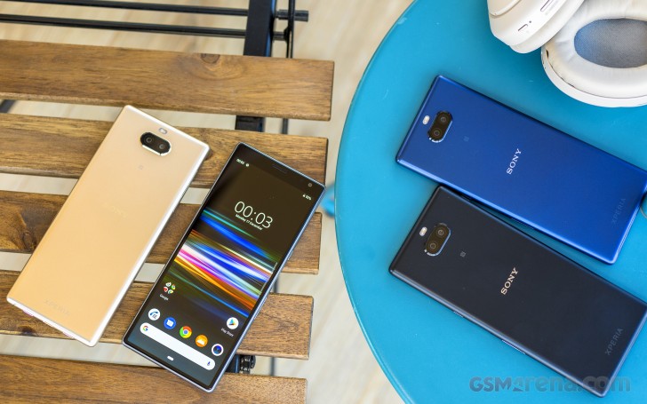
The two look and feel almost identical, with the "Plus" moniker mostly denoting a few hardware changes, like a zoom camera and more powerful chipset, as well as the obvious increase in size. Hence, it's only natural to look at these as a sibling pair and mention differences as they come for this hands-on.
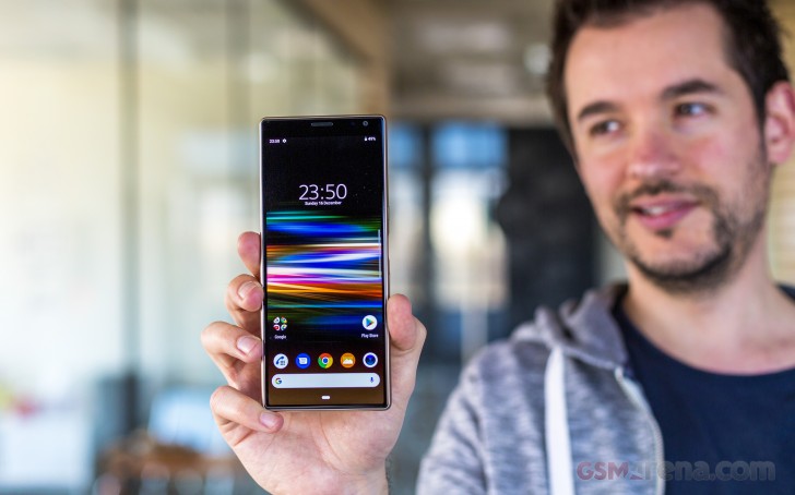
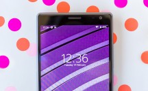
Just like on the Xperia 1 the stand-out feature here, the one that Sony will be focusing its marketing efforts on is the 21:9 display aspect ratio. Both Xperia 10 models have the new flavor of an extra-tall and pretty skinny panel. The main difference between the two being diagonal. Compared to the Xperia 1, however, you are loosing quite a few display quality aspects and features. But, more on that in a bit.
Even so, you still end up gaining all the cinematic multimedia watching benefits of the new aspect ratio, plus the boost in productivity it provides. Essentially, in practical terms, an Xperia 1 experience. Or at least most of it. On a budget.
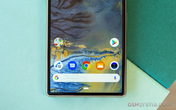
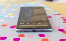
There are some subtle, but somewhat important differences in design compared to the Xperia 1, though. For example, the bottom chin on the Xperia 10 and 10 Plus has been shrunk down even further. Perhaps the LCD panels have less bulky logic boards, or ones that lend themselves better to "folding" and tucking away.
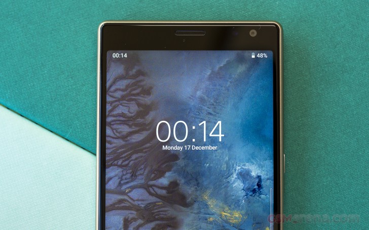
On the flip side, the area above the panels, or "forehead" if you will, has grown noticeably compared to the Xperia 1. While not really bothersome in itself, we do find it kind of odd and disappointing that the extra room didn't go towards a bigger or more capable selfie camera, nor a beefy second speaker. The Xperia 10 and 10 Plus don't even offer a hybrid stereo setup. Let alone a dedicated top speaker.
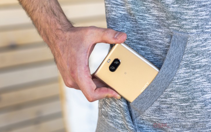
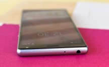
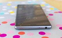
One thing that does technically occupy the extra space on top of the display is the 3.5mm audio jack. Legacy or not, we still stand by this versatile, tried and true connector and appreciate the fact that it made its way over from the Xperia "XA" family.
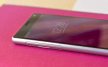
Since we are already discussing the frame of the Xperia 10 and 10 Plus, it is distinctly different from the one on the Xperia 1. The entire construction of the phone is relying on a plastic unibody shell, instead of the three-piece glass "sandwich" on the Xperia 1 flagship.
Sony's PR talk on the subject mentions "metallic finish," but that's not the case and probably for the better. The Xperia 10 and 10 Plus feel quite "silky" to the touch if that makes any sense. The plastic resides in a quite particular niche between hard and soft, which, in our opinion, makes for a really pleasant feel. Plus, no glass means a lot fewer issues with smudges and slippage.
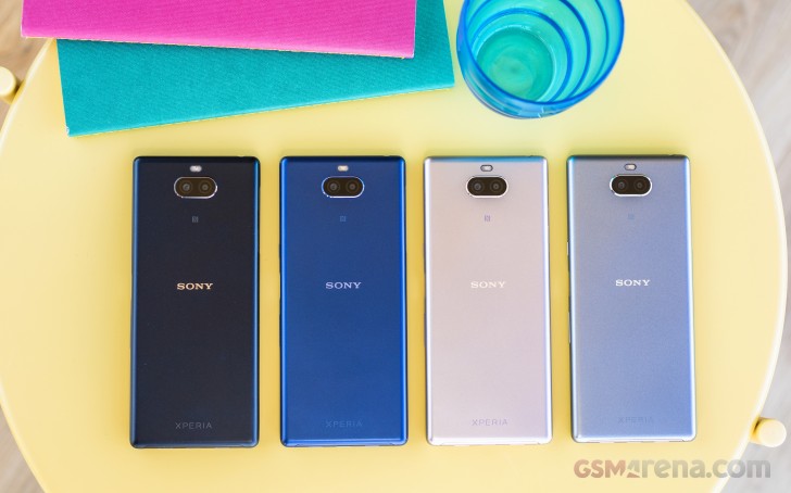
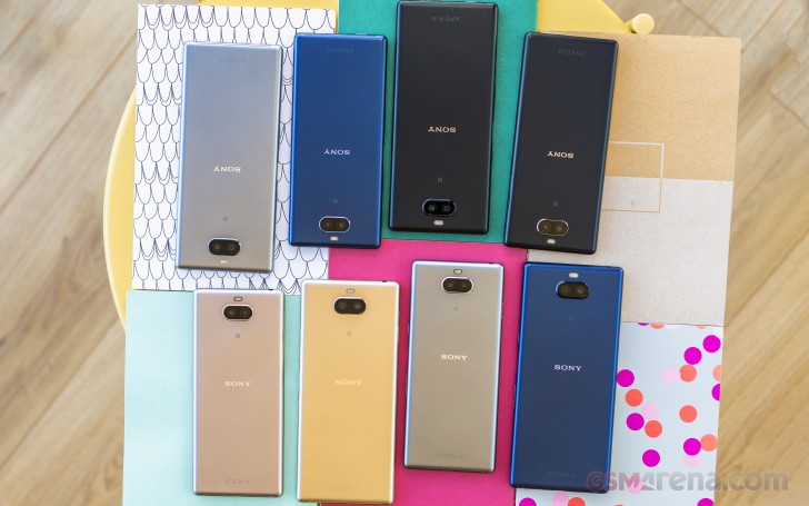
You can get both the Xperia 10 and the 10 Plus in Navy, Black and Silver colors. Pink is an exclusive shade to the Xperia 10, while the fourth color option for the Xperia 10 Plus is Gold.
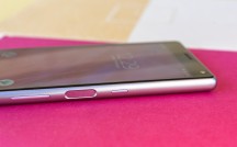
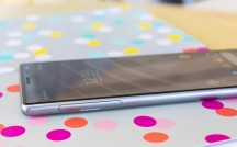
The rest of the controls on the Xperia 10 and 10 Plus are a mixed bag of similarities and differences. With the former mostly prevailing. The "super mid-rage" pair also uses a side-mounted fingerprint reader, accompanied by a separate power button. The legal reasoning and practical implications here being identical.
Though it is interesting to note that the Xperia 10 pair have a different fingerprint reader- one that is generally bigger and easier to use. In terms of speed and accuracy, we couldn't really tell any difference between it and the one on the Xperia 1. Our best guess is that the latter needed to slim down the control to fit the extra sensors for Side sense along the frames on the phone. In contrast, the Xperia 10 and 10 Plus lack said dedicated sensors. Side sense is still present but has to be triggered by tapping the actual edge of the display.
Another surprisingly important difference in the Xperia 10/10 Plus control layout is the relative location of the power and volume keys. These are swapped compared to the Xperia 1. Having the power button higher on the frame definitely makes it easier to reach, in our opinion. Then again, to reiterate an earlier point about the always-on fingerprint reader, most users are likely not going to use the actual power button much in day to day use.
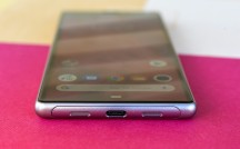
Despite its dual cut-out design, the bottom of the Xperia 10 and 10 Plus only house a single bottom-firing speaker. That's one notable downgrade compared to the Xperia 1. While on the topic, another one is the Gorilla Glass 5 protection of the display and a lack of any formal ingress protection rating.
There should, eventually, be an official Style Cover Solid case with MIL-STD-810G-516.7 rating for shock resistance, in case you need the extra protection.
Display
Considering the overall similarity in design, display diagonal is the most apparent differentiating factor between the vanilla Xperia 10 and the 10 Plus. Apart from a slight offset in the display position, telling the Xperia 10 Plus apart from the Xperia 1 from the front is a lot more challenging, since both rock 6.5" inch diagonal displays.
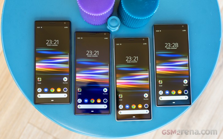
That being said, the Xperia 10 Plus and its smaller sibling do miss out on most of the high-end goodies the Xperia 1's panel has to offer. OLED technology gives way to LCD. There is no HDR support or extended color spaces for "Creator mode." There is no X1 for mobile enhancement engine either. The native panel resolution is also dropped down from 4K to FullHD+ (1080 x 2520 pixels).
Even so, both panels look perfectly sharp in person. Naturally, we'll reserve any official comments on their brightness, contrast and color accuracy for the full review, but our preliminary impressions are pretty positive.
Even though they're not getting the most advanced display tech currently in Sony's roster, the 21:9 aspect ratio of the screens allows the Xperia 10 and 10 Plus a comfy place in the company's new multimedia and productivity vision. Streaming content in 21:9 is only going to get better and easier, especially once Sony smooths official phone detection and support over with Netflix. As for multi-tasking, that works just as well on these devices. Barring some raw performance limitations, of course. Sony's Twin apps Side sense feature might not be available exactly at launch for the Xperia 10 pair, but it will be added in an OTA shortly after.
Reader comments
- Grimlen
- 03 Jun 2019
- rRU
Wow what a phone hands down
- DantE O2
- 31 May 2019
- a3p
you can't delete my comment cause i mentioned your mistake guys, for a device to be labeled as 4k/QHD/FHD/HD we should look at "vertical" pixels not horizontal pixels , this is an elementary term in resolution topics. so if a device doesn't ha...
- DantE O2
- 30 May 2019
- a32
6.5 in 21:9 is equal to having a 5.2 display in 16:9 and having it's up and down stretched
