Sony Xperia C4 Dual review: Flashy performer
Flashy performer
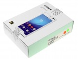
Plain cardboard box with all the basics
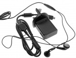
The Sony Xperia C4 comes in a simple retail package that doesn't impress with its contents. You get an AC adapter, whose output is rated at a rather low 850mA, so you may forget about speedy charging. There's a USB cable to complement it, as well as a headset with a single-button remote.
Sony Xperia C4 360-degree spin
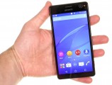
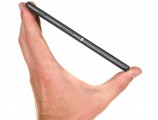
At 150.3 x 77.4 x 7.9 mm the Xperia C4 is decently compact for a 5.5-inch smartphone, certainly shorter than average. It is Sony's best performer in terms of screen-to-footprint, better than the latest Xperia Z3+ flagship.
With a little more effort put in minimizing the top bezel, screen-to-body ratio could have been a headline feature of the C4, but things aren't too bad now either. The thickness isn't particularly impressive, and at nearly 8mm one could have expected a larger battery these days.
The Xperia C4 tips the scales at 147g, which makes for a reasonably light phablet. If anything, it feels a little lighter than it actually is, thanks to its all plastic body.
Body and design
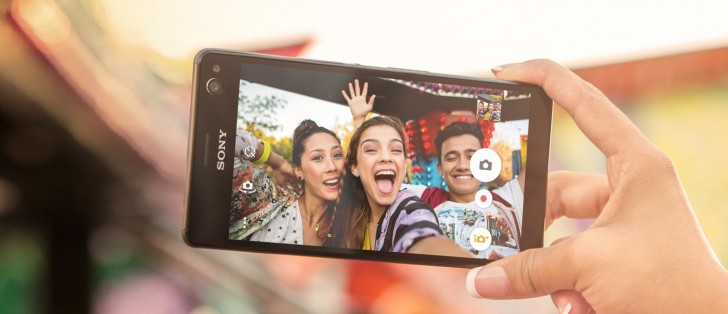
The Xperia C4 is no stunner, it's more of a regular run of the mill black slab type of a smartphone. Granted, that holds true for our (obviously black) review unit, and wouldn't so much be the case for the white version, not to mention the green (or Mint) one.
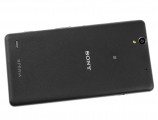
Unassuming design at first glance
Still, even in this conservative dress, this is a recognizable Sony design with a few characteristic touches that set the Japanese company's lineup apart from the competition. Chief among those is the aluminum power button on the right side which debuted on the original Xperia Z back in the beginning of 2013.
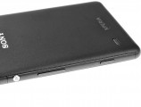
The aluminum circular power button is a signature Sony element
Another distinctive feature, the bumper corners, are a more recent addition to the Sony aesthetic. Those are functional in providing protection in case of accidents but they certainly don't help with looks. That said, they are less of an eye-sore on the Xperia C4 as they are on the flagship Z models. That's the case because the outer frame here is entirely made of plastic, so the corners don't contrast as much.
The frame is also interrupted for the card slots, of which there's a total of three - two for nano-SIM cards and one for microSD. A feature borrowed from the environmentally-sealed Z series, the flap that covers the push-to-insert-push-to-eject slots takes up the entire width of the frame and is rather inconspicuous.
The back is made of a soft matte plastic that is similar to the one used for the recent Z-series tablets. What that means is it feels very nice to the touch and offers plenty of grip, but it also accumulates grease with ease and on top of that is very difficult to clean.
A word of caution - the slots cover has a slit for opening it, which may at first look like a nice place to start popping off the back cover. The same goes for the microUSB port, it would have been a nice point for prying off the rear panel. Don't do it - it's non-removable and you may end up damaging your phone.
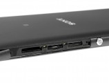
Card slots behind a flap • matte back
When you look at the front, the Sony logo on top helps a lot to establish brand affiliation, as the minimum bottom bezel is certainly a first for the company, and does tend to throw off the uninitiated at first glance. We like the route Sony has gone, though we can't help but wonder if the top bezel could have been trimmed a touch more. Next time, perhaps.
The lens of the 5MP front camera then takes center stage, though admittedly our black model camouflages it a lot better than the other color options. Hiding it was never the goal though, and the whole module is surrounded by a metal rim which sticks out a fraction of a millimeter, so even if you couldn't see it, you'd feel it if you run your finger. The LED flash, on the other hand, doesn't scream for attention all that much, instead it looks like just another sensor cutout.
The display is surrounded by a miniscule raised lip. It provides some protection to the display if the phone is lying face down, but it's a bit of a usability liability as the edge gets in the way of your swipes - a rather irritating feat in this age of smooth-edged 2.5D glass.
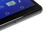
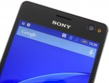
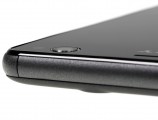
Minimal bottom bezel • 5MP camera with LED flash • both the camera module and the display border are raised a bit
Controls and handling
The Xperia C4 has a rather typical Sony control layout. The packed right side is home to most, with the aforementioned power button sitting a bit above midway. Above it is the card slot array behind the plastic flap, while below you get a volume rocker and the now nearly extinct outside of Sony's lineup two-stage shutter release button.
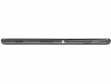


Most of the controls are on the right side
Perhaps worth noting is that the buttons feel noticeably clickier and offer much better feedback than the somewhat mushy ones on the Xperia M4 Aqua, though understandably not up to the Z3+ standard.
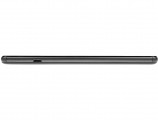
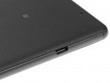
Over on the left there's nothing but a microUSB port for charging and wired connectivity.
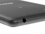
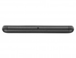
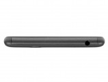
Up top there's a standard 3.5mm headphone jack, while the bottom is home to nothing else other than the primary mic pinhole.
The front is pretty crowded too, especially at the top (well, actually, exclusively at the top). The earpiece sits centrally above the company logo, with the notification LED and the ambient light/proximity sensor to its left. In the top right corner you'll find the 5MP front-facing camera module, joined by the headline LED flash.


Top bezel houses plenty of sensors
The back is home to the 13MP primary camera, which has an unusual slightly off-center location. Below it sits its own single-LED flash. A bit to the right there's a pinhole for the secondary mic, while the loudspeaker is in the bottom left corner behind a fine metal mesh. There's the obligatory Sony and Xperia logos, as well as an NFC label to tell you where the antenna is.

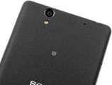
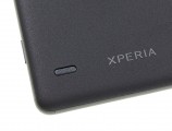
The back is home to the main camera and loudspeaker
The Xperia C4 handles well for a 5.5-inch device, helped by the grippy texture on the back and the compact bottom bezel, which places a larger portion of the screen within reach. The power button is easily accessible with either your right thumb or left index/middle finger depending on how you hold it.
The volume rocker sits somewhat low and turning the volume down requires some readjustment of the grip. The shutter button, on the other hand, is placed exactly where it should be.
Reader comments
- Young blazer
- 21 May 2021
- fu%
I signed this phone
- SAM
- 30 Nov 2020
- XNI
This is the worst mobile ever I used, I only used it for three months. I lost the original warranty and the company refused to service. It has a display issue. I switched from sony then, I will never use their smartphones ever.
- Nemesis
- 26 Jul 2019
- u7V
Don't buy this phone, awful battery life, heating very fast, charging port on side make damage very easy to charging cable + sony give us very short cable.. Full of regret after buy this phone
