Sony Xperia C4 Dual review: Flashy performer
Flashy performer
The usual Sony touches over Lollipop 5.0
One of the lighter Android overlays, Sony's XperiaUI keeps the looks close to the stock OS, only adding minor tweaks, where Sony deemed necessary. It's also remarkably consistent between different models and different Android versions, so recurrent Sony users always feel right at home.
There's a single clock widget on the lockscreen which by default uses Sony's signature styling with a bold hour numeral, and less striking minute digits. If that's not your thing, you can opt for a simpler digital clock or an analog clock face, but that's it.
The clock is followed by the lockscreen notifications, which Google introduced with Lollipop, and in Sony's case a double tap on one will unlock the phone and take you straight to the respective app.
Unlocking works only by an upward swipe, other directions won't cut it. You do get shortcuts to the camera and dialer, though. A double-tap-to-wake feature could be found on the Xperia Z3+, but on the C4 the power button is the only way to go.
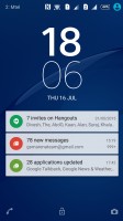
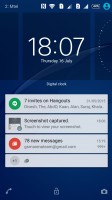
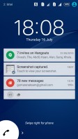
Lockscreen features a clock widget, notifications and shortcuts to camera and dialer
Beyond that, there's the usual set of homescreens, of which you can have up to seven. You can choose any one of them as Home, but you can't rearrange them, nor do they cycle to the first one once you reach the end. A dock of four app shortcuts plus app drawer icon sit on the bottom. Naturally, folders are supported on the dock, as well as the homescreens.
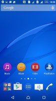
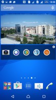
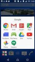
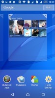
Homescreens with app shortcuts, widgets and folder support
There's an extensive theming engine and although the preinstalled themes offer mostly the same Xperia look in different colors, a whole bunch of other custom themes is available online. However, most options are paid.
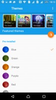

There are simple preloaded themes as well as a multitude of downloadable ones
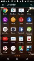
The app drawer displays a 4x5 grid of apps and you can't change that, though the large 5.5-inch screen could have easily accommodated a 5x6 grid. The apps can be arranged alphabetically, by most used, or in a custom user-selected order. There's a search feature, which comes in really handy if you have a lot of apps installed. To change the arrangement or uninstall an app, you need to evoke the side drawer, a feature of the XperiaUI used throughout Sony's proprietary apps.
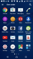
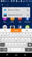
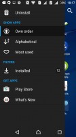
App drawer • search feature • side drawer for settings
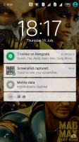
The notification area is the stock Lollipop flavor. That means a two stage design, with notifications displayed on the first swipe, and the settings toggles available upon expanding it. A less obvious gesture, a careful two finger pull down, will get you straight to the toggles.
Wi-Fi and Bluetooth are not mere switches, tapping on the text below will take you to the settings of the two. Editing the selection of toggles is available with a shortcut straight from the notification shade.
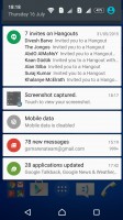
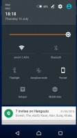
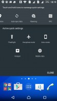
Stock two-stage Lollipop notification shade without auto brightness toggle
Like the rest of Sony's Lollipop builds, the Xperia C4 uses standard Android app switcher with the added benefit of a kill-all button. The more noticeable Sony touch comes in the form of Small apps.
They pop up tiny widget-like applications on your screen, which you can move around and use without having to open the full-fledged app. The set of available apps is: Active Clip, Chrome Bookmarks, Browser, Calculator, Calendar, Gmail, and Timer. You can launch only one instance of a Small App, but you can open multiple Small Apps simultaneously, though it can quickly become a mess.
You can download more Small Apps off the Play Store or use the option to turn your favorite widgets into Small Apps. Just hit the Plus key at the top of the list and choose a widget.
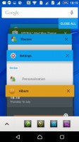
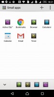
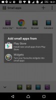
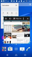
Lollipop rolodex task switcher with a Small app twist
The Xperia C4 has a couple of one-handed operation features which aim to help with ease of use on the large screen. Those range from the familiar scaling down and moving to the side of the dialer and unlock pattern dots, to the more novel Home double-tap for access to the notification area.
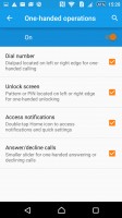
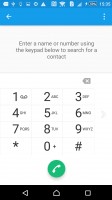
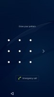
One handed operation puts parts of the interface to one side for easier access
Reader comments
- Young blazer
- 21 May 2021
- fu%
I signed this phone
- SAM
- 30 Nov 2020
- XNI
This is the worst mobile ever I used, I only used it for three months. I lost the original warranty and the company refused to service. It has a display issue. I switched from sony then, I will never use their smartphones ever.
- Nemesis
- 26 Jul 2019
- u7V
Don't buy this phone, awful battery life, heating very fast, charging port on side make damage very easy to charging cable + sony give us very short cable.. Full of regret after buy this phone