Sony Xperia M4 Aqua review: The lookalike
The lookalike
Android Lollipop with a pinch of Xperia
Sony only recently made the move to Android Lollipop and for quite a while, we were left with the impression that only the premium Z-line would be getting the OS update. We are happy to report that the M4 Aqua also came with Android 5.0 out-of-the-box. This was not the case with recent entry-level devices we have reviewed, like the Xperia E4 and E4g, but, it seems the new mid-rangers have made the cut.
That said, even though we're running the latest currently available (and final) firmware for our pre-release Xperia M4 Aqua, it's possible that there will be certain differences in how a retail version of the smartphone handles.
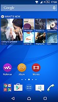
As far as the launcher goes, Sony has gone to great lengths to preserve its signature look and feel. If you are transitioning from a KitKat Xperia, you will instantly feel that almost everything is right where you remember, just with a fresher material-design look.
This even extends to the bundled application. Most of them are also practically untouched as far as navigation and UX goes, but now employ all the extra visual eye-candy of Android Lollipop. This kind of transition really takes effort and is definitely worth noting.
The lockscreen has undergone some changes with Android 5.0. There are no more lockscreen widgets available, apart, of course, from a selection of clocks.
The multiple panes have been removed as well. There are still quick shortcuts to launch the dialer and camera, which are now at the bottom left and right corners, respectively.
Naturally, you can protect your lockscreen by Face, Pattern, PIN or Password unlock, in ascending order of security.
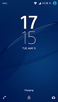
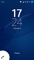
Xperia lockscreen, now lacking widgets
There are five homescreen panels by default and you can set any of them as your primary one. You can't have more than seven panes at any given time though, nor can you change the order they're in.
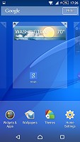
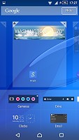
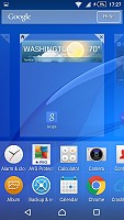
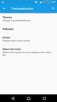
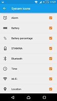
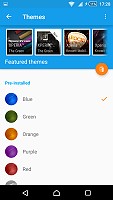
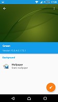
You can set various live and static wallpapers, add widgets and shortcut, or change the UI theme. You can also choose which icons will be visible on the status bar, and which should remain hidden.
The notification area is no longer arranged it two tabs. It uses the standard Lollipop-style pull-down effect with multiple levels. Quick settings are on the top and notifications on the bottom. The aforementioned can be accessed by swiping from the top twice, but Sony has also preserved its two-finger swipe gesture, which extends the full shade in one stroke.
The toggles are customizable and you can choose between a total of 13 and have up to 9 of them visible. Their order can be adjusted manually, or you can leave that to Lollipop, which will automatically rearrange them according to frequency of use.
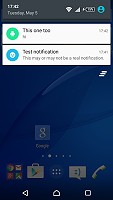
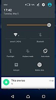
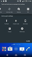
Notification area • Quick settings
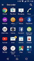
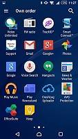
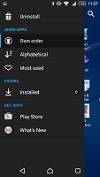
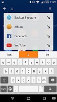
The app drawer is laid out across multiple pages and you can sort the apps in various ways. The settings for that are accessible via a swipe from the left edge of the screen and you can also search and even uninstall apps from there, as well as download new ones.
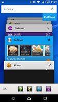
The Xperia M4 Aqua uses the stock Android task manager that lets you switch between the recently opened apps, as well as terminate any of them with a side-swipe. In Lollipop in features a lot more animation and also shows browser tabs as separate apps.
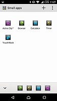
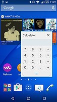
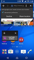
The so-called "small apps" are also available in the Xperia M4 Aqua and are accessible via the task manager. They are similar to Samsung's Mini Apps, and pop up tiny widget-like applications on your homescreen, which you can move around and use without having to open the full-fledged app. So far, there's a default set of five of those available: Active Clip, Browser, Calculator, Calendar, Timer and Touch Block. Interestingly enough, we have seen a number of other apps on Xperia devices, like- Chrome Bookmarks, Gmail, Notes and Recorder, which are missing on the M4 Aqua. On the other hand, Touch Block is something we haven't seen on other devices, which is kind of odd.
You can launch only one instance of a Small App, but you can open multiple Small Apps simultaneously.
Sadly, you can't disable the small apps entirely and will always have them cramming your recent apps whether you use them or not.
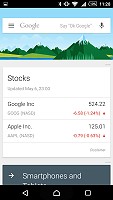
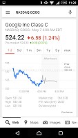
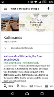
Finally, Google Now integrates with your Google account and can access your daily routine, internet searches, email, etc. and give you information relevant to your interests and daily needs.
The built-in 8GB (about 4GB of which are user accessible) of storage gets filled up pretty quickly and the Xperia M4 Aqua needs a microSD card to help carry the load. Unfortunately, some apps will still refuse installing on the external storage so it's best that you grab the 16GB version to begin with.
Reader comments
- Cobby Dale
- 22 Jan 2019
- mHe
Nice cheap phone with good camera, Only downside is the 8gb of storage
- Anonymous
- 26 Dec 2018
- vaS
Good phone
- penny borough
- 08 Dec 2018
- dTJ
Picked up for less than £30 albeit a used item, Can't fault it,Camera good, size just right, smooth performance, Why pay £100's then worr
