Sony Xperia S review: NXT of kin
NXT of kin
A couple of NFC tags in the retail box
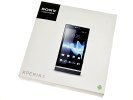
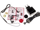
The retail box of the Sony Xperia S is slightly different from what we had for the preview. Inside is a rather large (and cheapish-looking) GreenHeart charger, which pairs with the microUSB cable to charge the phone. An in-ear headset is also available, with two extra sets of ear buds in the box.
You'll also find two Smart Tags - they are small and round, made of glossy plastic. We got one red and one black, which makes them easy to tell apart. The Smart Tags have lanyard eyelets if you need to put them on a keychain, but there's also two double-sided sticky tape patches if you want to secure the tags more permanently.
We wish there was a microHDMI cable included in the box, but those are relatively easy to find anyway.
Sony Xperia S 360-degree spin
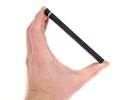
The Sony Xperia S measures 128 x 64 x 10.6 mm and is a bit on the heavy side at 144 g, even for a phone with a 4.3" screen.
Design and build quality
The Xperia S design is a combination of right angles and curves. It carries a unique accent too, the illuminated transparent strip. It's a throwback to the Xperia pureness, while the curved back is a nod towards the Human Curvature design.
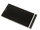
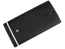
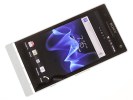
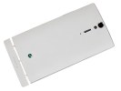
The Sony Xperia S is quite the looker
The screen on the Sony Xperia S promises great things and it delivers - it's mesmerizingly sharp, with punchy colors and very good contrast. It's backed by BRAVIA engine which, as we've seen before, does very well on screens with high pixel-density - and the Xperia S display is one of the most pixel-dense at 342ppi.
Its only downside (and it's not a minor one) are the sub-par viewing angles.
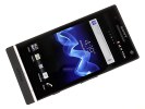
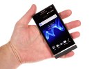
The Reality display boasts excellent picture quality
Anyway, the Xperia's screen has decent blacks, though the Xperia arc did a little better here. The Xperia S brightness is average at best but it's still brighter than the LG Optimus LTE, which is the other 4.3" 720p LCD screen we've tested. The contrast is over 1000:1, but is lower than the Xperia arc and the Optimus LTE screens.
Sunlight legibility on the Xperia S screen is pretty good.
Here's the table that compares the brightness and contrast of the Xperia S to other phones we've tested. Note that we couldn't get accurate measurements for the Xperia S screen at 50% brightness and they are not included in the table (Sony's software doesn't let you override the ambient light sensor with brightness settings other than 100%).
| Display test | 50% brightness | 100% brightness | ||||
| Black, cd/m2 | White, cd/m2 | Black, cd/m2 | White, cd/m2 | |||
| HTC Sensation XE | 0.23 | 172 | 761 | 0.64 | 484 | 752 |
| Nokia 701 | 0.64 | 619 | 964 | 1.12 | 1022 | 905 |
| LG Prada 3.0 | 0.19 | 184 | 993 | 0.81 | 835 | 1031 |
| Sony Xperia S | - | - | - | 0.48 | 495 | 1038 |
| LG Optimus Black | 0.27 | 332 | 1228 | 0.65 | 749 | 1161 |
| Sony Ericsson XPERIA Arc | 0.03 | 34 | 1078 | 0.33 | 394 | 1207 |
| Apple iPhone 4S | 0.14 | 205 | 1463 | 0.52 | 654 | 1261 |
| Samsung Galaxy Nexus | 0 | 112 | ∞ | 0 | 247 | ∞ |
| Motorola RAZR XT910 | 0 | 215 | ∞ | 0 | 361 | ∞ |
| Samsung I9100 Galaxy S II | 0 | 231 | ∞ | 0 | 362 | ∞ |
| Samsung Galaxy Note | 0 | 287 | ∞ | 0 | 429 | ∞ |
Anyway, above the screen is the SONY logo styled with their instantly recognizable font (unlike the "Sony" in "Sony Ericsson"). The earpiece is below, along with other bits of gadgetry.
There's a 1.3MP front-facing camera that can record 720p video, along with proximity and ambient light sensors. A charge/event indicator glows in red or green depending on charge status and blinks whenever there's something that requires your attention.
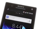
The earpiece and its companions
Below the screen, there are three tiny dots marking the three capacitive keys (Back, Home and Menu). The actual icons are within the transparent strip, so you might try to push those instead (like we did). The capacitive keys are big enough, but they've been tweaked to require a proper press rather than a light touch. Overall, it takes a while to get used to them.
The transparent strip has a cool white backlight, which makes it an attractive design accent in the dark. A fusion of form and function, this strip also holds the antenna. A closer look will show you the almost invisible grid inlayed in the transparent plastic that transfers the signal.
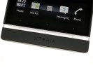
The three dots are the standard Android keys
The two wired ports - microUSB and microHDMI - are on the sides of the phone. Both are hidden under plastic flaps to keep dust away.
The right side of the Sony Xperia S holds a couple of other controls too - a not-so-comfortable volume rocker and a shutter key.
The Xperia arc S had a rather unpleasant shutter key and while this one is better, it's still not perfect. It's thin and has a low profile, but at least it's easy to press (stiff keys like on the arc S can lead to camera shake). The stop between half-press and full-press can be hard to feel sometimes though.
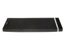
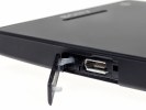
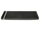
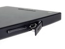
microUSB port on the left • microHDMI port, volume rocker and shutter key on the right
The Power/Lock key and the 3.5mm audio jack are on the top. The audio jack is left uncovered, but that's usually the case with these and it makes sense since it will probably see plenty of use.
There's nothing of interest at the bottom besides the lanyard eyelet.
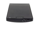
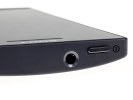
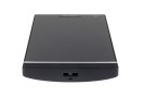
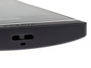
The Power/Lock key and the 3.5mm audio jack are on top • Lanyard eyelet on the bottom
The back of the Xperia S features the star of the show - the 12MP camera lens. It's located very near the top edge, which means you'll have to be extra careful not to put a finger over it when taking a photo.
The camera is accompanied by a single-LED flash and the secondary microphone used when shooting video. The loudspeaker grille is also here.

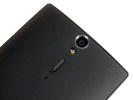
You should mind your fingers when shooting
The back cover is made of soft matte plastic, which feels good and hides fingerprints well. We had the black version for our hands-on preview earlier this month, but the white version we're testing this time around looks pretty cool too. The white plastic is matte too (not glossy as most white phones).
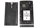
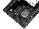
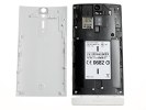
Removing the back cover doesn't reveal much - you'll find the microSIM card here, but you don't get to see the battery. What you would find is an aluminum frame painted black, similar to the Xperia ray.
The battery is a 1750 mAh unit, which is said to provide about 450 hours of 2G stand-by (420 hours in 3G) or up to 7 hours and 30 minutes of talk time in 2G (8 hours and 30 minutes in 3G).
We liked the clean design of the Sony Xperia S. The transparent strip is a unique accent and subtle enough (the Xperia pureness must be glad a small part of it lives on).
The curved back fits nicely in the hand, but again doesn't overdo it and make the phone thick (like some of those Human Curvature handsets). It's fairly compact and pocketable, you can take it anywhere - much more portable than a point-and-shoot camera, so it's always with you (they say that's the best possible feature on a camera).
Reader comments
- niels2029
- 08 Feb 2024
- m1v
the scren is very sensitive.. i broke mine last week... it was just below on a stack of books and it broke... so sad
- Asad
- 07 Jan 2022
- 6Qk
I want to get panel of this phone Is available,,
- Beast
- 29 Nov 2017
- Gfu
Does it have WhatsApp...
