Sony Xperia Tablet Z review: Stepping up
Stepping up
The enhanced user interface looks mostly stock
The Sony Xperia Tablet Z runs Android 4.1.2 out of the box and features the latest version of Sony's modifications. They are mostly the same as the ones that the Tablet S got, though the multi-user support was dropped (it was a nice feature to have, and it's a native feature of Android 4.2).
Before we go on, here's a short video walkthrough of some of the more interesting features of Sony's new tablet.
The lockscreen is the same as the one on the new Xperia phones. It's unlocked by a swipe up and there are two shortcuts - the camera and the music controls. We would have liked to see some more shortcuts here, two is okay (ish) on a phone, but they feel pretty lonely on a big 10.1" screen.
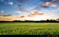
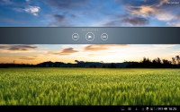
The lockscreen of the Sony Xperia Tablet Z
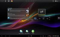
The homescreen can fool you for a second that you're looking at stock Jelly Bean, but then you start spotting the differences.
The bottom row is dedicated to the on-screen buttons - Back, Home and App switcher - and status (time, battery charge, signal strength and icons for notification). You can tap the status area to bring up notification area, another tap brings up toggles (Airplane mode, Auto-rotate screen and Notification toggles and shortcuts to the Wi-Fi and general settings).
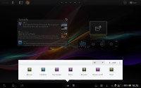
In between the on-screen buttons and status are two buttons for the Small apps. The first brings up a list of Small apps (those can be filtered: All, Starred, Apps, Widgets), while the second one is a shortcut for an app of your choosing.
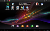
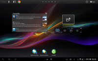
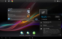
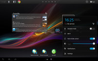
Almost stock looking homescreen • The notification area and toggles
Small apps are floating windows (small ones, as the name suggests) that can typically handle various tools - the default ones are Browser, Calculator, Clip Manager, Notes , Recorder, Remote control and Timer.
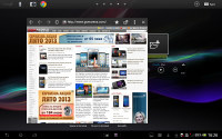
Each app can be dragged around the screen if you need to get it out of the way and some of them, like the Browser can be resized. You can also "minimize" them - just drag them to the right or bottom edge of the screen and they'll collapse to just their icon. A tap on that icon brings them back up again.
Only one Small app can run at a time, which is a little limiting. You can't, for example, launch two Small apps and use them side by side.
Small apps can be pretty useful and enhance the multitasking skills of the Xperia Tablet. For example, if you're writing something, you can use the floating browser as reference material. You can also tap on the expand button if you want to go to the full-screen browser.
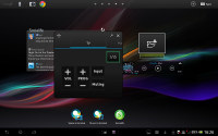
There's an option to download and install new Small apps off the Play Store, there are about 40 at the time of writing this. Not a big deal though because each and every widget can be made into a small app, so you can make a Small app that controls the music player in just a couple of clicks by adding the music player widget to the list.
Creating a small app from a widget
We'll get back to the Remote control app later, in the Connectivity section.
We like what Sony has done with the bottom row of the UI, which is usually pretty empty. The top row of the screen similarly makes efficient use of the available space thanks to some Sony customizations.
On the left is the always visible Google text and voice search shortcuts, next to it is a customizable dock of four shortcuts. In the middle of the row are five dots indicating the current homescreen pane (you can tap them to navigate to a specific one) and on the right side is the Customize button and the app drawer button.
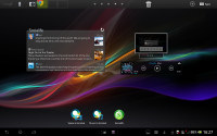
Editing the shortcuts in the dock
The Sony Xperia Tablet Z comes with five homescreen panes by default, but you can add up to two more (or delete ones you don't need). You can do a pinch gesture or use the customize button to add widgets, shortcuts or change the wallpaper or the whole theme.
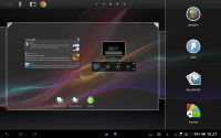
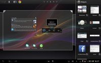
Adding widgets to the homescreen
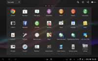
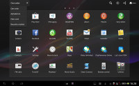
The app drawer houses just apps - the widgets are added from the homescreen itself. The apps ordered into pages and you can choose between a custom order, alphabetical, most used or recently installed.
Additional buttons here help you search for apps, quickly uninstall apps or share an app you like.
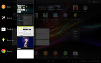
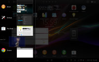
The task switcher has been tweaked slightly - it displays a list of recent apps on the left side of the screen with the apps icon, name and a thumbnail of its screen. You can swipe left or right to discard an app.
Overall, the Sony Tablet Xperia Z interface is fast and smooth. We like Sony's customizations, especially since they augment the stock Android interface rather than replace it. We do wonder what happened to the multi-user support - it was a nice advantage over the competition. Now it's gone, at least until the Android 4.2 update (which should bring native Android support for several users).
Reader comments
- vikram karthik
- 22 Mar 2014
- uvX
Very good product sony product
- Lionsauvaga
- 02 Jan 2014
- p@i
Hi, someone can help me by telling me if the apps can be transfer to SD? Because I am hesitating by getting the 32Gb or the 16Gb LTE, but I am not sure if 16Gb will be enough. I would surely go for the 16Gb/LTE if some of the apps can be transfer to ...
- AnonD-209109
- 23 Nov 2013
- 3CH
this tablet was the one for me, but the lack of a stylus support (even in just hardware, not software) was a deal breaker as the functionality is too useful to be ignored in a new tablet, i could go for a samsung note 10.1, but i will to see sony's n...
