Sony Xperia XA Ultra hands-on: First look
First look
Sony Xperia XA Ultra hands-on
The Sony Xperia XA Ultra has its roots in the C-series, going back to the C3 from 2014. At the time, the company also had the Xperia T2 Ultra to fly the Ultra banner, the 6-inch phablet itself inspired by the humongous 6.4-inch Xperia Z Ultra from the year before.
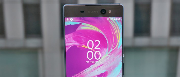
That's mostly ancient history, though, and it's clearly the Xperia C5 Ultra that has given the most of its genes to the new device. Edge-to-edge display, a large lens staring at you from above the display, front-facing flash, the similarity is undeniable.
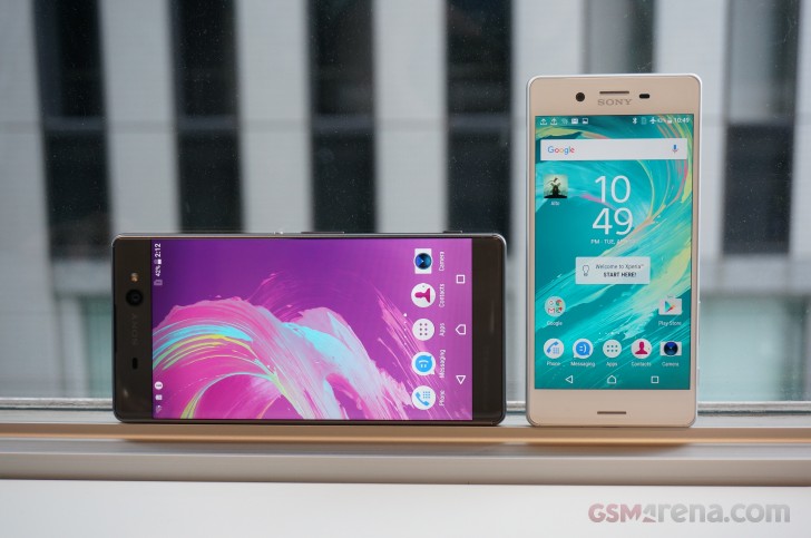
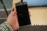
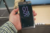
The borderless 6-inch display is one of the achievements Sony is most proud of. The tag line is "6-inch in 5.5-inch feel" and it's not just marketing talk either. With a width of around 79mm the Xperia XA Ultra is a millimeter-something wider than an iPhone 6s Plus. Admittedly, not a screen-to-body ratio champ that one, but still. On the other hand, the XA Ultra is a tall handset, there's no denying that.
And while the form factor comes from the C5 Ultra, the detailing is present-day X-series, and it's here that the close relation to the smaller 5-inch Xperia XA is most evident.
For one, the contemporary 2.5D front glass gives the XA Ultra a touch of premium feel that the outgoing model didn't have. And while the C5 had two cutouts on both ends of the front glass, the XA Ultra only has the one on top, XA-style.

Xperia XA Ultra next to the Xperia X
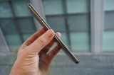
The new phablet gets a frame much like its bro's, only here it's made of metal, unlike the plastic XA non-Ultra.
The back is nothing like the Xperia C5 Ultra and that's a good thing. Sony used glossy plastic on the previous model, and it was impossible to keep clean. This time, the XA Ultra has adopted the XA's matte back and the result is infinitely better.

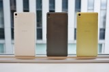
Three color schemes, no rose gold though
The rear camera has been relocated from the central axis to the upper left corner to be more consistent with the rest of the lineup. It's the setup used on generations of Sony flagships, and even if the midrangers may have strayed from it on occasion, the unification seems logical.
The control layout will be familiar to anyone who has held a recent Sony smartphone. On the right, you have the power button slightly above the midpoint, with a volume rocker under it and a two-stage hardware shutter release button close to the bottom. Both XA models are denied the privilege of a fingerprint sensor in the power button.
On the left there's a flap that covers the card slots, a 3.5mm jack is on top, joined by the secondary mic, while on the bottom you get a microUSB port, the primary mic and the loudspeaker.
It's not all about the design, naturally, and Sony has made some serious efforts in the camera department too. We'll go over these on the next page.
Reader comments
- Anonymous
- 19 Jul 2016
- IbE
Patience will earn you your prize!
- arun ice
- 12 Jul 2016
- rKb
am waiting 3months for xa ultra dual
- Anonymous
- 29 Jun 2016
- Ibx
Only thang poor here is your writing! Sony Rocks with quality /specs and performance cells.
