Sony Xperia XZ1 Compact review
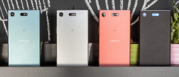
Android Oreo with Xperia topping
One of the highlight features of the new Xperia XZ1 series is the latest available Android 8.0 Oreo OS. Don't really expect a radical change in the UI of the device as most of the changes are under the hood, but they improve the user experience quite significantly. Long-term Sony fans should feel right at home with what is essentially the same Xperia launcher and overall light level of OS customization.
Sony uses a UI close to stock Android, and focuses most of its efforts in its in-house apps that come preloaded. This means the Xperia ROM is light on the chipset even if it's not as full of features as some of its competitors.
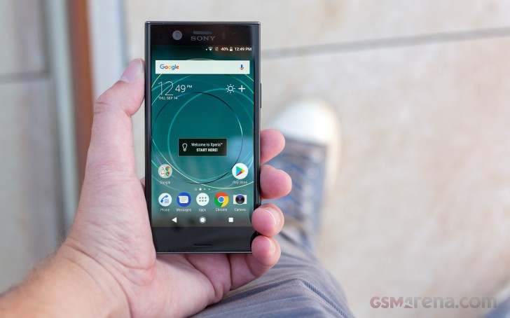
Since not much has changed in the UI itself, we'll try to keep our tour brief. Unlike some of its competitors, Sony is still sticking to the basics when it comes to biometric authentication methods. We already mentioned the signature fingerprint reader, which triggers an animation that slides the lockscreen away from your thumb (as if you pushed it out of the way).
If you have simple Swipe unlock enabled (without any PIN or password) you can tap on the Power button to unlock instead, provided you've woken up the device first.


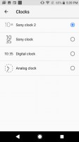
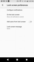
Lockscreen • Lockscreen and unlock options
The lockscreen itself is nothing special. Be default, you get a clock and date widget and a pair of quick unlock shortcuts. You still get some level of customization, including a few different clock designs and some notification area tweaks. Of course, the standard Android unlock methods are present as well.
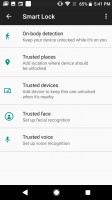
There is also the Android-native Smart Lock. It gives you conditional security - trusted nearby devices, locations, faces, or voices can allow you to skip the security protocol that you may have set up on the phone.
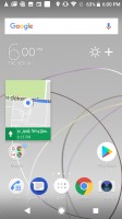
The homescreen appears unchanged from previous Xperia generations. This includes the swipe down gesture, which shows a screen of the apps you use most along with recommendations for new apps to install. The search field is highlighted so you can start typing the app's name immediately.
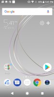
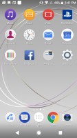
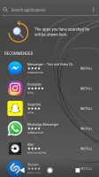
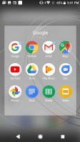
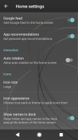
Homescreen • Homescreen • App search and suggestions• Folder view • Homescreen settings
The traditional app drawer is present, and you'll find a number of proprietary apps pre-installed. Sony takes great pride in the A/V prowess of their devices, and the multimedia apps are all custom and feature-rich, but more on those in their dedicated chapter.
The app drawer lets you sort the apps by frequency of use, name, date installed or a custom arrangement. One new detail we noticed is the absence of Sony's traditional app management mode. Now when you long press on an app, the launcher gives you the ability to uninstall it or enter its properties page, as well as a list of in-app shortcuts and quick access features.
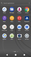
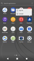
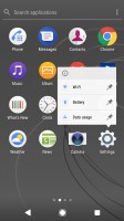
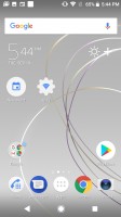
App drawer • App contextual menu • App contextual menu • Pinned homescreen shortcuts
If you happen to like something, the pin button brings the corresponding shortcut to the home screen. This is just one of the many Oreo goodies to be found on the XZ1 Compact. Most of these are buried quite deep, so stick around as we show you a few more in a bit.
Themes are available (both free and paid) that can customize the look and sound of the Xperia XZ1. Some themes are even interactive, with their wallpapers reacting to your touches. Besides themes, the Xperia launcher also offers wallpapers, grid settings and various transition animation options.
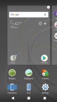
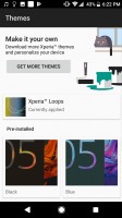


Launcher customization options • Themes
The notification area is plain Android. You can re-arrange the quick toggle tiles and adjust the screen brightness. What's missing is a toggle for Auto brightness (you need to go into the settings for that). It's the way stock Android is set up, but we miss that option there and Sony could have used the Oreo update opportunity to introduce it.
The app switcher is, a similarly vanilla Android affair, with the 3D rolodex look and an End All Apps button. The small apps are gone and are replaced by a Split Screen feature. If a running app supports split screen, you will be able to snap it at the top or bottom of the screen right from the rolodex. It's easy to use the split screen mode, but there is no way of knowing which app supports it - you have to start it first and then try to snap it.
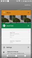
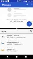
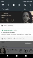
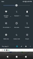
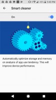
No-nonsense task switcher • Split screen apps • Notification area is vanilla Android • Smart cleaner
The Smart cleaner feature will periodically empty the cache of apps you haven't used in a while. You can switch this off, but unlike previous implementations of the feature, an app whitelist seems to be missing here.
So, is that all Android Oreo offers? Not quite - as we said major advancements come under the hood, in the shape of Background limits optimization for better battery endurance and new API's. These include system-wide autofill and camera API optimizations that will take some time and development to get utilized by third-party app developers.
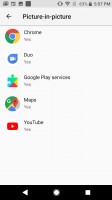
As far as more obvious new features go, there is Android Oreo's new picture in picture mode, which allows you to watch a video in a floating window while still doing other tasks on your phone. There are some players out there already capable of this, but we are talking about a core Android feature this time around. Currently, the YouTube, Chrome and VLC apps are said to support Oreo picture in picture.
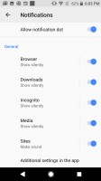
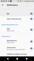
Notification channels are another potentially big change in the Android ecosystem. Again, support is still limited to only a few apps, but certain Google products have already separated their notifications into categories, which Oreo allows you to handle individually. That means you can mute a specific one without having to silence the entire app.
Reader comments
- rafael
- 24 Nov 2023
- GXs
still wating the same size and design phone from sony. best compact ever.
- Yakamoz
- 02 Jul 2023
- 3%W
I have 3 XZ1 Compact and one is still new. They all have a different display regarding brightness, contrast and saturation. Like the display on the Z Ultra (the Godzilla Phablet) the XZ1 Compact Display also gets white spots (you can see white bright...

