Sony Xperia XZ3 review
Design and 360-degree spin
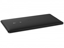
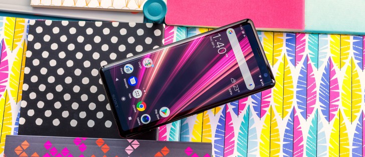
The Xperia XZ3 clearly represents a new and trendy design for Sony, no two ways about it. Definitely a bold step, if nothing else. As different as it is, however, it is not entirely unfamiliar, nor totally detached from the company's long-term design continuity.
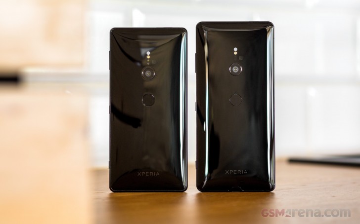 Top: Sony Xperia XZ3, Bottom: Sony Xperia XZ2
On the contrary. Even with the massive changes, implemented in the XZ3, Sony's design team managed to preserve some staples of the design, to the best of their abilities. Starting with the overall look and footprint - the "Ambient Flow" curves are still very much present all throughout the phone.
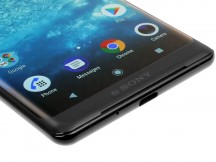
Then new curve display lines appear to flow naturally into the frame and then on to the sloping back panel, making the XZ3 one of the "curviest" Xperias to date. This is especially noticeable near the top and bottom ends of the front panel, which almost have a Google Pixel-like appearance, in the way they flow into the side curves.
Wider curves on the front, combined with the familiar "Ambient Flow" sloping back equate to a thinner frame on the XZ3. Compared to the XZ2, that is. Arguably, this provides a little bit more grip. The bill of materials has also changed a bit. The middle frame might be thinner but is now made of 7000 series aluminum. There is no flex in the chassis of the handset, whatsoever.
Controls
Since we are already discussing the frame, we might as take a tour of the controls as well. Their number and layout is practically unchanged from the XZ2. Nothing on the left and a volume rocker, power button and dedicated shutter key on the right-hand side. However, a narrower frame has necessitated significantly slimmer buttons.
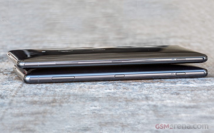 Top: Sony Xperia XZ3, Bottom: Sony Xperia XZ2
Thankfully, Sony did a pretty good job ensuring the same overall tactic feel for the buttons, as on the XZ2. We definitely appreciate the effort, but that is not to say the buttons are perfect. The are a bit "mushy" and lack a properly satisfying click. Still, we have seen a lot worse and even the new, thin variants are pretty easy to get used to.
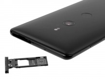
Just to round the controls tour up, the hybrid SIM tray is still found on the top of the XZ3. It can either house two nano-SIM cards, both with LTE and VoLTE. Or, you can swap one out for up to 512GB of microSD storage. Just like the other controls, Sony's setup of choice leaves us with rather mixed feeling. We appreciate the tool-less entry. However, we still can't get over the fact that every time you pull the tray, the phone instantly restarts. We probably won't stop bringing this one up until Sony decided to fix it finally (and not by splitting apart the SIM and microSD tray).
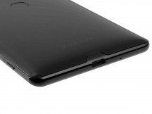
On the bottom - the main microphone and a Type-C port. The latter looks unchanged in any way and, indeed, it still supports a USB 3.1 connection. However, according to Sony's specs, charging is now done per the Power Delivery standard. The main microphone hole appears to be slightly tilted towards the front of the device now. Probably a deliberate choice to improve sound quality, but potentially also a consequence, of sorts, of the new curvier frame design.
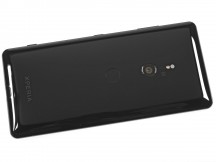
If there is one thing Sony's design team preserved almost entirely intact in the XZ3, it is definitely the back. Besides being a bit taller, for obvious reasons, it looks almost identical in its glossy finish and curvature to the one on the XZ2, when compared side by side.
One little detail that has left us a bit puzzled is a small portion of the metal frame, near the bottom of the XZ3 that extends into the Gorilla Glass 5 back. Its purpose continues to elude us, but we can't shake the urge to call it a "back notch", purely for the fun of it.
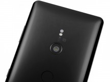
We do have to commend Sony on making the infamous bulge or hump on the XZ3 that little bit smaller. The absence of the dual camera setup from the XZ2 premium definitely helped and so did the taller body of the unit. Still, at 9.9mm, at its thickest point, the XZ3 does feel a bit thinner. A feeling further enhanced by the thin frame.
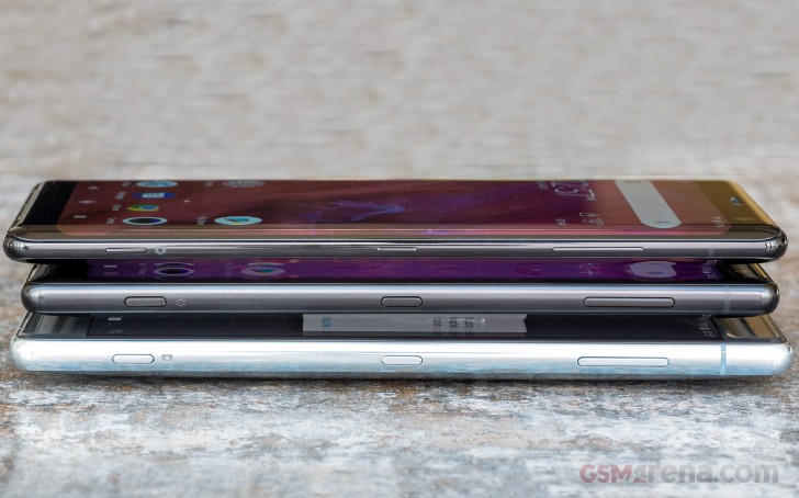 Top: Sony Xperia XZ3, Middle: Sony Xperia XZ2, Bottom: Sony Xperia XZ2 Premium
We are notably less impressed with Sony's persistence, with the fingerprint placement. Don't get us wrong; there is nothing intrinsically wrong with having a back-mounted reader. Plus, the one the XZ3 uses is just as snappy and reliable as ever. However, we do desperately wish Sony would bring it up to a more natural height. Seeing how the XZ3 is quite a bit taller, why couldn't all the module be shifted up, vertically, at least a little bit? Since, with the current setup, tour index finger is sort of conditioned to land right on the main camera.
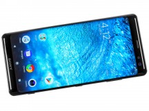
Circling back to the beautiful OLED panel, it is worth comparing it to something like the Samsung Galaxy S9 and S9+, seeing how the Korean behemoth is the main proponent and driving force behind the curved panel trend. Compared to those two, the curve on the XZ3 seems a bit more pronounced - sloping at a higher angle. This could explain why the XZ3 seems to display a bit more color shift in those areas, compared to its Samsung rivals. This is especially noticeable on a white background when the brightness is cranked up. Since the XZ3 has a slightly colder hue to it, in most color modes, the tops of the side curves start tho show noticeable traces of blue in these conditions. Definitely not as bad as on the Nokia 8 Sirocco, though.
Sizing-wise, the side bezels, on the left and right of the screen are a bit wider than those on the aforementioned Samsung. However, the difference is hardly worth mentioning due to the nature of the design. As in, you probably won't notice those either way.
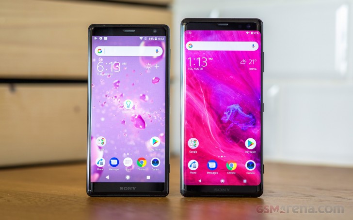 Left: Sony Xperia XZ2, Right: Sony Xperia XZ3
The chin of the XZ3 is noticeably thinner than the one on the XZ2. Still wide enough to house one of the two front-facing speakers. The speakers themselves are, apparently, the same units found on the XZ2 and they do live up to expectations. Plus, the XZ3 also gets the potential benefit from Sony's rather unique Dynamic Vibration System. If you are into that sort of thing, that is. But, more on that in the loudspeaker section.
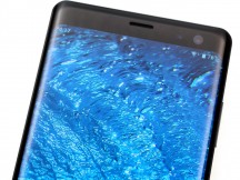
The forehead, on the other hand, is quite a bit wider on the XZ3. The extra space appears to be put to good use, though, considering the upgraded 13MP, f/1.9 selfie snapper. Plus, there is the other speaker in Sony's stereo setup.
Reader comments
- Anonymous
- 16 Oct 2024
- gkB
l have a sony phone,so sony ph is verynice, Thanks....
- Anonymous
- 06 Jul 2024
- DEP
This device is NOT for everyday activities including XZ2
- Sunny
- 07 Nov 2023
- 0xZ
Drop many times. Never breaks.
