Sony Xperia Z3+ review: The pre-sequel
The pre-sequel
Sony Xperia Z3+ 360° spin
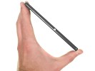
The Sony Xperia Z3+ measures 146 x 72 x 6.9 mm, which is exactly the same footprint as the Xperia Z3. Mere fractions of a millimeter have been trimmed off the thickness, 0.4mm to be precise - just enough for marketing to have something to work with. The difference is not really easily felt in real life. Sony however is rightfully proud it has achieved it without a protruding camera lens. The cameras on both the iPhone 6 (6.9mm) and the Galaxy S6 (6.8mm) are sticking out.
What is more tangible in practice is the decrease in weight. At 144g the new handset indeed feels lighter than the Z3, more so than the modest 8g worth of difference would suggest.
Body and design
If you've ever spent time with a Sony smartphone in the past two and a half years, you know the basics of their trademark design language, which the company calls Omnibalance. A rectangular two-sided glass slab held together by a metal frame makes for a premium styling which feels equally nice to look at and handle.
Sony has gone with a slightly different material for the frame this time around. While it's still matte, it has a bit more shine to it for extra flair. The bumper corners are still present and whether or not they provide additional protection in case of drops, they still are a bit of an eye-sore.
What is perhaps the most welcome design feature is the capless microUSB port. It's actually the second Sony waterproof smartphone to feature it, as the hot-off-the-assembly-line Xperia M4 Aqua is already shipping.
Apparently the IP68 certification for dust and water ingress could be attained without the hideous flap, which brought hassle to every charging session.
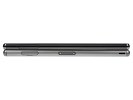
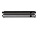
Sony Xperia Z3+ and Z3 compared
What used to be a workaround to that issue - the side-positioned magnetic docking port - is now gone for good or bad. You no longer have the option of docking the handset in landscape orientation. Instead, a new dock, again sold separately, allows you to sit the Z3+ in portrait mode.
We're not great fans of the design as the dock is not completely stable with the phone being wider than the dock itself. Also the dock tends to muffle the bottom speaker a bit.
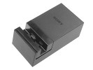
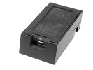
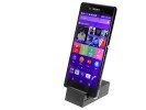
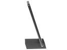
New docking station for the Sony Xperia Z3+
The speakers themselves mark a return to the Xperia Z2 in terms of placement. The relocation to the edges of the front means they are less obtrusive than on the Z3 and the front is now back to a solid glass panel with no cutouts.
Unfortunately, when listening to music they don't sound so crisp as we would have liked. Let alone that the whole phone vibrates with the sound when you have the full on (that's the case with the Z3 as well), but music is not as deep as before. In comparison, even the Xperia Z3 offers deeper sounding music, while the the HTC One M9 hands down blows it away. Music reproduction there is much deeper and nicer and there isn't any sign of vibration when playing back your tunes.
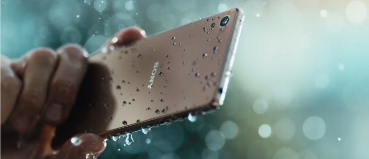
Sony is keen to point out that their camera lens sits flush with the back despite the slimmer profile, unlike pretty much every major competitor. A curious little detail for those of you keeping track is that now the lens is part of the glass panel, while the single-LED flash sits in a cutout, exactly the opposite solution to the previous model.
That said, looking at the back alone, you'd have to be a true Sony connoisseur to tell the Xperia Z3+ apart from the older models. We do have a Z3 for direct comparison so we admit that made our job much easier.

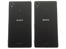
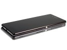
Sony Xperia Z3+ side by side with Sony Xperia Z3
Controls
The controls of the Xperia Z3+ are located on the right side of the device. The aluminum circular power button, a highlight of the OmniBalance aesthetic, is joined by the volume rocker in the middle third of the side, while the dedicated two-stage shutter button is in its expected position towards the bottom.
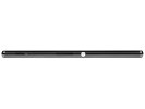
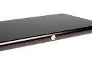
Right side with power button volume rocker and shutter release
What used to be two separate slots on the right for microSD and nanoSIM cards, hidden behind a long 33mm flap on the right, has become a single slot on the left, where the microUSB used to be.
Behind the single flap on the Z3+ there's a flimsy plastic tray, which can accommodate both a nanoSIM and a microSD card. The tray is a pain to take out and we wouldn't be surprised if it's easy to break if you take it out too often.
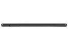
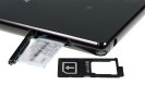
SIM card and microSD slot behind a flap on the left
On the top of the phone you'll find the standard 3.5mm headphone jack in the very same spot as on the predecessor. For little apparent reason other than to move things around a bit, the secondary microphone has abandoned the 3.5mm jack and is now on the other end of the top plate.
What used to be a bare bottom plate is now home to the microUSB port in the middle and a lanyard eyelet towards the corner, an increasingly rare sight these days.
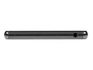
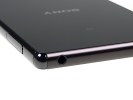
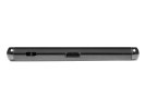
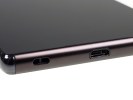
3.5mm jack and secondary mic on the top plate • microUSB and lanyard eyelet on the botom
A fairly standard arrangement on the front sees the 5MP camera and the sensor cluster on either side of the Sony logo. The layout is a mirror image of the previous three generations, and back to their original position on the original Xperia Z.
The 20.7MP camera is in the top left corner on the back, where it has been since the Z1, and so is the single-LED flash.

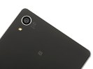
Front camera and sensor placement • Primary camera and LED flash
Handling
As we already mentioned, the Xperia Z3+ is noticeably lighter than its predecessor, and that makes for a superior in-hand experience. The phone just feels easier to handle.
What's remained unchanged is the dual-glass design which means the grip is less than ideal. And while you could squeeze it tighter for a more secure hold, placing it on an even slightly sloped smooth surface remains a gamble.
One thing that bothered us is the ever so slight lip that the frame creates over the glass panels. You could argue that it's there to protect the glass panels from scratches, but your fingers won't be happy. The Z3 doesn't have that and it's almost as if Sony made the new device 0.4mm thinner, but kept the frame as thick as before.
Reader comments
- Anonymous
- 13 Mar 2021
- 0AB
I use mine right now. I had to replace the battery a couple of years ago
- Anyone
- 11 Nov 2020
- YUU
It doesnt last long and dont you ever buy it
- Jagadishwar
- 04 Jul 2017
- rAM
Slot 1not working. Pl let me how it works
