Sony Xperia Z3+ review: The pre-sequel
The pre-sequel
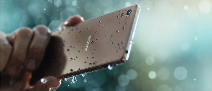
Lightly modded Android 5.0.2
The Xperia Z3+ is among the first Sony devices to boot Android Lollipop out of the box. Unlike other manufacturers, the Japanese giant has traditionally chosen to stick close to stock Android and the Xperia Z3+ stays true to that approach.
The lockscreen has a clock widget up front in Sony's recently adopted styling with a bold hour numeral, and less striking minute digits. You can also opt for one of two other clock faces.
Lockscreen notifications debuted on Lollipop and are present on the Xperia Z3+. A double tap on one will unlock the phone and take you straight to the respective app.
Unlocking works only by an upward swipe, other directions won't cut it. You do get shortcuts to the camera and dialer, though. A double-tap-to-wake feature can be enabled in the settings.
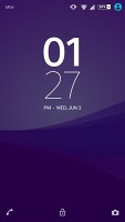
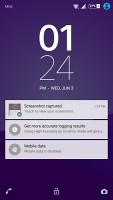
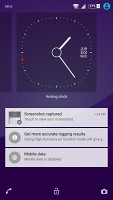
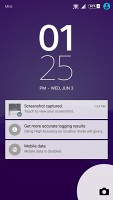
Straightforward lockscreen with notifications and shortcuts to camera and dialer
Beyond that, there's the usual set of homescreens, of which you can have up to seven. You can choose any one of them as Home, but you can't rearrange them, nor do they cycle to the first one once you reach the end. A dock of four app shortcuts plus app drawer icon sit on the bottom. Naturally, folders are supported on the dock, as well as the homescreens.
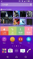
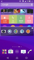
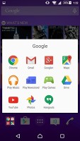
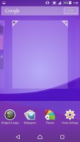
Homescreens with app shortcuts, widgets and folder support
There's an extensive theming engine and although the preinstalled themes offer mostly the same Xperia look in different colors, a whole bunch of other custom themes is available online.
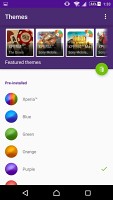

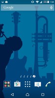
There are simple preloaded themes as well as a multitude of downloadable ones
The app drawer displays a 4x5 grid of apps and you have a choice of small or large icons, though opting for the small ones won't display more apps. The apps can be arranged alphabetically, by most used, or in a custom user-selected order. To change the arrangement or uninstall an app, you need to evoke the side drawer, a feature of the XperiaUI used throughout Sony's proprietary apps.
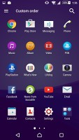
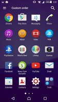
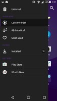
App drawer with small/large icon setting • Side drawer for settings
The notification are is the stock Lollipop flavor. That means a two stage design, with notifications displayed on the first swipe, and the settings toggles available upon expanding it. A less obvious gesture, a careful two finger pull down will get you straight to the toggles.
Wi-Fi and Bluetooth are not mere switches, tapping on the text below will take you to the settings of the two. Editing the selection of toggles is available with a shortcut straight from the notification shade.
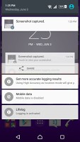
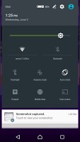
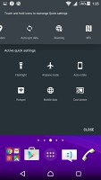
Stock two-stage Lollipop notification shade without auto brightness toggle
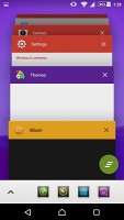
Like the rest of Sony's Lollipop builds, the Xperia Z3+ uses standard Android app switcher with the added benefit of a kill-all button. There's more to it though, and it comes in the form of Sony's Small apps.
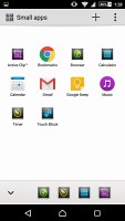
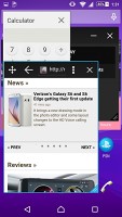
They pop up tiny widget-like applications on your homescreen, which you can move around and use without having to open the full-fledged app. So far, there's a default set of ten: Active Clip, Chrome Bookmarks, Browser, Calculator, Calendar, Gmail, Google Keep, Music, Timer and Touch Block. You can launch only one instance of a Small App, but you can open multiple Small Apps simultaneously, though it can quickly become a mess.
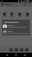
You can download more Small Apps off the Play Store or use the option to turn your favorite widgets into Small Apps. Just hit the Plus key at the top of the list and choose a widget.
Reader comments
- Anonymous
- 13 Mar 2021
- 0AB
I use mine right now. I had to replace the battery a couple of years ago
- Anyone
- 11 Nov 2020
- YUU
It doesnt last long and dont you ever buy it
- Jagadishwar
- 04 Jul 2017
- rAM
Slot 1not working. Pl let me how it works
