Sony Xperia Z vs. HTC Butterfly: A tale of two screens
A tale of two screens
Hardware overview
From a purely design standpoint the two devices are very different – the otherwise cool-looking polycarbonate unibody somewhat lacks the sophistication of the glass-clad Xperia Z. In terms of footprint, they are largely the same, but the Xperia Z is more than a millimeter thinner at 139 x 71 x 7.9mm, against 143 x 70.5 x 9.1mm for the Butterfly. What we should note here is that the curved screen edges and the symmetrically sloping borders rearside make the HTC Butterfly feel equally slim in hand – which it most certainly isn’t.
Looking at the Xperia Z, the elegant design is initially its most eye-catching aspect, and the glass panels on both the front and rear lend not only to this, but also make the package more solid and of higher quality. The HTC Butterfly's polycarbonate unibody is perhaps more sensible, but the "wow" factor is clearly stronger in the assertively angular Xperia Z.
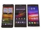
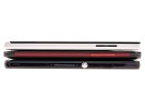
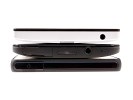
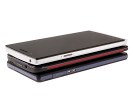
The two devices are pictured here with the Oppo Find 5 (white)
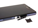
Since both phones feature non-removable back panels most ports and slots are under plastic flaps along the edges. Because of its IP57 rating, the Xperia Z has every one of its ports covered, and it's the same with the Butterfly except for its 3.5mm audio jack. It's important to note that the Butterfly's microUSB port cover is too hard to open, which is a major annoyance considering how much it gets used.
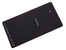
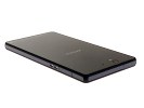
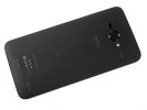
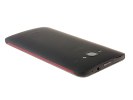
The backs of the devices take after some very different design schemes
Weight-wise, the devices are again very close, with the Xperia Z (146 g) being heavier by just 6 grams. It’s certainly not the kind of difference you can feel in hand.
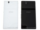
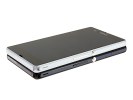
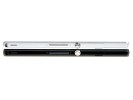
The black and white variants of the Sony Xperia Z
As we mentioned earlier, both feature 5-inch 1080p displays, and are almost identical in terms of how much space they take up on the front of the device. The important difference here is that the HTC Butterfly has the main capacitive keys below the display and thus offers a little bit more real estate for actual content than the Xperia Z, which has on-screen controls. Effectively, the two phones have nearly the same amount of lower screen bezel and while the HTC uses this properly, on the Xperia it's just blank space.
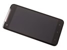
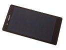
The screens are identical in terms of size and resolution
The HTC Butterfly’s screen is curved at the tall sides, making it easier to start swipes from outside the screen. In contrast, the Xperia Z's hard edges make this gesture more difficult.

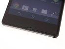
On-screen vs. physical buttons
The notification LEDs for both phones are located on the upper right, above the display, but the Butterfly has a second LED on the back, which comes convenient when it's laying on its screen.
As for the other features, the volume rocker is on the right edge of both devices, and both feature power/lock buttons which are not standard - the Xperia has a circular one that juts out on the right, while the Butterfly has one that lies in the direct center of the top, and is almost entirely flush with the surrounding surface. The positioning and lack of definition of the button are an odd design choice and make it very hard to use, and given that this is the most often used hardware button, that's quite irritating at times.
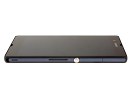
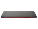
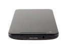
The power buttons' location and usability vary widely between the two devices
Both devices feature 3.5mm audio jacks on top (the Xperia's is covered). On the Butterfly, the microSIM compartment and microSD slot are on the top under the same flap, while on the Xperia the microUSB and microSD slots are on the left, separately. The Butterfly has the microUSB port at the bottom.
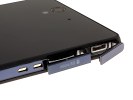
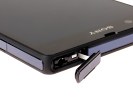
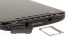
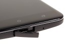
The various ports are all covered by protective flaps
When all's said and done, the pocketability of both devices is about the same, although the glass panels on the Xperia Z make it a bit more slippery.
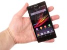
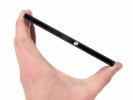

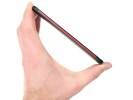
Sony Xperia Z in-hand • HTC Butterfly in-hand
Winner: Sony Xperia Z. Personal design preferences aside, the Xperia Z's construction feels more solid, and the IP57 rating is a nice bonus. The HTC Butterfly, while also a solidly built device, is hampered by its hard-to-open microUSB port cover, as well as poorly placed and designed power/lock button.
Reader comments
- Timmy
- 10 May 2020
- Nue
Pls I need to no more about Sony Xperia z camera
- sonu
- 11 Jul 2015
- rKv
Completely Disagree with u.....
- random
- 27 Oct 2013
- uuA
Ive been using the Xperia Z for 7 months now, nd I haven't been let down by sony. It was the first flagship having water resistance. There may be since issues with the viewing angles but otherwise it is a great phone to invest in if you're looking ...