Sony Xperia Z vs. HTC Butterfly: A tale of two screens
A tale of two screens
User interface
Although both manufacturers supply their smartphones with Android Jelly Bean 4.1 out of box their personalization approach is quite different. Still thanks to Jelly Bean's native Project Butter both phones are incredibly responsive, and they also get the other goodies of the 4.1 release - old widgets move out of the way when placing new ones and there's Google Now on board.
Here are the two UIs on video to get you started.
The lockscreen is one area where the two devices aren't too similar. The lockscreen on the Xperia Z uses a new cool animation and has two shortcuts for quick access to the camera (swipe to left) and to the dedicated music controls (swipe right). When the music player is active, the lockscreen will show the music controls by default, but you can hide them with a swipe if you want. You can also enable Face, Pattern, PIN or Password unlock, in ascending order of security.
There's no way of accessing other applications besides the music player and camera, unlike on HTC's Sense UI.
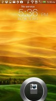
HTC Butterflly's Sense lockscreen has four shortcuts and a ring at the bottom, all of which are customizable, but there's a catch - in order to change the apps that display on the lockscreen you need to manually change them from the homescreen dock.
But that's not the end of it - the HTC Butterfly comes with nine different lockscreens preinstalled. You can access the others from the Personalize menu - a photo album, Friend Stream, Weather, Clock, Stocks, Productivity, People, Music or just a plain wallpaper.
The notification area on the Xperia Z features several connectivity toggles (Sound, Bluetooth, Wi-Fi and Mobile Data). There's also a quick shortcut to the settings menu. For some reason, the notification area isn't accessible from the lockscreen. Naturally the notification pane also displays the various notifications from different apps and you can resize those with pictures in them, as well as lists of emails.

Sony Xperia Z notification area
The Sense notification area gives you a Settings shortcut here if you need to power something on or off. There's also a Clear button to dismiss all notification or you can swipe them off one by one.
Unlike the Xperia Z, the HTC Butterfly offers just one toggle here - the Power Saver on/off switch. It does exactly what it's supposed to do - toggles the power saving mode or (if you tap on its name) takes you to the Power Saver options. If the phone detects headphones it will also display the Beats Audio on/off switch in the notification area. The notification area is also available in the lockscreen.
The Xperia Z gives you the option to change the number of homescreen panes (by adding more or removing some of the default 5) and even select any of them as home. You can't have more than seven panes at any given time though.
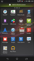
Adding stuff to the homescreen is done by tapping and holding on a blank area of a homescreen or using the pinch zoom out gesture. A context menu appears, allowing you to add various customizations to your phone - add widget, shortcuts to apps, change the wallpaper and change the theme. You can also add shortcuts from the app drawer by holding your finger over an icon and dragging it to the add to homescreen area.
Sony has added a number of its own, custom widgets. Unfortunately they are not resizable by default but are still more adequately sized to boot and don't take up the entire screen.
There is no overview mode as it was with previous Sony Xperia smartphones. Instead, you get the homescreen edit menu when you do the familiar pinching gesture. More on this later.
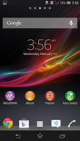
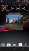
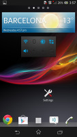
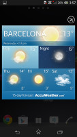
Sony Xperia Z homescreen and widgets
A gripe we have with the HTC Butterfly and Sense in general is that it doesn't make sense for a widget to take up an entire homescreen panel on the Butterfly's big and pixel-dense screen. The fact that most Sense widgets cannot be resized adds to the problem.
The homescreen has an auto-hiding indicator of which screen you're on and a dock with five shortcuts - the middle one is locked to the app drawer, while the other four can be customized as you please (you can even put a folder there, if four shortcuts isn't enough).
Leap view is still here - tap the home key (while on the default homescreen) or do a pinch gesture to zoom out (with an awesome animation) to display the thumbnails of all homescreen panes at once. Upon a press and hold you can drag to reposition the homescreen panes. A small house icon indicates the default homescreen, which cannot be changed, although its order can be moved around.
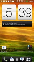
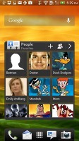

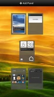
HTC Butterfly homescreen and widgets
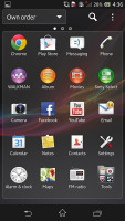
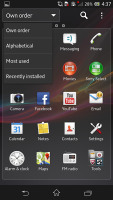
The Xperia Z app drawer is organized in pages and you can sort the apps manually, alphabetically, by the most used or most recently installed. If you tap and hold on an app a green Add to Homescreen area will appear on top of the app drawer. Just drag the icon there and you will go back to your homescreens where you can put a shortcut.
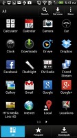
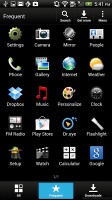
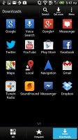
The main menu on the Butterfly has the typical grid layout, which is composed of horizontal pages with shortcuts sorted alphabetically. You can set different sorting options - alphabetical, most recent or oldest - but you can't rearrange them manually. There are Search and Play Store shortcuts along with a menu for some options.
Placing a widget, changing the wallpaper or theme, etc. is done by either holding a finger on an empty spot on the homescreen or doing a pinch gesture on the screen. You can edit the homescreen panes here, swipe widgets and apps through a list and dragging them or tapping them onto the desired screen.
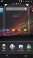
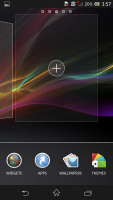
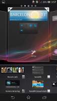
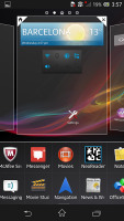
Placing apps, widgets, etc. on the Xperia Z
Sense UI does it more or less in the same way, however it gives the priority to the widgets and apps view and shrinks the homescreens significantly. You tap a homescreen to select it and then select a widget to add to it (or you can just drag the widget).
There's a search option to speed things along or you can choose a widget from the dropdown menu and then select which size you like, but that still feels like an extra step-the old method of picking a widget and then picking the size (if any) seemed simpler.
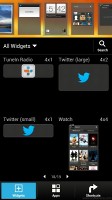
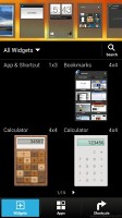

Placing apps, widgets on the HTC Butterfly
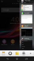
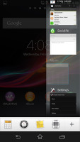
The Sony Xperia Z has a nice task manager we first met with in the Xperia T. It lets you go to the recently opened apps as well as remove them with a side-swipe. The so-called "small apps" are on tap as well. Sadly you still cannot close all opened apps at once, but that's also the case with the Butterfly.
HTC has a remodeled app switching interface - screenshots of the running apps are displayed, slightly tilted sidewise. They're ordered horizontally (instead of vertically as is the ICS standard) and you can swipe up to remove them. The not so-good news is that you can only see three of them at a time, even in landscape mode - a waste on such large screen.
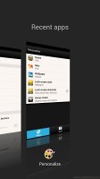

App switcher on the HTC Butterfly
Sense UI was among the first custom launchers to offer in-depth customization of the OS, but Sony is doing all it can to catch up. For now they have done so in terms of visuals - selecting a new theme changes the lock and home screen wallpapers and the color of the system icons (toggles, menu icons, etc.).
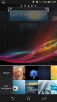
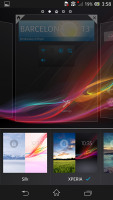
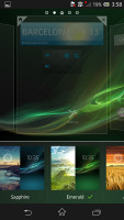
Changing wallpapers, themes on the Xperia Z
HTC's response is the much further reaching Personalize menu. The proprietary Scenes function is an essential part of Personalize - essentially five custom homescreen setups (Work, Travel, Social, Play and default). Each scene changes the wallpaper and the set of widgets. For instance, the Work scene has a stock ticker, while the Social offers a Twitter widget. Those can be customized, of course, and you can download and assign new ones.
Switching between scenes takes a couple of seconds, but they're a handy feature if you use your Butterfly as both work and personal phone.
HTC Sense has another customization option called Skins. Every skin changes the look and feel of most of the onscreen buttons, application screens, option menus, and other items. They also come with unique wallpaper each and use different colors for various UI elements.
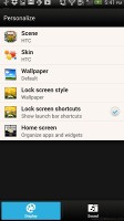
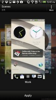
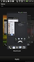
Personalize menu on the HTC Butterfly
Keep in mind that both the lockscreen and the launcher (which is the homescreen + app drawer) can be replaced with a 3rd party app, so you're not tied to a particular combo if you buy the Xperia Z or the Butterfly.
To sum up, the lockscreen on the Butterfly is superior, the widgets on the Xperia Z are slightly more thought-out, the Sony also has a more useful notification area while Sense UI excels at personalizing the feel.
Winner: Tie. Overall two very different approaches to the same underlying OS. What it comes down to here is personal taste - what you prefer. Both interpretations have their strengths and weaknesses but the good news is they both provide solid user experience.
Reader comments
- Timmy
- 10 May 2020
- Nue
Pls I need to no more about Sony Xperia z camera
- sonu
- 11 Jul 2015
- rKv
Completely Disagree with u.....
- random
- 27 Oct 2013
- uuA
Ive been using the Xperia Z for 7 months now, nd I haven't been let down by sony. It was the first flagship having water resistance. There may be since issues with the viewing angles but otherwise it is a great phone to invest in if you're looking ...


