The million dollar review: Going window-shopping
Going window-shopping
Vertu Constellation Rococo: Chic simplicity
The next one up in this impromptu review is the most basic of them all. Well, basic is not quite the word we're looking for but if you somehow pull yourself together and stop staring at the price tag, you may get the idea. By the way, at 8000 US dollars the Vertu Constellation Rococo is perhaps the cheapest Vertu handset. Entry level, so to speak.

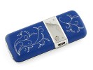
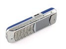
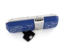
Vertu Constellation Rococo is the British manufacturer's idea of an affordable handset
It's not like it looks common or anything - certainly not with a name like that. The Vertu Constellation Rococo is just a bit understated compared to the rest of the handsets in this article. No compromise is implied though with the quality of the materials. The makers claim the handset was inspired by aeronautics.



The design, inspired by aeronautics and all the flowers make a rather peculiar combination
The stainless steel body is something you might even find on a regular phone, but the hand-finished leather and the sapphire crystal display are certainly rare. Not to mention the ceramic keypad, which has 1100 laser-drilled holes, hand-filled with a light-permeable lacquer.
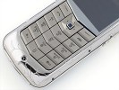


The laser-drilled ceramic keypad only reveals its full beauty in the dark
The Rococo unit that we had for this particular review also features embroidery on the leather, which comes in a choice of four colors - sapphire (as in our case), noir, ivory and scarlet. Other noteworthy decorations are the engraved bezel and the cabochon sapphires in the D-pad and on the sides of the front panel.
The handset is rather more compact than the Ascent Ti Ferrari, and feels a tad lighter in hand. However, at 140 grams it still gives that marvelous solid impression that the fans of expensive handsets will surely appreciate.
As far as usability is concerned the keypad of the Rococo certainly makes a good impression with its terracing and V-shaped (as in Vertu-shaped) styling. The press is also great, for comfortable typing and expensive feel.
The rest of the keys: volume rocker on the right and concierge button on the left, along with the D-pad are pretty comfortable too, making the handset very user-friendly and nice to use. Unlike the cooler looking Ferrari we took for a spin in the previous chapter, the Vertu Constellation Rococo feels more like a Jaguar. It might not turn as many heads but it certainly has a charm of its own and greater roadability.
We are also pretty pleased with the sound, delivered by the two large speakers, located on the two sides of the handset. Once again those are not there to justify the price tag or anything like that - they are more like a little something to make you feel different in a good way.
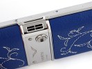
Vertu surely know how to produce a nice loudspeaker
Packaging and extra goodies
The Vertu Constellation Rococo comes in a box that is quite a lot smaller and somewhat less impressive than the Ferrari package. It still throws in a bit of leather and is nothing like the box of any regular phone so we might just be getting a bit picky after all that luxury we're treated to.
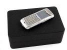
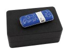
The leather box is not as impressive as the Ferrari one
Inside you will find a bunch of rebranded Nokia accessories and a key for releasing your Constellation Rococo's battery cover. It looks a lot simpler than the Ferrari's key.
The user interface in the Rococo is again the time-tested S40, spiced up with a couple of nice extra applications. Here might be the right time to mention that the interface of each Vertu comes with a theme that is specially designed to suit the exterior. And they do pretty well we might add, an almost perfect match for the design.
The Rococo design is obviously feminine and a very subtle, especially compared to the Ascent Ti Ferrari. All those floral ornaments on the outside and the inside look pretty sweet though hardly too expensive. And looking expensive is half the job those handsets need to do as far as we know.
We'd be pretty happy with having one of those, although to be honest, the Blue version won't top our wishlist. The simplistic design looks way better when it comes in Black if we're to be asked. Come to think of it though, a team of geeks is hardly the right people to ask about insanely expensive and functionally-crippled handsets.
You're free to disagree, but you're welcome to join us on the next page or you risk missing some more Vertu action.
Reader comments
- Ray
- 18 Jun 2015
- t1$
My friend wanted to know why the Vertu Signature cost a fortune. I showed her this review and we had a good laugh. Funniest review ever!
- hk
- 17 Apr 2012
- utZ
how much price of mobile somebody tell me pls because iwant to purchase this mobile
- mack
- 19 Jun 2011
- vw6
very precious comment dude.........................made it ............really is mean it.............................